With stablecoins gaining traction and regulation improving, African merchants may be nearing a crypto tipping point. Here’s why 2026 could mark a shift from hesitation to adoption.
Review — Windows 8 Consumer Preview
It’s Windows 8 Consumer Preview and it’s the very best version of Windows 8 yet. Sure, we’ve reviewed Windows 8 Developer Preview but it sucked balls. It constantly crashed, the USB rarely worked, the app store wasn’t live and it conceivably gave me stomach cramps. It set my old Jewish man mode to FULL BLAST and I eventually removed it.
But let’s forget about Windows 8 DP, because Windows 8 CP 64-bit edition may be the greatest thing since French toast. Possibly, even greater.
Remembering DOS
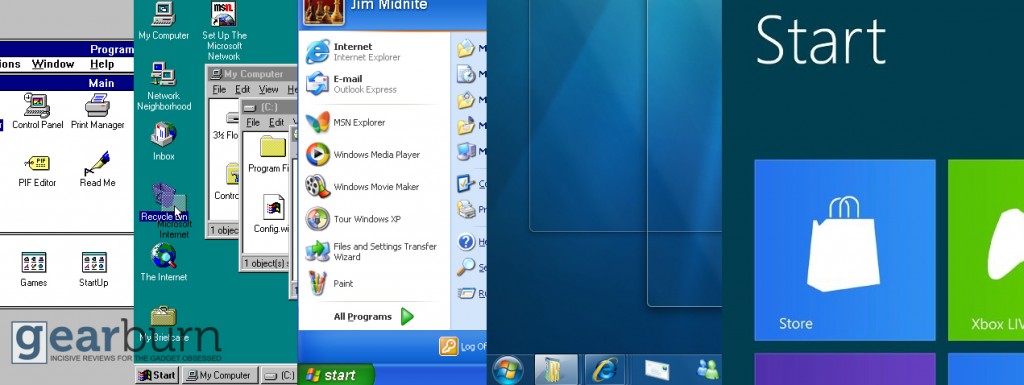
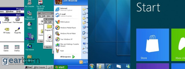
Personally, Windows 8 CP marks an evolution in Microsoft’s OS. Gone is the desktop (well not gone, but hidden) and gone is fumbling around for files. Everything is within easy reach, proven by the search function is built into the meat of the UI. Windows 7 had a neat search bar which ran from the Start menu. Windows 8 tosses that crap out the window and lets users search from anywhere. Just start typing and Windows 8 delivers search results. Done. Command prompt, Explorer; these are artefacts of the past.
I have to digress. Why change the look of a UI that is 30 years in the making? Because we have to grow up, and embrace the future. Staring slack-jawed into an ugly desktop is so 2006. This is 2012 and the tech-hordes want change. Change is hard to invest in though. Change leads to fear, and fear leads to the Dark Side. But what Microsoft has done is nothing short of a binary revolution.
One device fits all
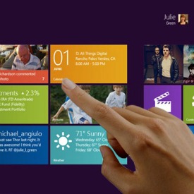 We, and I use the royal “we” here, want pretty pictures and instant response. We’ve come to accept the fact that information is instantly handed to us in notifications, instant messages and status updates. Why shouldn’t our OS be the same? Windows 8 CP is that OS and it’s going to change the world, so wise up and get with the program.
What I enjoyed about Windows 8 CP is that the same experience is offered across most Microsoft platforms now. Windows 8, Xbox Live and Windows Phone all use the same type of interface in varying degrees. And you know what? It works. It’s a smooth ride and users can jump from one device to another without ever losing a beat. It’s called the Metro UI and works as well, if not better on touch-based devices.
Getting used to the new interface presents an issue for long-time Windows users. The Live Tiles are daunting, constantly shifting to present new ideas, ever buzzing with information. You quickly get used to it though.
An App ecosystem
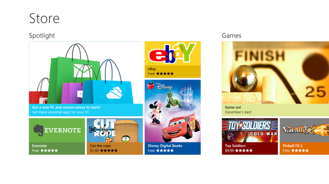
You get all the apps you need with Windows 8 CP. Social networking, email, messaging, calendar, contacts, It’s all there. For anything else, there’s the App Store.
What other default apps are there? There’s the acceptable Bing Maps, the Xbox Live-like Zune HD, weather, finance and music apps. Every app is labelled “preview” so if it stuffs up, don’t blame Windows.
I enjoyed the “People” app though. Think of it as a contact list on Windows Live. Hell, it’s got the exact same interface and functions like the Windows Phone interface. It links to everyone in your social networks, draws out details and creates a fairly meaty phonebook with very little effort on your part. Me likey.
It’s not as powerful as the Mail or Messaging app, both of which are pared down to exquisite simplicity. Messaging combines Facebook and Windows Live chats, Mail mixes Gmail, Hotmail and Outlook mail into a melange of information. The new “all-screen” format of Windows 8 CP pushes the information into the forefront. It’s clean, spares and readable.
The included Xbox Live app is a replica of the Xbox 360’s service. Find friends, clothe your avatar and launch games (eventually). I was unsurprised to see how well it was replicated on PC, considering that Microsoft drives the good ship Xbox.
SkyDrive, Windows 8 CP’s stab at cloud-services, is fairly useable, letting you pick which files you want to upload. In the full-fledged SkyDrive App (coming soon says Microsoft), automatic syncing between local and cloud files will be the norm.
And Internet Explorer? It’s back, and it lets you download Chrome, so Kudos for that. Ironically, Internet Explorer is pleasant enough but it’s such a tightly-walled environment and I can’t even begin to stomach it in its new Metro guise.
The Microsoft PDF Reader is a treat. PDF’s are full-screen and scroll quickly. What more could a boy want? No toolbars messing up the interface and that’s what the PDF Reader delivers.
Dude, where’s my Explorer?
As I said earlier, some will lament the “loss” of Explorer, the tried and tested UI of past Windows efforts. Not I, says the interface lover.
You can’t access the Start menu anymore. It’s gone and pressing the “Windows” button shifts the view back to the Metro homescreen. You can still press Windows key and tab to change to running apps, or hover over the top-left portion of the screen to access recent programs.
Charms, which rarely worked in Windows 8 DP, run like a bomb on CP. Any open app has its corresponding Charm, or app options. Hover the mouse to the right side of the screen and the Charm bar appears. Dandy, and handy. The default Charm bar lets you access the settings, but not all of them tellingly. Best of all, that goddamn awful language bar is integrated into the Charms bar. Never again Microsoft, never again.
In all fairness, Explorer remains alive and well in Windows 8 CP, but it’s supposed to stay hidden for the default user. After a day of use, you’ll wonder why you ever needed it as open apps default to full screen, but if you prefer, can be minimised or docked as it was with Windows 7.
Windows key plus “R” will run any app directly from prompt. So there, no one can complain about the loss of Explorer. I can’t comment on the touch aspect of Windows 8 CP; my non-touch laptop merely complained every time I pressed its LED screen.
One more thing
You need to have a Windows Live account to run Windows 8 CP online. If you don’t enter your details, the system is a faceless ghost, spewing random information without context. Once you sign up with your Windows Live account though, your life is seemingly slotted into Windows 8 CP with nary a hassle. Note, you can link almost every social media account into Windows 8, eliminating the need for separate Twitter, Flickr or Facebook apps.
One word that comes to mind with Windows 8 CP is polished. Every inch of Windows 8 CP absolutely stinks of polish. From the sliding windows to the fast-loading apps to the most usable interface EVER CREATED (patent pending), Windows 8 CP is a delight to use. This is a good start to a bright, Metro UI focused future.
Download Windows 8 CP from uncle Microsoft right now. Do it.

