With youth unemployment above 60 percent, South Africa is betting on digital skills to drive inclusive growth. Here is how MICT SETA is positioning the next generation for the Fourth Industrial Revolution.
Alcatel One Touch 990: Budget, but good [Review]

I can’t recall that I’ve ever heard Alcatel smartphones being mentioned along mobile manufacturer heavyweights such as Samsung, HTC, LG, Motorola, RIM, Sony, Apple or even Huawei. I can vividly recall however, my first encounter with an Alcatel phone. I remember the frustration and subsequent catharsis I felt as I repeatedly bashed it against my car’s steering wheel shortly before throwing it out the window.
That happened a few years ago. Since then, I’ve matured — I’d like to think I’m less impetuous — but have Alcatel’s consumer phones?
When the One Touch 990 arrived at Gearburn HQ, no one leapt at the chance to review it. Mostly we procrastinated, being pedantic about the spelling mistakes in the user manual and pointing out the apparent indifference of Alcatel to its own product: the product colour on the packing was specified as “blueish black.” The sense of apathy was further exacerbated by a picture of a red OneTouch 990 on the packaging.
Haughty temperament tamed, I spent some quality time with the 990 and can now safely say that I’m not in love, but definitely in like with this budget phone.
I believe that if I could travel back in time and give my temperamental self the 990, parts of this introduction would have never been written.
In terms of design flair my expectations were low. Why? Alcatel doesn’t enjoy large mainstream consumer mindshare, and for good reason. The company is part of Alcatel-Lucent, a multi billion dollar global communications conglomerate with a focus on service providers, enterprises and governments. Eight years ago, Alcatel-Lucent partnered with TCL Communication and have since then been dabbling in the consumer phone market.
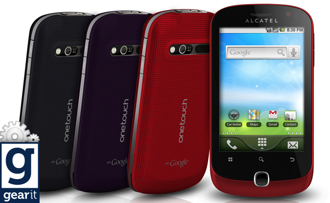
To my surprise, the One Touch 990 feels solid, looks sleek and is a pleasure to hold at 116 mm tall and 62.2 mm wide. It has a quality feel and in the dark blue colour that we had, looked understated and dapper. There’s also Auberguine and spicy red colour options.
On the front there’s a capacitive 3.5-inch, 320 x 480 TFT display, with three haptic feedback buttons — Menu, Search, Back — and one physical home button sitting just below it. Above the display is an earpiece and a front-facing VGA camera. Slightly annoyingly, the buttons didn’t seem to consistently light up in the dark, leaving you to aimlessly stab around in the hope of hitting the right key.
On the top right hand side of the phone is a volume rocker, and awkwardly placed on the bottom left, you’ll find the power/lock button. The 3.5 mm headphone jack and microUSB port are located at the top of the phone.
Rounding off the outside, on the back of the phone there’s a 5MP camera, LED flash and speaker grill.
Taking off the back cover, you’ll find a 1300 mAh battery with a microSD – and SIM slot located beneath it. You’ll have to take out the battery every time you want to swap an SD card, but on the bright side, a 2GB card — expandable to 32GB — is included with purchase.
Due to its mainly plastic construction the unit weighs around 144 grams, but as I said earlier, it doesn’t necessarily feel cheap.
True to its budget sensibility, the One Touch 990 has a modest 600 MHz Qualcomm MSM7227 processor and 150MB of RAM. I want to say it’s “slow, but steady”, but pardon the candour, it just isn’t.
For the most part, interacting with the OS — Gingerbread 2.3.4 on our review unit — was acceptable and you will no doubt succeed in getting things done. But, on multiple occasions it would miss my finger swipes. The lack of consistency which carries through to the web browsing experience can be annoying at times. The web browser, performs on par with browsers running on phones in the same class as the 990, though. Pages load fast enough, but don’t expect consistently smooth scrolling or pinching/zooming. There’s also no Flash support.
Apart from the UI hiccups, the One Touch 990 performs tasks admirably, helped by the Adreno 200 GPU. Although there are smoother Angry Birds experiences out there, it’s definitely playable on the 990. High quality YouTube videos are streamed with ease and multitasking is smooth.
The Quadrant Standard score puts the One Touch somewhere between an HTC Desire and Sony Ericsson Xperia X10i.
With a pixel density of 165 ppi, the 3.5-inch, 320 x 480 TFT display is slightly behind competitors such as the LG Optimus One and Samsung’s Gio, but ahead of the Samsung Galaxy Y. It’s therefore an average display for its class with colours being adequately crisp indoors, but struggling a bit outdoors.
Overall, I enjoyed the quality of pictures and video that the display managed to produce, especially at the full brightness setting — I wouldn’t recommend anything lower actually. The viewing angles are good too.
The sound is a high-point. The One Touch 990 sounds great and definitely stands out from budget phones in its class. It sounds even better with a pair of high quality headphones. The pair of headphones included with purchase really doesn’t do the 990 justice.
The 5 megapixel camera on the 990 delivers a mixed bag of pictures, but with a steady hand and some patience, you’ll get good shots and the colour reproduction isn’t too bad — a little washed out if anything.
The camera app is pretty much stock and you’ll find all the regular Android functionality here. Focus mode, exposure settings, scene modes, picture size/quality and ISO settings. There are also anti banding options, continuous shooting modes, geo-tag toggling, white balance options, flash mode as well as timer and zoom — 1x to 3.9 digital — settings.

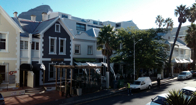
Landscape sample
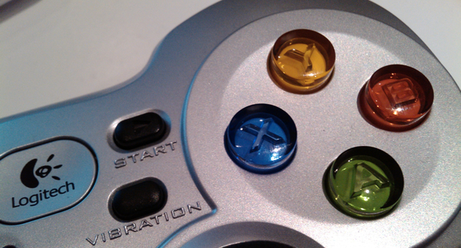
Macro sample
Where the 990 falls flat on its face is when it comes to recording video. It happens at about quarter VGA or 352 × 288 pixels to be exact, and colours are bad, pixelation is standard, transitioning from light to dark is jarring and panning in any direction results in all hell breaking loose. The video sound quality is good though.
You can expect fast HSPA data transfer speeds with a maximum theoretical download rate of 7.2 Mbps. There’s fast 802.11n Wi-Fi onboard, though I did struggle a bit with reception. I found it to be on the weaker side, so don’t venture too far from your hotspot. Bluetooth version 3.0 is also here.
Phone call quality is great and the speakerphone is nice and clear thanks to that excellent external speaker mentioned earlier in the review. I disliked Alcatel’s phone dialer and in-call options UI though. A bit too cartoony for my taste. Having said that, Alcatel did a great job overall leaving well enough alone. Gingerbread is mostly stock, but more on that later.
Realistically you can expect about a day’s joy out of the 990. Some would argue that this is sub standard for a budget device and I agree, but a full day is all you really need. Alcatel says you’ll get about 6 hours of talk time and 23 days of standby time.
The phone is rounded off nicely with a stock-standard list of internals. The usual suspects are here: accelerometer, proximity sensor, compass and GPS — the 990 gets a GPS lock very snappily. There’s also an FM radio tuner; handy. Apart from the USB charger and cheap headphones we mentioned earlier, there wasn’t much else in our review unit packaging. According to some blogs there might be an additional back cover included with some units, but we can’t verify this.
The 990’s packaging advertises Froyo 2.2, but our review unit came pre-loaded with Gingerbread 2.3.4, so an upgrade does exist. We doubt it will ever get Ice Cream Sandwich, though.
The OS is mostly stock, so if you’re into that, rejoice. The included themes are subtle, but pleasant and the 990 copes well with live wallpapers. Of course the Android Market is there, so it’s highly customisable beyond the default options.
If you look closer, you’ll see subtle changes like the ability to double tap the homescreen to hide the status bar at the top. I love this. It gives the homescreen a clean, uncluttered, minimalist appearance.
You have the ability to choose three, five or seven homescreens and there’s an additional TouchPal keyboard, which you might like if you’d like to ride the short learning curve it poses. It incorporates some clever tricks like giving you the ability to swipe up and down on characters and words for character and word variations.
The contacts app is standard fare for the most part, but it doesn’t integrate with Facebook to show pictures of your friends. It redeems itself however, by showing tweets from contacts.
The Alcatel One Touch 990 competes directly with other budget Android devices such as the LG Optimus One (P500), Samsung Galaxy Gio and Samsung Galaxy Y, but I highly recommend checking out the slightly more expensive HTC Wildfire S and Galaxy Ace as well.
A front-facing camera and rear-facing 5MP camera is rare for this type of budget device, and the external speaker delivers excellent sound. I loved the build quality, FM radio and the way YouTube videos stream smoothly.
Overall the OS performed admirably and I loved the fact that it has a pretty much stock UI, but I disliked how it was unresponsive to my input at times. The web browsing experience was disappointing as well, but by far the most disappointing aspect of the 990 was its video recording ability.
It’s a budget device and it deserves repeating, so leave your lofty expectations at bay. In the end I didn’t fall in love with it, but I did take a definite liking to it. It’s well built and with some patience it will help you get things done.


