With powerful hardware working together with an industry-leading camera system and intuitive AI experiences, everyday tasks have never been easier and faster
Can the Vodafone SmartTab 7-inch beat its brethren? [Review]


Steve Jobs was never all that big on seven inch tablets calling them “dead on arrival”. Here at Gearburn, we’re not so sure. We like the ultra-cheap Netsurfer Touch and we really like the BlackBerry PlayBook now that it’s rocking OS 2.0. So, can Vodafone’s seven inch offering match up to these two beauties?
One thing is for certain — it won’t have as difficult-a-task of pleasing us as its 10-inch sibling. After all, that was starting to get into iPad and Galaxy Tab price territory without delivering anywhere near their specs.
Everything that was discordant on Vodafone’s 10-inch offering somehow just makes sense on the baby of the range. Don’t get me wrong, it’s still minimalist (and that’s still an issue with the tablet industry as a whole) but it all just seems like a much neater package. Even the buttons don’t stick out as much.
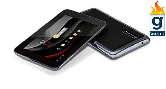
One thing that is different is the trim. On the 10-inch it was metallic silver. On this baby, there’s only the thinnest hint of silver before it becomes metallic black. Very stealth. Very cool.
The seven-inch Smart Tab rocks exactly the same Snapdragon Dual Core 1.2 GHz processor, 1GB of RAM and 16GB of internal storage as its big brother. I’d like to say that the company managed to get things working better this time around, but it didn’t. You get the same second or so lag when you switch between landscape and portrait mode and apps crashed on me left, right, and centre.
The touch is fine. Not silky smooth, like you would get on a high-end device, but fine. Still, rather than that feeling you’ve been scorned by a temperamental girlfriend.
This sucker comes standard with a 5MP rear camera and a 2MP front-facing one. Once again, exactly the same as you get in the 10-inch version. Once again both are competent, but as soon as you start heading into unnatural light, things start getting noisy.
At 800X1280 pixels, this isn’t the last word in high-res screens, but it’s passable. That said, some of the larger icons seemed just a little fuzzy. Unless you’re HD-obsessive, you probably won’t notice though.
Okay, if I keep comparing this tablet to the 10-inch version, I think a reader might hunt me down and drive a pencil through my throat. So I won’t go on at length about the fact that it also runs Android 3.2. A lot of tablets do and you can’t blame a company for consistency across its range of products. The particular flavour Honeycomb running on the Smart Tab is fine. It’s not crap, but it doesn’t reach wet-yourself-with-excitement levels of brilliance either.
The one thing I do have a gripe with, having owned a couple of Android devices, is the native Gmail app on the Smart Tab. Get rid of it at your earliest convenience. Other than that it’s all business as usual, baby.
![]()
It seems that we’re finally getting to the stage where manufacturers are paying attention to battery life. I managed over 24 hours of of casual use with the Smart Tab. Obviously that’s going to go down a lot more if you’re using the device heavily and have 3G constantly turned on. Battery life is a bit like a car’s petrol consumption, you see. Sure, some models will get more juice out of a tank than others, but a lot of it comes down to how you drive.
So, what conclusions can we draw? Well on specs alone the Vodafone Smart Tab Seven-inch can certainly play in the market. Thing is most of its competitors are going for a lot cheaper these days. Much as I’d love to reccomend buying this little tablet, I have to say you’d be getting a PlayBook. And if you want the Android experience, root it.
