With powerful hardware working together with an industry-leading camera system and intuitive AI experiences, everyday tasks have never been easier and faster
Sony’s Xperia S hits the right notes [Review]

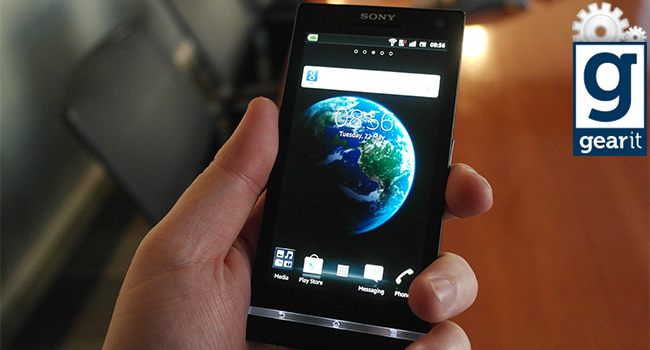
It was the hypnotic, blue background swirl of the Xperia S which first drew me in. Like staring into the night sky, digital ribbons flux merrily on a 342PPI display.
It’s gorgeous, an apt display of this 1.5Ghz dual-core beast’s powers. Sony’s gone and pulled an ace out of it’s smartphone collection and I’m pleased to say that the Xperia S is one of the better phones of this generation. Nothing is without its flaws though, and minor issues reign the Xperia back from being the next iPhone 4S or Galaxy S III.
The design both impresses and disappoints, not unlike that current cinematic abortion Battleship. The front of the Xperia S is the talking point. The screen is a 4.3-inch stunner which is very smooth to the touch. It feels warmer than the iPhone 4S, especially when I rub it on my cheek. This is possibly due to the Xperia S being plastic from head to toe. So sure, the price will be lower but the pure erotic feel of metal is lost. This brings me great sadness.
Below the screen is a transparent menu dock, which does sweet eff-all except glow white when the phone is turned on. It brings a certain unique charm to the phone, but is 100% ancillary, serving only to guide users towards the menu functions. Personally, this detracts from the monolith aesthetics of the Xperia S and veers the device towards an almost childish design. Both the Xperia U and P have the same transparent bars, which are hot-swappable on these models. If it was possible to swap the transparent bar out completely, I’d cartwheel across Cape Town.
The Xperia S’s rear is so ugly, and designed so poorly, it makes me gag. For the life of me I’ll never understand why the Xperia S needs to have a rounded back. Sure, it remains steady in hand and on the table, but the fat bulge grates against my tasteful requirements. Smartphones are thin, it’s supposed to be a sleek device, not an overweight lump of plastic bulging in my pocket.
I do like the dainty buttons on the sides of the device though. The power button, volume rocker and dedicated camera key all nestle comfortably on the sides. Hidden on the frame are the micro-USB and micro-HDMI ports. Overall the design is “pleasent” but feels cheaper than it should. Not a great start.
This is where the Xperia S rocks the boat, hard. The dual-core, 1.5GHz Snapdragon CPU handles everything that’s thrown at it. I copied over a high-def episode of Game of Thrones and the Xperia S ran it with ease. The one game I had, Fruit Ninja HD, ran as smooth as butter and the phone loaded the app instantly. Don’t even get me started on Google Maps. Apart from the Galaxy Nexus S, this is the best loading of the map app I’ve ever laid eyes on.
I used Quadrant, a free benchmarking app to really test the beast within. It scored 3195, which was roughly a third more than the speed of the Galaxy Nexus S. Colour me impressed. Of course, benchmarks can be dismissed as arbitrary nonsense, but with statistics like these, it’s hard to argue down the raw speed of the Xperia S. This is a future-proof phone in every sense of the word. I reckon that any Android app released in the coming two to three years will run smoothly this beefy device.
This is the standout feature of the Xperia S, and undoubtedly the reason that many users will snap up the phone. The 4.3-inch, 720×1280, 342PPI display is the best there is. It’s like clearest liquid. Bottled, chilled and spread on a wafer-thin layer across a slab of Sony tech. Peep as hard as you like, you won’t be able to tell pixels apart. With the Sony Mobile BRAVIA Engine powering the display, everything looks like an LED treat, a firework display of colour and motion. Everything Sony promised us in terms of display tech is made real on this phone.
HD content looks amazing. There’s no ghosting and the beefy GPU renders high-def content with once-unknown clarity. Sure, the iPhone 4S looks incredible, but it’s been beaten in the pixel wars by the new kid on the block. That’s not to say that the iPhone 4S won’t perform like the Xperia S in terms of graphical fidelity. iOS apps made specifically for the Retina display are picture-perfect. As soon as the Google Play store wakes up and includes apps which work in tandem with the 342PPI display, iOS apps are going to have to play a lengthy game of catchup.
It’s 12-Megapixels and I’d go on record to call it a “proper” replacement for a point-and-shoot digital camera. In fact I have just gone on record and said it in this review. There’s plenty to dig into with the camera, starting with these dazzling sample shots (plus video recording) I took.
[jwplayer config=”Post_embedded” mediaid=”40501″]
Shot’s are crisp and clear, it’s a Sony camera after all. Shots max out at 4000×3000 pixels which is pretty much insane. That’s almost three times full-HD, so suck that bit of info down.
There’s a slew of picture settings. Set the camera to auto, normal shot, or the 3D mode which requires a 3D TV plus the micro-HDMI cable to work. I wasn’t able to test this function, but I’m sure it would look pretty dazzling. Other features include smile detection, geo-tagging and other fancy features which nicely add to the overall picture taking functionality of the device. The camera also films in full-HD, so it’s pretty much a replacement for your digi-camera and camcorder. Rock on, Xperia S.
Sadly, it’s not an LTE phone, but it’s HSPA+ which promises 22Mbps and that’s okay with us. I say okay because the fastest speeds I managed was roughly 3-4Mbs when tested with the Speedtest.net app in a very busy urban area.
The antenna is located on the bottom of the Xperia S, which is inside that matte section with “XPERIA” printed on it. If I held onto this with both hands, the signal dropped slightly, but calls remained clear and noise-free throughout. The phone is built for yapping and with a promised talk time of 8.5 hours (on 2G) there’ll be plenty to talk about.
The Li-Ion 1750 mAh is pretty meaty and keeps the Xperia S running for a full day without a charge. With a screen this enormous, a day of use is exceptional. Standby time is roughly 450 hours and the battery is hardwired into the device. What I mean is that if the battery stuffs up, there’s no turning back. Yanking off the flimsy backing plate reveals a spot for the SIM card and that’s about it. I’m not sure why Sony decided to go this route, it should have maybe gone with Apple’s method of sticking a SIM card into a slim slot on the side.
Now here’s where it gets interesting, and boring at the same time. It’s a Ying and Yang situation. Gingerbread is the OS bundled with the Xperia S and frankly at this point in the game, that’s just not good enough. Thankfully, the Xperia S is getting an firmware update to Android 4.0 in the coming months. The way Google has drip-fed Android 4.0 to the masses is pretty sickening, so for now we’re stuck with Gingerbread.
The overall feel of the OS is slick, but terribly bland. You can sex up the background with various colourful themes, or even better, install Go Launcher EX and remove the ugly stain called NXT. No really, do it now.
Anyway back to the default OS. Since it’s a Google product, you integrate a Google account with the phone and boom, your life is moved over onto the Xperia S. You can also add a Facebook account, this syncs the reminder of your contacts.
So with your life in order, the next step is navigating the damnable thing. Tapping the menu button displays a mess off app shortcuts which can be long-held and dropped onto another app to create folders (thank you, iOS). Flicking left and right navigates through the menus but most of your time will be spent on the home screens. Create shortcuts, sort the home screen out and keep life simple. There’s plenty of Sony’s NXT crap like Timeline but I chose to ignore this. Some may call me foolish, I would call these naysayers blind men in the land of the damned. NXT is a hateful UI which should be quickly replaced with Go Launcher EX.
Gingerbread is an admirable OS and shame, it tries. If I was saddled with it I’d also make the best of a mediocre OS, which the Xperia S has gone and done. On the plus side, it’s as customisable as you want it to be. On the negative side, it’s Gingerbread, not Ice Cream Sandwich.
Well, I’m a whore for decent screens and the Xperia S has one of the best, if not the best on the market. It’s bright, clear, crisp and vibrant, like a tiny-LED TV. The phone is faster than a greased monkey only infinitely less hairy and greasy.
It looks good, but suffers a few knocks thanks to its bloated rear. Overall though, the Xperia S is nothing short of a revolution for Sony and one of the best Android devices on the market. I have no doubt in my mind that once the Xperia S receives the Android 4.0 update, there’ll be nothing holding it back from claiming the top spot in the hearts and minds of Android lovers the world over.


