With powerful hardware working together with an industry-leading camera system and intuitive AI experiences, everyday tasks have never been easier and faster
Microsoft Office 2013 installed, previewed, loved
After what seemed like ages installing Office 2013 I was good to go. A word of advice to anyone ready to try out this new version of Office, don’t listen to what the dialog boxes are telling you. Anyway, when it was finally installed I gave it a whirl.
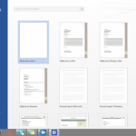
As a person who practically lives in Office I was interested in how this new version of Microsoft’s productivity suite would affect my everyday life. As I type this article on Word 2013 I must say I’ve picked up on a few slight differences as well as some big ones. Beyond the obvious Metro-fied UI which left me slightly petrified for like a few minutes, it grows on you. When you start any of the programs for the first time, or any time after that it throws you into this very frustrating ‘Start Page’ with templates and recently used documents. I was slightly jarred for a few minutes trying to figure out what was going on but after beating my head into the keyboard I figured it out. In Office 2010 it automatically opened a new document, here they give you the option of opening a recent or new document.
The cloud is front and center
Cloud storage and social services are front left and center in Office 2013. With Facebook, LinkedIn and Windows Live integration, sharing that document you just wrote became a lot easier, however I don’t think you would want to share a letter on Facebook though. SkyDrive storage is fully integrated into the software and from what I could gather it saves your files automatically to the cloud. For personal use that is quite handy, but I would recommend business users turn that feature off unless you have Managed Live accounts.
The Metro all white UI is quite bright at first but it’s actually very beautiful. Simplicity is the name of the game in Windows 8 and Office 2013 fits perfectly. The icons for the various applications are slightly bland and as a person who likes 3D icons this will take some getting used to. The Ribbon is not going anywhere, and you do have the option of hiding it. But to me it’s quite strange how some people still can’t use it, or find it confusing. Everything is right there.
Outlook’s fresh and clean
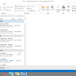
I use Outlook daily and I must say I’m quite happy with the few changes Microsoft made to Outlook. The clean, fresh and easy to understand UI makes me want to use Outlook. I just love how it optimised the ‘Reply’ email function to keep it within one window, because sometimes during my day it can get a bit messy. You obviously have the option to make it ‘Pop out’. The Calendar function and Tasks options have been moved to the bottom of the window. Although you can ‘Pin’ these to the right as they were in Office 2010, they suddenly feel like they’re taking up space. Everything now feels slightly messy if you try to make it like it was. Well that’s just my opinion. The new Peek feature is something to get used to, but will most likely improve workflow…in a parallel universe.
Another ‘subtle’ difference Microsoft made to Office is how, when you type, the cursor moves fluidly. It almost feels and looks like you’re gracefully sliding across the page instead of using some 1900’s typewriter. It’s not something everyone will notice but it made me feel all fuzzy inside.
Everything you need
Everything you would expect in Office is here. Most of the new features are in PowerPoint and One Note, and everything that was changed in Word, Excel and Outlook was to make your workflow easier and to make access to your files seamless. If you came over from Office 2010 everything would be exactly the same with a tiny adjustment. I liked the way how all my Outlook accounts synchronised and all my emails were automatically imported. All my SkyDrive files were available from the get go.
Office will come with two options, the Home Premium version and the Pro version. The Professional version comes with all kinds of goodies such as access to Office 365 (Subscription), SkyDrive Pro et al.
The Home version comes with the usual Office 2010 Home & Small Business programs and SkyDrive. We’ll still have to wait and see what Microsoft will come up with but I hope it will be as simple as Windows 8. I will have to explore these different options in Office, because a lot has changed in the background.
Shipped with Windows 8, RT
With Windows 8 almost here you can most definitely expect Office 2013 Preview to ship with it, as a built-in Feature like how Office 2010 Starter shipped with Windows 7 PCs. Most of the programs will be limited but for the average consumer that should be more than sufficient.
Well most people will ask, is this really a reason to upgrade and I would say definitely. With Windows 8 on the horizon at that more than attractive R300 upgrade price I would say going Office 2013 will be an oxymoron. The level of integration and the slight performance upgrades is well worth it.
Will I be going back to Office 2010? I think not. Now to dig in and figure out where Microsoft ‘added’ Skype to Office. For more details on the new office, as in a million details, click here.
