Anthropic says its AI will not be used to spy on customers, even in government contracts. Here is what that means for AI governance, enterprise trust and defence partnerships.
Android 4.2 JellyBean: The rundown


It’s that time of year again, when a select few Android nerds the world over get excited for the latest and greatest from Google, and even though I’ve only been using 4.2 for a short time, I can honestly say that it is fantastic. Sure, there will be battery woes, luckily I have a charger and a USB cable, of course there will be niggles, I’ve already found a few of those too, but is the Android team breaking ground and innovating? Unquestionably, yes.
Okay, so that intro pretty much cements my Android ‘fanboy’ status and I’m okay with that, but let’s look at what is new in 4.2. I should also state that I am not using a Nexus 4, sadly, because I don’t have one, but if anyone feels charitable and fancies handing one over, I’d be more than happy to give it a whirl. Right, so back to Android 4.2 and the new things it brings.
Total recall
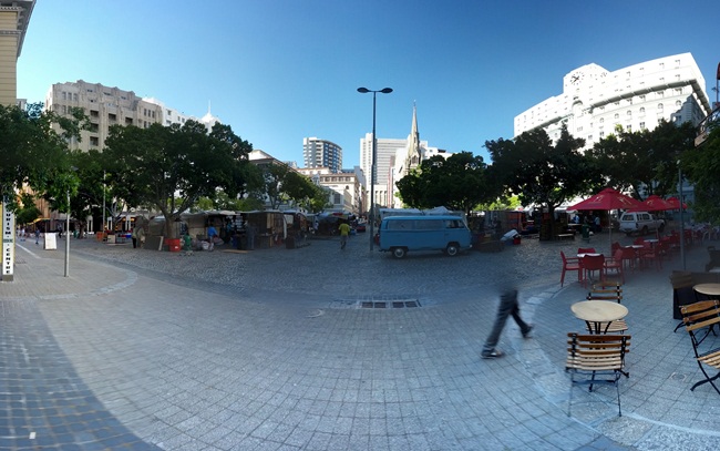
The camera has gotten a complete overhaul, the UI has been simplified, and the phenomenal ‘Photo Sphere’ has been added. Photo Sphere basically creates full, 3D panorama pictures. It’s the evolution of the traditional panorama mode we saw released in Ice Cream Sandwich. I tried it out on my walk to work this morning in Green Market Square in Cape Town. It’s not the best shot, but I’ll get better.
There are also tons of new editing tools in the camera, which makes me really happy, because let’s face it, you can only use an Instagram filter so many times before it starts looking like everyone else’s pictures. I love that Google have thought about the effects they’ve added, there are frames as well now, proper frames, not simple squares, so you can frame your panoramas, Photo Spheres and normal pictures.

Lockscreen love
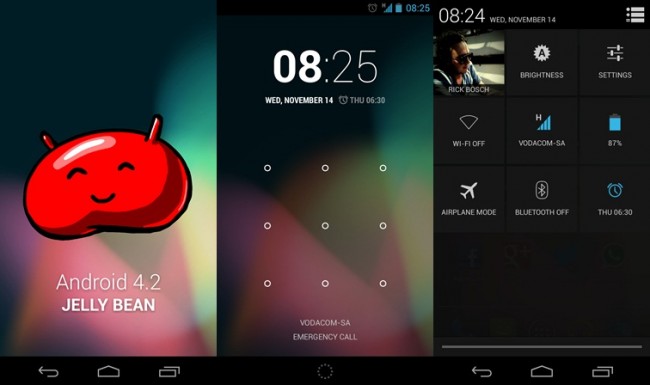
Another part of the OS which has received a huge overhaul is the lockscreen and in my opinion, it’s a little bit hit and miss. Sure, it gives me cool new features, like access to my calendar, Gmail, camera and messages without having to unlock my phone, but I honestly don’t see why I need them there. It removes a few steps from the process I guess, but it certainly is something I can live without. I’ve not managed to find somewhere to turn them off, hopefully we’ll be given the option in a future upgrade.
Then there is one thing which really winds me up because it’s cosmetic and used to work perfectly, and that is the clock which is not only on the lockscreen, but it’s still visible in the status bar as well. I have to be honest, it’s minor, but it really does annoy me.

An incredible update
Then there is brand new keyboard, with gesture typing. I’ve used Swype and SlideIT and I can honestly say that this smokes the both of them, easily. It’s slick, accurate, and I don’t think I’ve needed backspace yet. Kudos to the big G: it nailed the keyboard, absolutely nailed it.
The clock app has received a countdown timer, stopwatch and world clock too, so all in all it’s a more complete app, and I am sure it’ll be useful. Then comes arguably the biggest visible change to JellyBean and that’s in the notification drawer.
Android’s notification drawer is immaculate, and I think there can be very little argument to that, but it just got even better. Swipe down with one finger and you’ll see your notifications as per usual, however, swipe with two fingers and your settings panel will be revealed. Here you can find shortcuts to you Wi-Fi, mobile data, Bluetooth, brightness, airplane mode, battery, settings and alarms, much simpler, more intuitive and more importantly, hidden.
I’ve seen the skins which OEMs slap onto Android and most of them look like sick to me, they’re cluttered with notification toggles, brightness sliders, etc so I really appreciate the “hidden” and “only visible when required” approach Google has taken.
This is obviously not the most in-depth review of the OS, so I will go into more detail of the individual features over the next two weeks, as I get to know my Nexus all over again.
