With stablecoins gaining traction and regulation improving, African merchants may be nearing a crypto tipping point. Here’s why 2026 could mark a shift from hesitation to adoption.
App of the week: Summly

Every few months an app is released that has us all gagging to have a go at it. We watch and share the well produced promo videos and read endless blog posts and tweets about it’s coming that create a snowball effect and set the tech environment on fire with anticipation of the release date. Normally, these apps are good-looking solutions to simple problems that we experience in our first world lives, or highly complex games that we would never imagine playing on mobile devices. One thing is certain though, no matter how much hype is generated around the launch, the app always has to deliver.
Over the past few months, the internet and has been set ablaze by news of seventeen year old Nick D’Alosio’s groundbreaking app Summly. While much of the content surrounding the prodigy’s success was based on the news that he’d received millions in funding from the likes of Ashton Kutcher, Stephen Fry and a host of well know tech entrepreneurs from around the world, many of us were waiting with baited breath to see if the actual app lived up to all the hype around it. I got hold of it on launch day, and this is what I think of it.
Let me start with what Summly actually does for the user: it summarizes articles from well-known sources across the net and provides the reader with a version containing all the pertinent facts in four or five lines (400 characters). Easy right? I mean, this is what we all used to do for high school book reports right? Yes, and no. You see, the very process of summarization of a piece of writing, or anything for that matter, requires you to have a relatively thorough understanding of the entire piece of content so that you can highlight the most important parts. This is easy for humans, as we have brains capable of independent thought and memorization, and this is what amazes me about Summly.
Sure it’s terribly, terribly good-looking and the user experience is revolutionary (we’ll get to all of this later on) but what excites me the most about this app is how it does what it does. D’Alosio (completely self-taught in the art of coding) designed the app from scratch using artificial intelligence and complex algorithms that highlight and pull the most important facts about a story that would normally take you five minutes to consume, into a short summary that won’t take you longer than thirty seconds to get through. Great for passing the time in queues and waiting rooms or just catching up on news during a short break in your busy day. I’m hooked already. So now that we’ve gone through what the app does, let’s get to what else I love about this app.
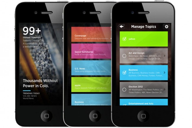
As regular readers know, I am a die-hard fan of any app that pushes the boundaries of interface design and user experience, and I’ve often been guilty of using an app I don’t like, just because it looks good. When I first launched the app from my home screen (yes, it was there before I even checked it out) I was greeted by a slick little video that quickly explains what Summly is and does, before being taken to a beautiful cover page that is so beautifully laid out that I didn’t get to the actual menu for the next five minutes. On it, is a count of your unread summaries and a feed of featured headlines, set elegantly on a striking piece of photography. It’s more Microsoft than Apple in its looks but that’s before you get to the breathtaking user interface built into this powerhouse of an app.
By tapping the next icon at the top right corner, you’re taken to your category list, which is a series of semi-transparent, colored rectangles which are as pleasing to touch as they are to look at. Tap on one of them and you’re taken to the latest summary the app has pulled in that category. Swipe right to read the next summary, down to load the full article, and up to return to the cover page. Double-tap to load a more detailed summary or hold your finger on the screen to access the sharing options, which appear as digital petals that can be tapped to be used. Remarkably simple yet seriously pleasing.
Everything about this app has been meticulously thought through to create an immeasurable reading experience, and it shows. From the way the article pictures slide in a tad slower than the content, to the progress bar that quickly refills as the news feeds refresh, there is nothing design wise that disagrees with my idea of aesthetic perfection.
To summarise (see what I did there?), Summly is not only a ridiculously good-looking app that blows me away every time I use it, it is a simple idea that has stepped forward to solve the problem of properly consuming news in today’s fast paced, news heavy environment. Too much news, too little time? Not anymore.
Download Summly and enjoy a hell of an app
Name: Summly
Developer: Summly Limited
Category: News
Size: 33.3MB
Price: Free


