Bitcoin has surged to its highest level in a month as global risk sentiment improves and Donald Trump signals renewed support for the crypto sector.
HTC One review: all hail the king

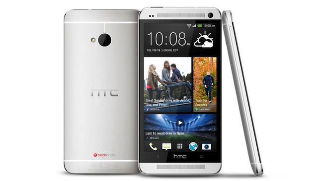
Samsung and Apple better beware – the HTC One combines stunning design, a supreme screen and explosive power to offer one of the best smartphones around.
It’s got a full HD screen crammed into 4.7-inches, which brings a 468ppi – well above what’s needed for the eye to discern, but it does definitely bring sumptuous sharpness throughout the use of the phone.
On top of that there’s a CPU and RAM combo that is barely bettered, a more-than-enough 32GB of storage and top-end Bluetooth, Wi-Fi and 3G / 4G connections, all topped off by a completely re-imagined version of HTC Sense. What’s not to like?
It’s at the sharp end of the smartphone price scale, although can be had for around £34 per month on a two year deal in the UK, which isn’t too bad at all compared to the competition.
The design of the HTC One is something that you simply have to experience in the hand. Where those that pick up the Samsung Galaxy S3 will go ‘Oh, it’s a bit plastic, isn’t it? But ooh, it’s quite light’ and those who encounter the iPhone 5 will, to a person, say ‘Ooh, it’s very light isn’t it? You don’t expect it to be that light!’ those that try the HTC One will simply say ‘Oh, that’s really nice. Really, really nice.’

And do you know why? Simple: the HTC One is one of the best-designed phones on the planet. Not content with inventing a new machining process to allow the body to be all aluminium, the Taiwanese firm has extended the screen to the edges of the chassis further than ever before, meaning you’re getting a 4.7-inch full HD display without the additional heft you’d probably expect.
It’s even thinner than its predecessor, the HTC One X (we know, that naming strategy leaves a lot to be desired) and as such slides nicely in the pocket. It’s not light either, weighing more than most of the competition, but rather than feeling overweight, combined with the metallic chassis is oozes a premium build. Samsung is probably hoping not a lot of people hold this phone side-by-side with the new S4 as otherwise the buying choice is going to be a lot more of a worry for the Koreans.

On top of that, there’s a whole host of little design wins that delight when you first try the HTC One. For instance, the machined holes that allow sound to emanate from the dual front-facing speakers (can you say BOOMSOUND?) looks amazing, and the lines on the back of the phone give a nice textured movement to things, helping to break up the constant greyness of the aluminium.
You could argue that straight-on it looks far too much like either an iPhone or a BlackBerry Z10, and you’d have a good point, as this phone doesn’t reinvent the rectangle-with-rounded-edges formula that we’re so used to, but in the hand the curved back brings a whole new dimension to things.

There’s a zero-gap construction at work here as well, which means that you won’t find any gaps, holes or light leakages to make you feel like you’ve not spent your hard-earned cash on something wonderful.

The volume control on the right-hand side of the phone is in the same dazzling metal, and contrasts nicely with the rubber/plastic that makes up the sides. Our sample actually showed a fair amount of wiggle in this area, and slightly detracted from the overall premium feel.
The power button resides on the top, and doubles as the infra-red blaster – however, this is one of the poorer points as it doesn’t have a whole lot of travel.

Similarly, the placement of this button, even on a phone that’s been shrunk down while accommodating a larger screen, is still a bit inconvenient. We had to shuffle the phone around in the palm to turn it on and off on many occasions, and a lot of the time we couldn’t use our thumb to hit the whole of the screen without jiggling the phone up and down.
That’s another problem with the design: it’s pretty slippery thanks to the metallic chassis. We thankfully only ever suffered two serious drops when we were about a foot off the carpet (basically scrabbling for it to turn off the alarm in the morning) but there have been a few near misses when trying to manoeuvre around the screen.
If only that power button was on the side, or a physical home button unlocked the phone, this whole issue would be negated for a large part.

But as we mentioned, HTC has wandered away from the physical buttons – where once it put a trackpad in the Nexus One, now it’s stripped the capacitive buttons down from three to two, with the multi-tasking option going the way of the dodo. You can still get the same functionality by double tapping the home button, but it’s not the same.
Overall though, you can guess we’re impressed with the construction and design of the HTC One. We’re not even looking at final hardware here – although we appear to have got lucky with our sample, as there are few design flaws in sight – so the chances of metallic chipping (‘because that’s just what it does….’ OK, Apple) are slight to say the least.

We thought we’d scuffed it so many times during our test, but each time it was simply a slight amount of dirt or dust that wiped right off. Tick from TechRadar on the design front, HTC.
This article by Gareth Beavis appeared on Techradar.com, a Burn Media publishing partner

