With powerful hardware working together with an industry-leading camera system and intuitive AI experiences, everyday tasks have never been easier and faster
5 iPhone apps better than Apple’s native equivalents

My name is Danny and I’m an iPhone user. I have been actively using since the 4, and I can even remember the time and date that I first touched the device and fell immediately in love with it. I remember being completely and utterly blown away by every notion of it back then, and it took some time for me to see the flaws that were blazingly obvious to others at the time. Not the device, not the OS, but the native apps. Of course, there are one or two that I still use every now and again but below, you’ll find a list of the replacements I’ve made, and stuck to for a while now.
We’ve all heard the horror stories surrounding Apple’s poor attempt at replacing Google’s superior handling of all things maps and navigation and to be honest, if you’ve not yet made the change back to Google’s new and improved Maps app, it’s your own fault if you get lost in the Australian outback. Seriously though, when looking at the slick design and incredibly accurate turn-by-turn navigation functionality, it’s no surprise that our friends in Cupertino had to issue an apology for their poor attempt.
Weather? Living Earth — US$1.99
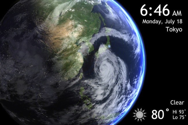
Look, the only problem I have with Apple’s aptly titled native weather app is its design, that and the fact that it relies on Yahoo! for its data. Yes, it was fine in the beginning but surely it would’ve come up with something better by the time iOS 6 rolled around? This app was sent to the “Apple” folder long ago and replaced by the beautifully designed and highly accurate Living Earth. Where else can you see a real-time picture of the earth, complete with clouds, lights and weather info that you can spin with your finger?
Never before have I ever seen an uglier looking app. First off, the color scheme. Yes, it’s supposed to look like the old notepad that we’re all used to, but seriously, brown and yellow? You’ve got one of the world’s most beautiful screens with millions of colors and you go with brown and yellow? Let’s not even get started on the font choices. I like SimpleNote because it does what the name says, it makes note taking simple and efficient. You can go with the free or paid version and it really is one of my all time favorites, and a great reason to bin the native app.
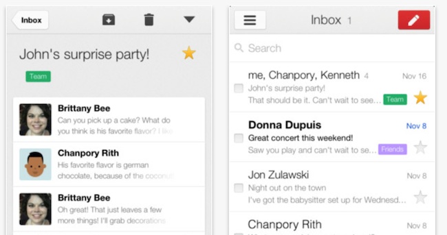
I’ll start off by saying that the only mail account connected to my phone is my personal account, which is of course, a Gmail account. Now the first draft of the Gmail app was pretty shocking to say the least, and I’ll admit that it took a lot for me to stay on it and not switch back to the native mail app. But that was all sorted when it brought out the newer version, which not only looks and feels better, but is faster and handles my mail a lot more efficiently than Mail ever did, add to that the fact that it is ridiculously good-looking and you’ve got a winner.
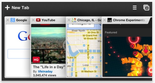
Yes, I’m taking another Google app over an Apple app but this one just had to be on my list as it’s an app I use every day. Like with Gmail, it’s beautifully designed, aesthetically pleasing and lighting fast, kind of everything that Safari isn’t right? Look, Safari isn’t bad, and I’ll use it with apps that don’t support the ‘open in Chrome’ function yet, but it’s never going to be my go-to browser
Bonus: Get rid of that horrible newsstand icon with StifleStand
I’m not sure what Apple’s problem is with Newsstand. Why doesn’t it allow us to get rid of it? Why can’t it be hidden away in some random folder on the 3rd screen? Why is it always visible? Does it really want us to use it? I’m not sure, but whatever the reason is, I hate it, just sitting there all empty and brown. So I did some research and found a little app called StifleStand, which allows you to hide the icon in a folder without jail breaking, here’s how:
Download and open StifleStand* (Mac only), plug-in your iOS 6 device and allow the app to detect your device. Now keep an eye on your newsstand icon (on the device) and click “Hide Newsstand” on your Mac. The Newsstand icon disappears and a folder (aptly titled “Magic”) appears, with Newsstand hidden neatly inside. This folder behaves like any other folder on your device and it’s here that I dump all my unused native apps that I have since replaced.
