With powerful hardware working together with an industry-leading camera system and intuitive AI experiences, everyday tasks have never been easier and faster
Sony Xperia Z review: the best Android smartphone yet
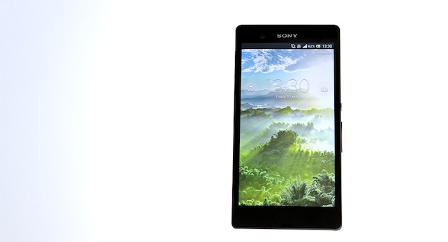

I’m no Xperia fan. I dislike the name (any product name that begins with an “X” in it reeks of nineties shame), I’ve never warmed up to Sony’s range of phones and I certainly didn’t care when Sony split from Ericsson and created the Xperia range. But I care about Sony’s Xperia Z — a handsomely made 5-inch smartphone that’s near invulnerable. There are two standout features that elevate the Xperia Z above the competition: the incredibly fetching 5-inch screen and it’s superhuman strength. Is it worth the close to US$600 asking fee? Let’s find out.
Apple design envy
Sony has created its best-looking phone yet with the Z. It’s shatter-proof and scratch-resistant glass back and front and when I say I tested the strength of the phone, I mean it. The Z claims to be water-resistant up to one meter (for 30 minutes) and is also dust-resistant. The aquatic promise of “up to 30 minutes” of waterproof joy interested me the most. “You have my curiosity, but now you have my attention” sort of deal.
Now that’s something. When you think of a waterproof phone, the image of an ugly rubber Nokia pops into mind. That Sony has managed to create a life-proof phone that looks as good, if not better than the iPhone 5/HTC One/Lumia 920 is something to smile about. As for dust-resistance, I dumped the Z into a barbecue, post-fire and it was covered in ash. After a quick dusting though, the Z performed as well as it always does. Which is to say, exceptionally well.
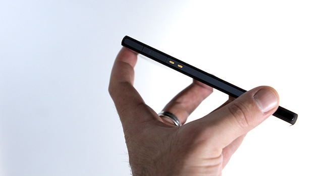
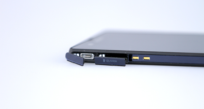
How is it waterproof though, and what has Sony done to prevent crap from leaking into the Z? Most of the ports are covered on the Z, with the exception of the weedy speaker. Tiny flaps cover the ports with the phone even occasionally reminding me to “cover the flaps for maximum water protection”. Whenever I tested the phone, I covered the ports so I cannot say whether the Z will self-destruct if the flaps are left open. But after immersing the phone in water, the sound became muffled. Only by the next day of use did the sound return to normal. I’m guessing that it needed time to dry. Repeating the water dunk brought the sound issue back.
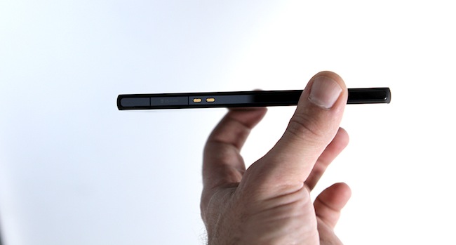
Design-wise, Sony’s left nothing to chance. The Z is weirdly light, a 146g smartphone that’s only 7.9mm thin (the iPhone 5 just beats it by 7.6mm). The all-glass back and front of the Z is a sight to behold, it really is the best-looking phone Sony’s yet to make and it stands apart from Apple and Samsung’s efforts as it’s the most modern-looking phone of the lot. Glass and plastic combines to form a unibody smartphone with nothing left to chance. It’s so sharply designed, a true work of smartphone art that is most likely going to score a design award from some random European country. As cool as the design is, it’s got nothing on the display.
The Xperia Z is all but smooth from top to bottom. Outside of the volume rocker, it has no physical keys, except for the rather ugly “Signature Xperia Power button” which sticks out on the right-hand side of the Xperia like a sore thumb. It’s a terrible addition to the attractively designed Z. Without buttons though, how do you navigate the phone? Simply enough, according to the Z – the phone has software buttons: Home, Back and Multitasking. Each one works well and quickly appears (when hidden) during an app.
Screen of the gods
This is one of the best displays so far. The Z has a full-HD screen at 443 ppi and there are only a handful of other phones that can boast such a display. The Oppo Find 5, and the Galaxy S 4 (although these are both listed at 441 ppi, so well done Sony?) and the crazy displays of some HTC phones, like the One, which has a killer 468 ppi. Sony’s Mobile BRAVIA Engine 2, the hardware that powers the Z is outstanding. Colours are crisp and full-HD content looks alive. Basically, the Bravia engine makes the darker colours rich and vibrant, while still managing to balance out the lighter colours. It’s quite something to see. I’ve included Sony’s example below.
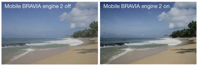
When software developers begin creating apps especially for screens like the Xperia Z’s, it’s going to be a transformative experience. You can see the clarity and power of the screen with an unaided eye, it’s simply that good. It’s fine in direct sunlight as well, definitely not as good as the iPhone 5 in this regard, but almost on-par. Once you find the ideal viewing angle, you’re in for a treat. A 1080p screen makes a massive difference and once you’ve experienced it, it’ll be hard to go back to anything else. Just a note, turn off auto-adjust for brightness as it tends to wash out the colours.
Android’s best Xperia outing yet
Android 4.1.2 (Jelly Bean) has become my favorite mobile OS. Apple’s iOS is too rigid and BlackBerry’s OS 10 is an experience that deteriorated for the longer I used the phone. The Z has the best version of Android (for Xperia) yet, with the hateful Xperia UI is so polished that it’s not even an issue anymore. It’s no stock Jelly Bean like the Nexus 4, but it’s close enough.
What I love about Android is the account synching. It’s now as effortless as it is in iOS to synch from one new phone to another, with the Xperia picking up all my old contacts and downloaded software from my previous Android phone (the Galaxy Note 8). Once Gmail, Facebook, Twitter, Instagram, Flipbook, WhatsApp, and Candy Crush Saga were installed, it was business as usual.
One issue though, and it’s a big one. The LED status light never worked for me and currently the only way to turn it on is to factory format the Z. I’m not going to try this just to activate LED notifications, and it’s a major issue in my opinion. You can always install an LED app such as Lightflow, but why not just have it working correctly?
Outside of Android, there’s some old and crusty Sony Xperia apps knocking about. Album, Walkman (music), Sony Select (a Sony-approved app store), TrackID (think Shazam), Sony Car (GPS driving mode) and Movies. All the apps do what they say on the tin, but the look and feel of each app seems dated. TrackID for instance, looks like it should belong on the first Xperia phone.
What I dug were the widgets that appear on the Multitasking screen. There’s four widgets initially: Calculator, Timer, Notes and Voice Record, but others can be added which further extend the usefulness of the Z. These widgets appear on top of the OS, and are quickly closed with a tap of the “X” button.
Sounds horrible
There’s two things wrong with the sound. Firstly, it’s tinny and flat — the sound emits from a single loudspeaker located in the bottom right corner. You’ll have to wear the snug headphones to get the most out of it, but once you do the sound springs to life. I just prefer it when the built-in audio reflects the quality of the device. The HTC One has superior built-in speakers, so why not the Z? The second issue I mentioned above: the sound distorts terribly after the Z’s been immersed in water. The only solution is letting the Z dry out for a day. Not ideal.
Camera’s okay
The 13.1MP camera seems to perform marginally better than the current smartphone camera king, the iPhone 5. I’ve included comparison shots below.
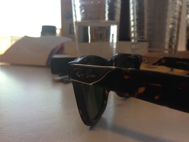
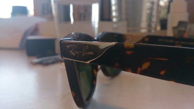
It’s not too shabby, colours seem balanced and the Exmor RS sensor seems to do a nice job of keeping the pictures and video bright in low-light conditions. Video is more impressive than still images though, and records in ultra-sharp full HD. I wish the picture was as decent as the video mode. Superior Auto mode sorts out most of the picture images, and mostly selects the correct image setting for each scene. If you zoom in on text, the Z switches to “text mode”. Aim it at a mountain, and the Z flips to “landscape.” It’s all very standard stuff and I expected more out of the Z, such as images that were so sweeping and sexy it would take my breath away. As it goes, the images are passable.
The most powerful phone yet?
We’ll end with the specs, because for me this is the most vanilla section of any phone. The Xperia Z already wins with screen and design, the incredible hardware specifications makes it untouchable. The extensive tech spec list is here, but standout features include the 1920×1080 screen, 2GB RAM, the Quad-core 1.5GHz Krait CPU and the Adreno 320 GPU.
Speeds the name of the game and the Z is as fast as it gets. I test with the most demanding Android game you can get, Modern Combat 4, and the results were spectacular. Not only did MC4 look incredible, but the frame rate never faltered, something the iOS version was prone to. There’s simply no stopping the Z.
Verdict:
If you’re buying the Z for looks, go for it. If you want one of the fastest phones on the market, the Z is what you need. If you desire a phone that can take the knocks in life and keep coming back for more, the Z wins again. Outside of a few issues that tarnish the otherwise golden-glow of the Z, this is the best phone currently available. It’s priced right, and will be a tough nut to crack. The only phone I can possibly see besting the Z is the Galaxy S IV, but even Samsung’s phone will have to push hard to beat the current king of the Android phones.
Score: 9/10


