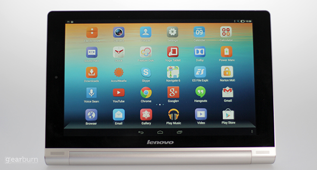
Kimi K2.5 has launched as a powerful open AI model from China. Here’s how it compares to ChatGPT 5.2, Claude, Gemini and Grok in capability, architecture and strategy.
Lenovo Yoga review: is this the future of tablet flexibility?

There were tablets before the iPad, but none of them really made anything more than a splash in the market. Since then, Apple has sold millions of the things and completely dominated the space. Efforts to erode its market share meanwhile have mainly been undertaken using products that look remarkably like the iPad: flat rectangles.
Sure, some of them were a bit smaller, but it only seems very recently that the big manufacturers have taken a look at the iPad and realised what the peripheral industry has known for a long time: the iPad’s design is not without flaws.
With the recently launched Yoga, Chinese tech giant Lenovo has gone after one very big iPad flaw. In its 10″ iteration, the Apple tablet can get seriously taxing to hold, never mind awkward. Don’t believe me? Then explain the existence of this ridiculous contrivance.
At launch Lenovo said that the Yoga’s design had been inspired by studying how people interact with the media they consume and were particularly struck by the effect of folding a magazine back in on itself has.
“Watching and discovering that people frequently use tablets in three main ways allowed us to break the mold on the current ‘sea of sameness’ designs, giving them a better way to read, browse, watch and interact with content,” Liu Jun, senior vice president and president, Lenovo Business Group, Lenovo said at launch.
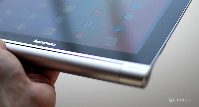
The company therefore went with a round battery at one end, creating a kind of wedge shape. And on the face of things, it’s not that big a change: it still has a tablet screen, works like a tablet and operates the same apps as any other Android tablet. But it’s actually allowed Lenovo to make one of the most versatile tablets I’ve spent time with in a very long time.
Cool, clean, comfortable
You see, Lenovo’s designers weren’t wasting their time when they were watching people read magazines, because that round battery unit actually means that you can comfortably grip — not awkwardly rest thinking how swell one of those daft after-market hand grips would be — the device in one hand and use it at the same time.
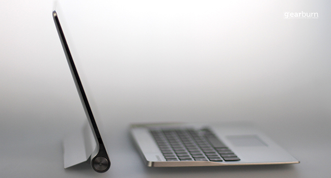
It’s also allowed Lenovo to build in a sturdy stand that unlocks the tablet’s other modes, “tilt” and “stand”. Yup that’s right, a tablet manufacturer has managed a kickstand that enables you to use the device at multiple angles (we’re looking at you Microsoft). Tilt is great for when you want to do something on the tablet that requires a flat surface — send emails, read recipes, that kind of thing. Stand meanwhile, is ideal for watching video or having a video chat. If you’re willing to fork out extra for the Bluetooth keyboard (which doesn’t snap onto the tablet) it’s also pretty decent for productivity tasks (I wrote the first couple of paragraphs of this story on it).
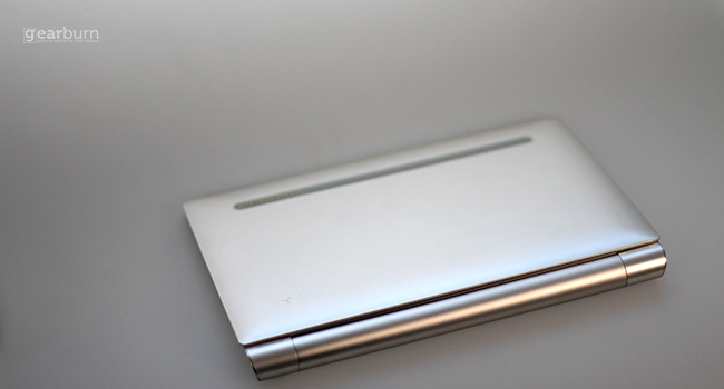
Oh, one last thing about that battery. Lenovo reckons the 9000mAh power unit in the 10″ Yoga will give you 18 hours of active use in the 10-inch model, while the 6000 mAh battery in the 8-inch model will keep you occupied for 16 hours.

That’s 18 hours of active use, which would pretty much stick it at the top of the tablet battery life table. I was unwilling to use the tablet for 18 hours straight (if that’s a common occurrence in your life, please stay far, far away from me), but I can tell you that in two weeks of fairly consistent use, I’ve had to charge it twice (bear in mind that large portions of that were also spent using the Bluetooth keyboard).
But what about the basics?
So the design’s innovative, the tablet seems pretty well crafted and the thing that sets it apart from most of the rest of the market is genuinely useful. But what about all the other stuff that matters on a tablet?
Well, the Yoga isn’t exactly going to win any spec races, but it’s unlikely to leave you sighing in disappointment.
The Yoga features a quad-core 1.2GHz CPU and 1GB RAM. That’s not outstanding for a top-of-the-range tablet, but nothing I could think to do made it lag or freeze on me. Even with plethora of other apps updating in the background, I was able to play Fifa 14 without a player even threatening to slow down on the ball.
When it comes to internal storage, you can choose between 16 and 32GB or, if that doesn’t fulfill your needs, you have to option of expanding it with a 64GB SD card. That’s probably a fair option if you plan on putting a load of movies on it, but if you live in country with plentiful and cheap WiFi, then you should get by with whatever cloud option you chose to use.
The operating system meanwhile is a pretty stock version of Android Jellybean and, actually, I’m glad for that. When manufacturers try to put their own edge on Google’s mobile operating system things tend to go awry and performance is often compromised.
A couple of flies in the ointment
It’s not all joy and smiles with the Yoga though. While people using tablets to take pictures at events tends to raise my ire (Stop it. You just look stupid), I do feel like Lenovo could’ve done better than the 5MP rear camera the Yoga sports. I mean, the front camera is absolutely fine for video calls but cameras are the probably the biggest battleground in the smartphone wars right now. Surely some of that should be trickling down (or up) to the tablet space.
Perhaps the biggest letdown though is the screen. It features a middling 1280×800 resolution and a PPI of 187. I’m sorry, but in age of 4K screens and smartphone screens bending crispness beyond the reckoning of human sight, Lenovo should have done better.
The tablet form factor, is after all, tailor-made for consuming content. Surely then, every tablet maker should strive to make consuming content as enjoyable an experience as possible.
Verdict: The Lenovo Yoga kicks some new life into the tablet space with its design. A phenomenal battery and solid internals would make for a great user experience, but it’s let down by a sub-par screen resolution and camera.
Score: 7/10

