With youth unemployment above 60 percent, South Africa is betting on digital skills to drive inclusive growth. Here is how MICT SETA is positioning the next generation for the Fourth Industrial Revolution.
‘Smart’ review: a brilliant homescreen replacement for your ageing Android


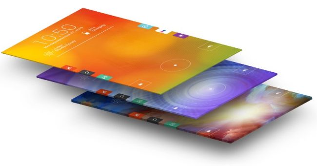
How many older Android phones (and we’re talking about Froyo, Android 2.2 here) have what we would call a “handsome” start screen? Customising Android is an easy affair, but the dirge of apps that can takeover a homescreen are not of the highest quality. So is finding a functional start screen with custom apps and live feeds an impossibility? Not so, says Celltick which has developed Start, a free homescreen replacement app that is as intuitive as it is soothing on the eyes.
What it is
I don’t want anyone to be unfamiliar with what I’m about to review. A start screen or homescreen is the first display you’ll see when you unlock an Android phone. iOS (the interface on iPhones, iPods and iPads) is different to Android in this regard, because there is no homescreen, just a collection of apps. Android is a little different in this regard as the homescreen is first, with the apps hidden away and it’s like this for 99% of all Android phones. Homescreens are customisable so having the weather, a Google search bar, an email preview window and other widgets are commonplace. What Start does so well is unify all apps and widgets into one. Instead of a clash of interfaces, Start creates a single place for all your content.
What it does
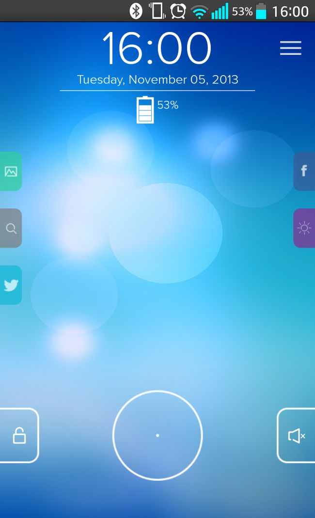
After installing Start, lock your device and reopen it. You’ll be presented with something like this:

From here, you can begin customising your Start screen. But let’s talk about gestures first. Tapping the hollow circle on the bottom of the screen brings up another menu with four more options, namely call logs, messaging, camera and media, and most recent apps. For most of the part, Start knows what apps you need and use on a daily basis. It’s collected stock apps and grouped them into folders. Every time you add a new app, there’s a high change it’ll appear in one of the on-screen radials. If not, you can add it in the Settings menu which is accessed from sliding down from the top-right of Start.
Next, there are the widgets. On the sides of Start there’s a default set of widgets that can either be pulled to the left or right to reveal a feed of info. My installation of Start had Facebook, Music and Yahoo! Weather on the left, with Photos, Yahoo! Search and Twitter on the right. These widgets can be changed in colour and size, but you cannot add Google search, which is a pity. Being forced into using one search engine seems backwards.
Why you need it
I need one of two things from my apps: I need it to be both stable and useful. Start is both. It rarely crashes and loads into its custom screen every time. And it’s free. There’s no ads, and tons of free themes, all available on Google Play.
So how stable it is? Start never crashed, or glitched into a weird mess of pixels and colours. It loads when your phone does and sticks to the homescreen until you either remove it or shut the phone down. And it’s useful. There’s no more trawling through screens to find what you want, just one screen and one gesture to launch almost any app.
If you own an Android that’s stuck on a lower version (Froyo, Gingerbread, Honeycomb, Jelly Bean), then here’s why you really need it: Start is a new look to your phone, a fresh beginning with the sort of interface you always wanted from Android. Start goes as far as to make an older Android slightly relevant again. If that’s not a reason to download it, then I don’t know what is.
Verdict: Start is a clean, free, no-fuss homescreen replacement for Android that looks as great as it functions. It’s got one single gesture to open any app, and customisable widgets for Facebook, Twitter, weather, and more. It’s the ideal app and will refresh the look of any Android. Did I mention that it’s exceptionally free? Download now.
Score: 9/10


