Bitcoin has surged to its highest level in a month as global risk sentiment improves and Donald Trump signals renewed support for the crypto sector.
Samsung Galaxy S5 hands on review: feature-rich with a brilliant display
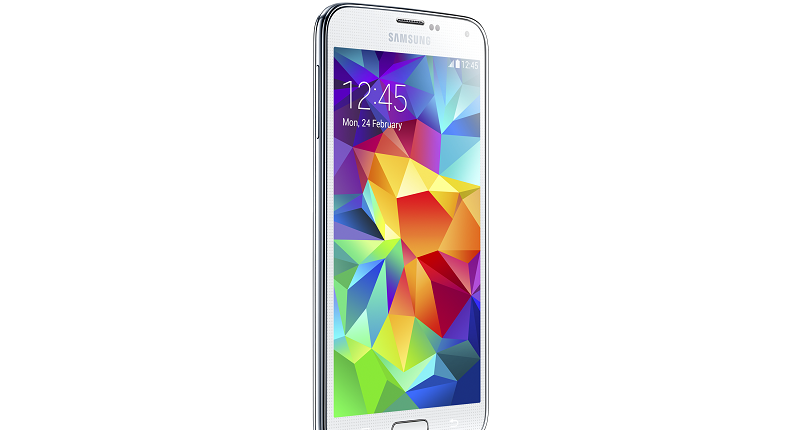

Before I even touched the Galaxy S5, which was lassoed to a glowing table at a fancy Samsung launch event, I came in with diminished expectations. I wasn’t a fan of the Galaxy S4, yet I loved the S3 and S2. Samsung has embraced plastic and eschewed the full metal look, which the HTC One so beautifully rocks. It’s also almost identical to the S4 in terms of hardware and design (have a gander for yourself). So do I love, or even like the S5 and more so, will you?
It all depends on what you want from a phone. If you require the latest smartphone crammed with every feature possible minus the fireworks display button (most likely coming in the S6), then you’ll be happy with the S5. For those looking for a future-proof phone crammed with extras they may or may not use a few months down the line, then the S5 may not be for you. It has possibly the best screen I’ve ever seen, great sound and a slick revamp of Android KitKat, but it’s just another addition to the S-series and if you own the S4, there’s little reason to upgrade this year. But for the Samsung die-hard fans, this is the most feature-packed Galaxy S yet. And here’s why:
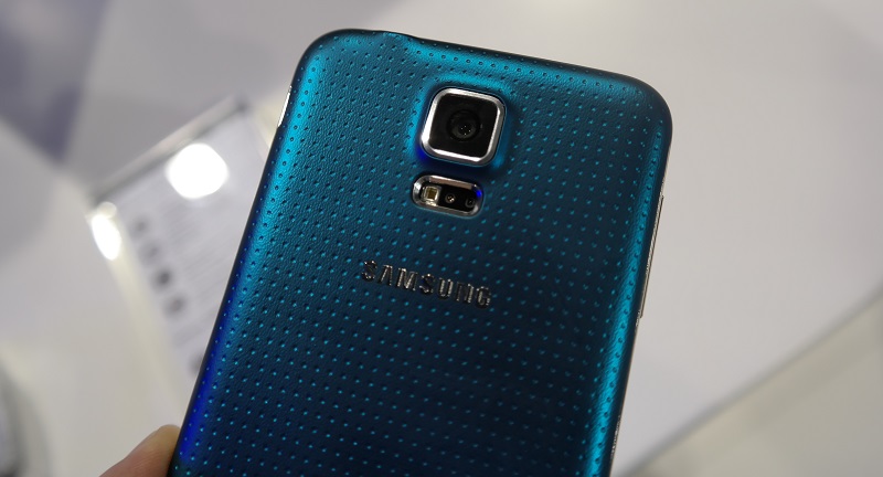
Samsung’s gone out of its way to cram as many useful features as possible into a 5.1″ display. The 1920×1080 screen is incredible to look at and exceptionally smooth to navigate. Content looks the part on the display, everything is crisp, images look life-like and high-def video was seemingly made for this SuperAMOLED stunner. For it’s part though, it looks like the same display as the S4’s, which is still one of the best in the smartphone business. If you want a phone with a great screen, the S5’s perfect for you.
One of the more controversial aspects of the S5 is the new dimpled rear which I found quite fetching. My favourite colour? Copper-Gold. Shiny plastic is out, scuff-free rubber is in. It feels great to hold, but the dimples didn’t really do anything for me. I say controversial, because it doesn’t add to the desirable aspects of the S5. It doesn’t make me want to purchase it based on looks alone, something Apple is now expertly versed in. There’s a thick band of metal around the sides, with volume, home and a power key as the only physical buttons.
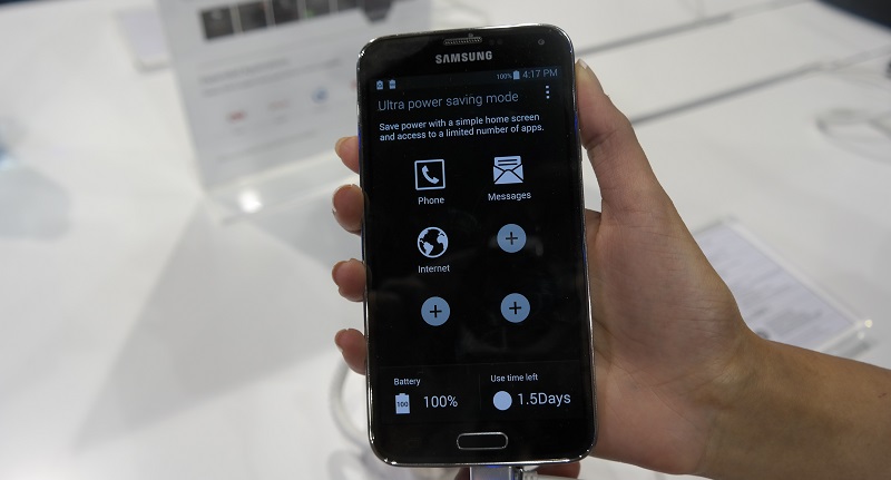
There’s one feature of the S5 which impressed, namely the Ultra Power Saving mode. When activated, the S5 goes drops into a black and white display (see above), only allowing calls, texts and web browsing. On 10% battery, Ultra Power Saving mode can extend the battery life by 12-hours. This alone is an innovation I look forward to seeing in every new smartphone from now on.
The home button is an interesting addition this time round, chiefly because it’s a fingerprint reader now. Not the best one, but it’s there if you need it. Unlocking the S5 is unlike the iPhone 5s, because you have to hold the phone in two hands to unlock it, and only with a downward swipe. On the iPhone 5s, I’d hold my finger over the silver circle from any angle and the phone would unlock.
On the S5, it’s hold the phone in one hand, unlock with the other. There’s the option of adding passwords and PayPal payments with the fingerprint reader, but I didn’t have additional time to test this. I’m sure it works though. But after locking and unlocking the S5 many times, I can tell that the fingerprint reader is going to become a novelty, and not sadly a necessity as it is with the 5s.
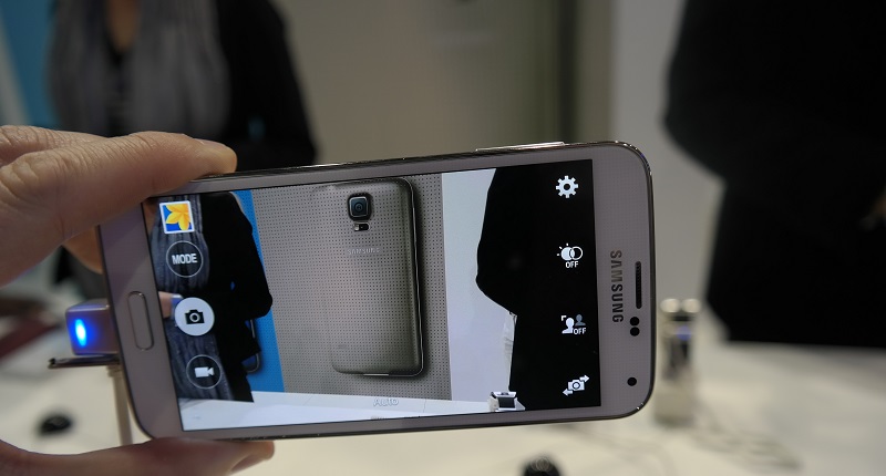
The S5 comes standard with Android 4.4 or KitKat but hot damn, has it been dumbed down. There’s no other way to say it. The S5’s homescreen looks almost exactly the same as the S3 and S4 homescreen, but dig a bit deeper and you’ll find a UI that’s a little too basic for its own good.
Of course, Samsung has to appeal to the millions of casual users who’re going to purchase their first smartphone, but for dedicated Samsung fans, the new look is going to disappoint. Those expecting a brilliant new overhaul will instead find a UI inspired by Disney. It’s all bright colours, shiny effects and cutesy corners. Remember Toon Town from ‘Who Framed Roger Rabbit?’ This is a phone Mickey Mouse would be at home with.
But for R10 200 (or US$650), this is no phone for kids. The S5 is one of the most expensive phones on the market, but that’s the trend with Samsung, as the S4 cost the same in 2013.
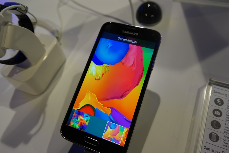
What I didn’t have much time to play around with was the speed of the phone because firstly, these were demo models without internet access and secondly, what games were loaded onto the S5 (Cut the Rope 2), weren’t exactly taxing the CPU or memory.
Once I’ve spent more time with the S5, I’ll be able to accurately gauge its speed. My guess though is that the S5 will perform well for all games, as during the short time with the device, it rarely lagged and opened apps in split-seconds. This includes the 16MP camera, which took images with no hardware delay, even the new and improved HDR mode snapped images as quickly as any other camera. Also, there’s slow-mo but it’s nowhere near as good as the iPhone 5s’ attempt.
Overall, the S5 is a capable smartphone, stuffed to the brims with extras and designed to fit in with our digital lives. When paired with the Gear 2 smartwatch or Gear Fit fitness band, your entire life can be streamlined the Samsung way.
If that’s what you want, Samsung offers it. But the S5 is an expensive upgrade, and adding either accessory puts the price into the fairly to extremely ridiculous category. I haven’t spent enough time with the S5 to make a judgement call, but my snap decision is to weigh your options carefully before purchasing this, especially when phones such as the Xperia Z2, iPhone 5s and HTC One (M8) coming in at the same price.
