Sony launches the WF-1000XM6 in South Africa with upgraded noise cancelling, better call clarity and premium sound. Pricing starts at R7,999.
7 Android launchers to revive your homescreen
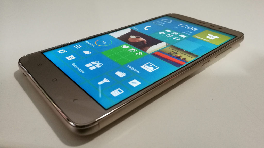
The best thing about Android is the customisability of it all, allowing you to radically change the look and feel of your smartphone’s interface without much work. But where do you start though? How do you sift through the noise and find the best launchers around?
We’ve picked seven free launchers you should try out.
Nova Launcher
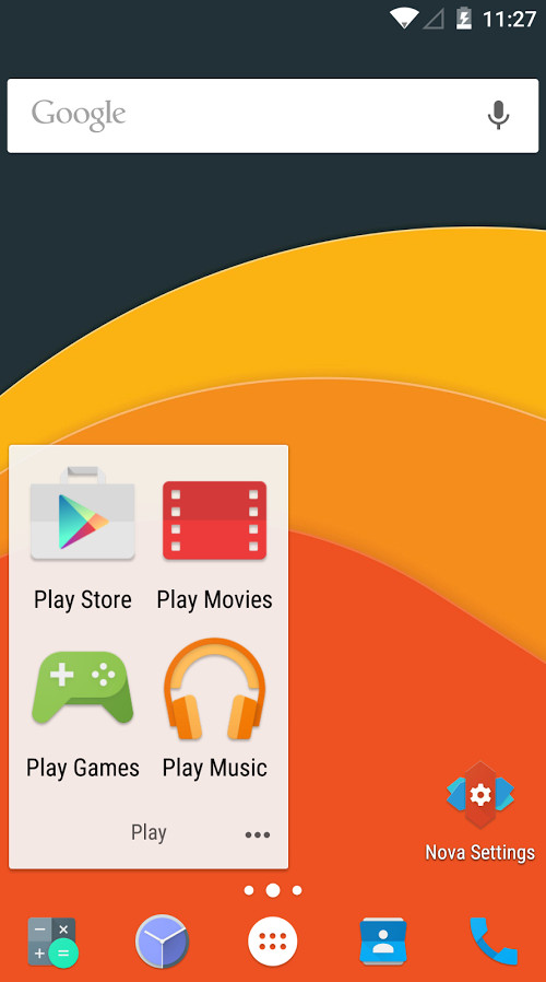
One of the first major launchers to gain a ton of popularity, Nova Launcher stands out thanks to its extensive list of options and features.
The launcher has a rather vanilla feel to it, featuring an app drawer (with vertical scrolling) flanked by two shortcuts on either side. You’ve also got several standard homescreens to work with, giving you a more traditional Android vibe.
Where Nova stands out is in the settings, allowing you to tweak the scroll animations, wallpaper scrolling, page indicators, app drawer variables (size, vertical/horizontal scrolling, etc), folder settings, gesture controls and more. A paid version, called Nova Launcher Prime, serves up more gestures, unread counts, more scrolling effects and several other features.
Launcher 8 WP Style
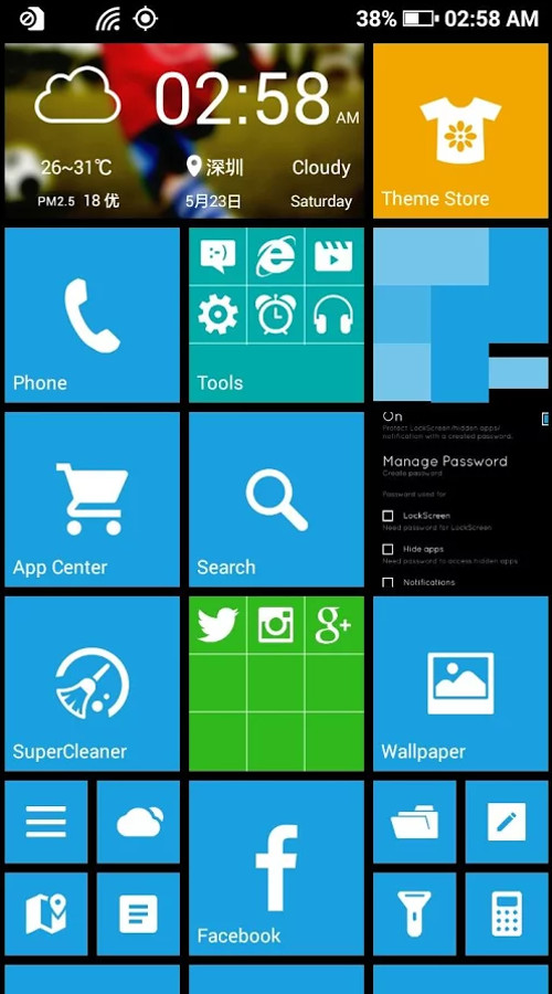
Coming from a Windows Phone? Or maybe you just like the look of Microsoft’s mobile platform in general? Either way, this is for you.
Launcher 8 offers a rather polished imitation of Windows Phone, down to the apps list on the right-hand side, the people hub and the signal/WiFi icons.
The only real downside to the launcher is that some tiles link to bloatware and ads. Otherwise, this is a rather lovely take on Android launchers.
Google Now Launcher
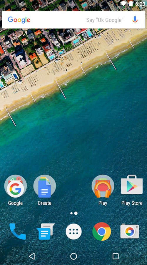
Have a hankering for stock Android but can’t be arsed to flash your phone or buy a Nexus? This is your next best bet.
The official Google Now Launcher gives a mostly pure Android experience, offering Material Design aesthetics, Marshmallow wallpapers and App Suggestions.
As the name implies, Google Now is the centrepiece of this launcher though, being given a dedicated homescreen to show off your various information cards.
Microsoft Arrow Launcher
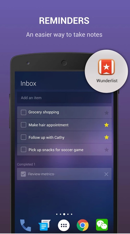
Did you know that Microsoft makes launchers for Android as well? Well, our resident Gearburn editor Andy Walker swears by this one.
Arrow differentiates itself from other efforts by drastically changing up the homescreen system. Each homescreen is devoted to a certain purpose, namely contacts, reminders, documents, widgets, recent files/calls/videos/tracks/images and most-used apps.
Otherwise, a standard app drawer and the ability to swipe up from the bottom for control centre-style toggles are two other additions to the formula.
Nokia Z Launcher Beta
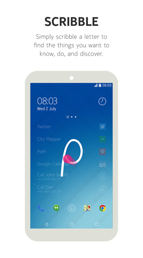
Another surprising purveyor of Android launchers is Finnish pioneer Nokia, delivering their Z Launcher over a year ago.
The unique appeal of Z Launcher is its ability to learn from you, serving up apps, contacts and websites you’re most likely to use on the central homescreen.
Otherwise, the launcher delivers unique gestures (such as writing out letters for apps and contacts) and a stark, three-panel homescreen layout to good effect.
Yahoo Aviate Launcher
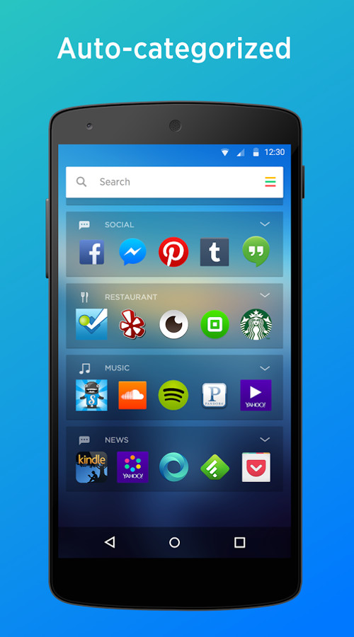
Even recently acquired Yahoo has released a launcher, in the form of the intriguing Aviate.
This little launcher prides itself on its simplicity and automatic organisation credentials, offering three unique homescreens (in a similar manner to Arrow Launcher).
There’s a screen dedicated to automatically sorted “app collections”, one devoted to all your apps (an app drawer), a homescreen devoted to news stories and one for your widgets. Not too shabby then, and the ability to add more screens is a lovely bonus.
New Nexus Launcher
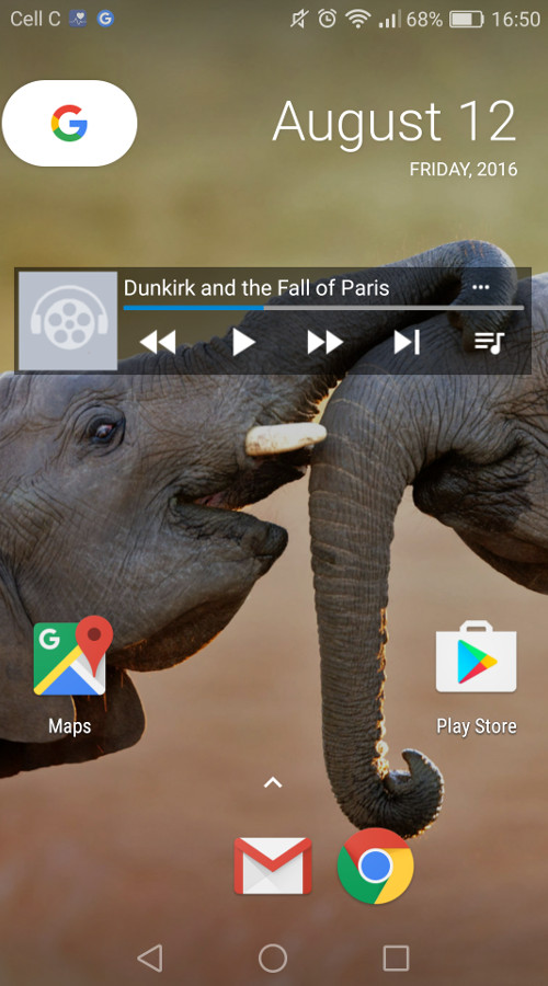
The new Nexus handsets aren’t even out yet, but their launcher has leaked already, courtesy of the XDA forum. So, what’s new?
The most immediate change is in the visual department, as the single homescreen features a new Google Now logo and understated time/date text at the top.
Other than this aesthetic tweak, the second (and arguably bigger) addition is the ability to swipe up to show the app drawer. No app drawer button anymore.

