A Joke, A Threat, And A Very Online Meltdown Trevor Noah delivered a measured, globally tuned monologue while hosting the 2026 Grammy Awards. Donald…
First impressions — Windows 8 Developer Preview

When you have been using multiple versions of Windows over a two decade period, it’s not difficult to write an unbiased review about Windows 8, it’s impossible.
Thankfully, this is the Windows 8 Developer Preview, Build 8102, therefore I can rip it apart if it doesn’t meet my ridiculously high standards. It’s Windows, but not quite. How so?
Think of it as an exceptionally well crafted alpha version of Microsoft’s latest magnum opus. It’s fast, it’s slick and it makes my heart beat wet, noisy thumps of happiness.
Note: of course, myriad operating systems have now evolved well past the clunky nature of Windows, with Ubuntu 10.11 and Lion coming to mind in terms of OS evolution. In order to avoid a flame war, this review will not reference competing operating systems. They’re all wonderful, let it go.
Windows 8 is also incredibly comprehensive and some features will be omitted in my review for brevity. What I have written about are the best features. On to the review!
Baby Steps
So where did I grab Windows 8 Developer Preview from? Piratebay? The Tor Networks? Newsgroups? None of the above. Microsoft offers WDP free for all and sundry. Download the 32 or 64 bit version, burn it to a DVD, install it onto a clean partition and journey into the world of Metro.
It’s not Windows
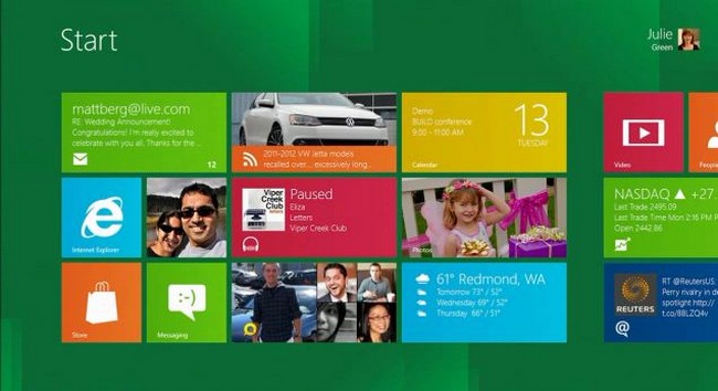
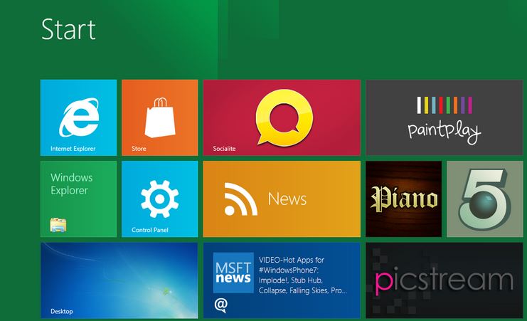
First impressions are enough to alienate most regular Windows users from the OS. The desktop is hidden, replaced with the Windows Phone’s Metro interface. Giant, living titles replace icons and breath new life into the overly tired look which Microsoft’s OS has been knocking about in different guises for years now. It’s a major difference, and much more than a cosmetic front-end styled for hipsters and graphic designers.
Live Tiles, for those unfamiliar with them, are feeds which create chaos out of the clutter which social media thrives on. Want to check your Twitter feed? Glance at the screen and see who’s tweeting who. Interested in the weather report? The Live Tile shows minimum and maximum temperatures without as much as a mouse-click. Sure, widgets have been providing this functionality for years, but never as slickly as this.
The Metro UI is easy to customise and applications that don’t play nice with the bright new interface simply become default icons in a green box. All Metro apps, of which there are plenty to play around with, appear like iOS apps with a bright, clear image and name displaying its purpose. This is no omission of elegance, but the inclusion of form and functionality.
Getting familiar with the new interface takes an hour or two until comfort levels sink in. The lack of a desktop is frightening at first, and then ultimately, a freeing experience. For 90% of the users, most of the information and apps they will need to access will be available from the Metro UI. Windows 8 knows this, and hides the desktop, turning it into a peripheral UI which is easily accessed, but rarely needed.
Charming extras
The Windows Key, a hateful knob that I would have one one occasion ripped bodily from my precious keyboard now serves it’s one, true function as a master of the domain. Pressing it rearranges your screen in a butter-smooth motion of panes inter-crossing each other. It’s an accessible way of jumping from one active task to the Metro UI in split seconds. It’s shit hot.
Mostly everything else, such as the settings which are usually buried under layers of windows, is accessible from the what Microsoft is calling “Charms”. When on the faux-desktop mode, the usual Windows button is visible on the taskbar, but clicking it takes you back to the Metro UI. Hovering over it, though, instantly displays the time, date, network connections and remaining battery power. The Charms windows slides in from the right when you click “settings”. From here, you can change wireless connections, brightness, volume, and power off. Why has this never been done before in Windows?
One of the handiest functions is the humble search. Hit the Windows Key and just start typing. Windows will then discover your files, settings and media in a heartbeat. This is a time-saving feature which I dearly hope migrates to the grown-up version of Windows 8.
Did I mention that Windows 8 is built on a responsive framework, which works equally as well, if not better on a touchscreen device? Swiping, clicking, moving apps from one side of Metro to another, it’s all good. The Metro UI lends itself to a touch-friendly interface so when Windows 8 tablets start to roll off the production line, the OS will need no further enhancements to correctly operate in a keyboard-free environment.
Applications work the same
Windows 8 seems to have a high level of compatibility for most legacy software, but I have to note that Office 2010 would not install under any circumstance. If there is anyone who managed to install it on your copy of Windows 8, I would be dying to know what you did right.
Need more Windows 8 specific apps? These can be accessed from the App Store which sadly, does not operate under the Developer Preview. Judging by videos though, it seems to be functional enough. Hopefully an update will bring the App Store into our eager hands.
There are plentiful Windows 8 apps to play with. The games are simple mobile gaming fodder and quickly ignored, there is a nifty RSS feed which displays information like the iPad’s famous FlipBoard app, an interesting experiment called “Near Me” which finds places of interest based on your location, a Twitter and Facebook app, remote desktop, a digital synthesiser and more. Most of the apps are seemingly aimed at the touchscreen crowd, especially the painting application, which is the natural evolution of the interminable Windows standard, “Paint”.
Strong like Bull
In regards to performance, Windows 8 is a meaty beast. It runs on my very-sub standard laptop… correction, it flies, with very little graphical lag to be more accurate. The Metro UI is always responsive and in terms of the BSOD, my build of Windows 8 never crashed during my month-long test period. The recommended systems specifications are a 1Ghz CPU with 1GB of RAM and a DirectX 9 GPU. It may chug on this, but I believe that it would run well enough.
A little help
Installing Windows 8 can be a nightmare if you are unfamiliar with setting up partitions. It needs a clean drive in order to install, so no upgrading from Vista for you, young Windows fan. Luckily, I have been through the washer and present these steps for Windows 8 installation.
-
Open the Disk Manager
Right-click on your primary drive and select “shrink volume”
After a few minutes, the Disk Manager will display the maximum amount of space you can shrink. Select a number and apply this setting. Windows will assign a new drive letter to the fresh partition.
Name the new partition “Windows 8” (or whatever you like). When you open explorer, you’ll find a new drive, ready for the OS.
Place the DVD with WDP written to it into your drive and reset.
After restart, Windows 8 will begin to install. Ensure that when it comes time to select an installation destination, choose the new “Windows 8” drive.
Simple as that. WDP installs itself with very little user input (if you so choose).
Refined, rejuvenated
I can’t give Windows 8 a score, and I can’t Gear it or Burn it owing to its Alpha build. What I can give it, in this current form is a thumbs-up and a pat on the back. Well done, Windows 8. Well done for moving into mobile-like territory with style and grace. Innovation, thy name is Windows 8.


