Sony launches the WF-1000XM6 in South Africa with upgraded noise cancelling, better call clarity and premium sound. Pricing starts at R7,999.
App of the Week — Reader X

This week I take a look at Reader X, a brand new, cleverly designed and simple to use Google Reader client for the iPad.
As I’ve probably mentioned in one of my previous articles, I’m a big fan of Google Reader. I love the simplicity, the ease of use and just the whole idea behind it, although the design does lack a little here and there. Regardless, I love getting into the office early and opening it up for a few quick reads before I start my day. It helps to keep me up to date with happenings and developments in my industry, see what my favorite design blogs are showcasing, read tech articles the minute they are published and generally help me save time on days that I don’t have much to spend on reading.
Since receiving my iPad a couple months back, I’ve become extremely lazy with computer based stuff at home. The laptop stays in its bag in the corner where I left it, simply because the iPad is just a lot more convenient and fun to use when lying on the couch. Recently though, I’ve run into a real problem when wanting to read my favorite articles at home: the Google Reader clients available for iPad just don’t work as smoothly as the original interface and tend to over complicate what really shouldn’t be very complicated. So normally I’d just pick up my iPhone and start using Reeder, but I realised that there just had to be some thing else out there. And no, I don’t like opening up the web interface on Safari either.
A few days ago I heard about Reader X, and how it completely revolutionised the reader client by simplifying things even more than on the web interface. This I just had to see, so picked it up at the introductory price of $1.99 on the app store.
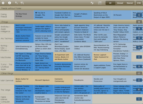
The app launches quickly and asks you for your existing Google account details on the first launch. After a few seconds of loading, Reader X displays all your sites and lists each of the articles published in chronological order in a sort of color-coded wallpaper that you navigate through by simply swiping horizontally and vertically. Truly unique and innovative, it breathes fresh air into the news category by just putting a completely new spin on how you use Google Reader.
Each article is represented by a coloured block, and each colour has its own meaning: blue for unread articles, grey for read articles and yellow for starred articles. Over time, each block’s colour fades as it gets older and it slowly gets pushed out of your screen area as newer articles are published, very clever indeed, and it makes for a very interesting, almost live view of your interests.
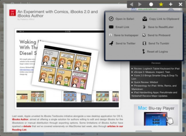
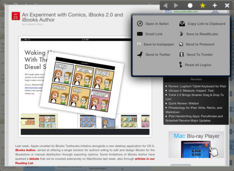
Opening articles is as simple as tapping the block for a preview, and then expanding the article (which Reader X has already loaded in the background) to its full site view. I this view you can read the article, mark it as a favorite or skip to the next article. Tapping outside this box closes the article and marks it as read. The app also allows you to filter by read status, share articles with your social circles on various other networks and even mark entire folders as read, quickly and easily.
Design wise, I love what they’ve done with the colouring and user interface. I would, however, like to be able to set my own color themes for my app but I’m sure this will be featured in a future update, as it should be quite simple to implement. I also like the fact that you can choose to have the badge alerts switched on or off, as I hate nothing more than an app with a badge alert of over one hundred cluttering up my home screen, silently complaining that I don’t spend enough time with it.
To finish off, Reader X is now the most used app on my iPad and has quickly snuck into its well deserved place on the dock alongside Phraseology. If you love Google Reader like I do, get hold of this app now while it’s still US$1.99.
Name: Reader X
Seller: Wolfgang Augustin
Category: News
Size: 2.2 MB
Price: US$1.99


