Bitcoin has surged to its highest level in a month as global risk sentiment improves and Donald Trump signals renewed support for the crypto sector.
iOS 7 concept video shows off ‘jailbroken’ interface

Frederick Bianco, an industrious designer, has created an interesting concept video for Apple’s upcoming iOS 7. Bianco gets to work in this video, demoing both the iPad and iPhone versions of his iOS 7 concept. The best part? Most users with a Jailbroken iThing can achieve the same look and feel Bianco has achieved.
It’s a peculiar video, as it envisions an iOS that is very much in line with what the jailbreaking community has rolled out. Widgets, a better Mission Control, an OSX style download queue for Safari mobile, quick settings and quick reply.
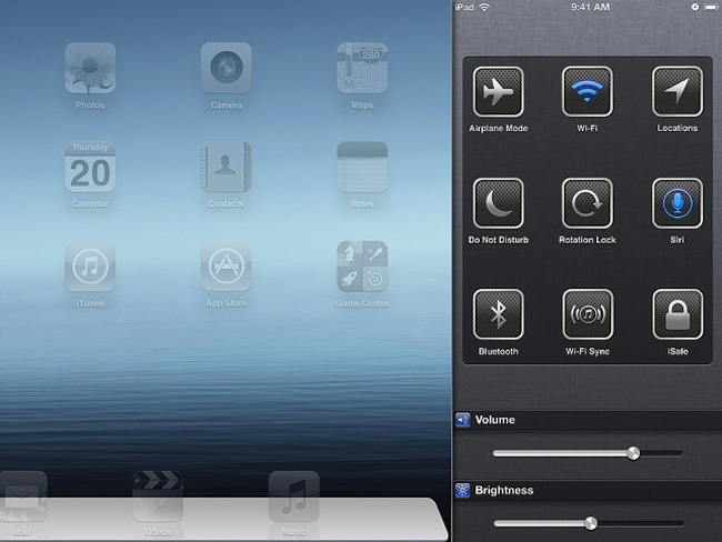
First out the gate, we have the updated lockscreen with hot-swappable quick settings. In the video, the phone icon is pulled into the place of the camera icon, so when the screen slides up, the dialer appears. How very Z10. From here, the video demos further quick-setting controls, these ones are accessed by sliding from the right of the phone. We see flight mode, Wi-Fi, Bluetooth and Do Not Disturb. Those who have hacked their iPhones, can get the same functionality with an app called SBSettings. SBSettings (for jailbroken iThings) lets users customize a quick settings menu which can be accessed with a swipe or a tap.
These quick settings are neatly replicated on the iPad as well, but Apple is not keen on making users lives any easier, with the standard iOS 6 screen only capable of pushing out Facebook or Twitter updates. There’s very little interaction outside of checking the weather and notifications, but this is what Apple delivers. Quick access, with little in the way of hardware selection. Bianco’s version of Quick Reply is also a jailbreak special. By swiping on the message, a quick reply box pops up instead of taking the user into the text, as is tradition.
Widgets, which seem like an excellent idea in this video, are beautifully implemented and are one of the best features of this concept iOS 7 video. Tapping calendar or the App store doesn’t take the user into the app. No, instead a folder like interface drops down as the user is funneled directly into a calendar entry or a new app update. This is an outstanding vision for iOS 7, and would cut out most of the frustration iOS users face when updating their apps.
If the music app could be turned into a widget, we think that iOS would be the better for it. Tapping the music icon creates an OS X-like music player which again, doesn’t force the user into a specific app. It’s tap, play, consume.
As for the full quick settings menu, which Bianco seems to have as a shortcut on his homescreen, it’s a 1:1 clone of Cydia’s (the app store for jailbroken iThings) SBSsettings. Rotation lock, location toggle and network settings are all part and parcel of SBSettings shortcut options. For those who haven’t cottoned-on by now, SBSettings is a must have. We love how the quick settings can be accessed with an OS X-like swipe from the edge of the iPad. It’s very MacPro.
It’s Bianco’s version of the download bar in mobile Safari for iOS 7 which will leave iOS 6 users gasping for more. There’s no an extra download tab which practically mirrors the intuitive look of OS X Safari. Downloads have the blue progress bar on both iPad and iPhone, a fantastic addition if there ever was one. But due to Apple’s restrictive nature of locking down iOS, this would never happen. It’s too much freedom for the average user.
Finally, we get Mission Control which again is very much like OS X. There’s hundreds of options for the jailbroken user, so emulating Bianco’s version of Mission Control would be a doodle. The windows shrink down and in a very Android way, the active screens are displayed on top of the multitasking windows. Mission control even lets users close all open apps, something the current iOS is loath to do.


