Hisense is making a deliberate play for South Africa’s growing gaming and hybrid-work audience with the launch of its latest monitor lineup, led by…
Holo-themed Android apps and why I love them

Since Android 4.0 (Ice Cream Sandwich), Google’s mobile OS finally started looking as well as it functioned. Pre-ICS was a horrible thing to look at if I’m honest. It wasn’t designed well and felt like more like an afterthought, but that all changed when Android introduced, it’s “holo” design.
Holo is short for “hologram” and it has been implemented as part of Android’s creative vision for its OS. The design guidelines were created to achieve three goals, “Enchant Me”, “Simplify my life” and “Make me amazing.” Simply put, Android had to play catchup with iOS for a number of years, so the focus was mostly on functionality, integration and user experience. When Android reached a level that was on par, if not a touch ahead of iOS, the Android team turned its focus to the way the “new” OS looked and Holo was born.
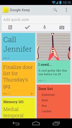
According to the Android creative vision, “Beauty is more than skin deep. Android apps are sleek and aesthetically pleasing on multiple levels. Transitions are fast and clear; layout and typography are crisp and meaningful.” It also states that “it’s not enough to make an app that is easy to use. Android apps empower people to try new things and to use apps in inventive new ways. Android lets people combine applications into new workflows through multitasking, notifications, and sharing across apps. At the same time, your app should feel personal, giving people access to superb technology with clarity and grace.”
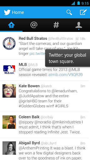
I’ve taken to only using holo themed apps to go along with my stock Android experience and the results are fantastic. I can remember turning on my HTC Desire for the first time and thinking “these popups are possibly the ugliest things I’ve ever seen.” Now, I look at my Nexus 4 and each app looks incredible. Android has caught up, if not surpassed the competition, when it comes to design. The minimalist, easy to read and gorgeous to look at holo designs have helped the Android team round off a very polished product. As a user, I appreciate good design and functionality, yet in the past I felt as if you had to value functionality over design as an Android fan.
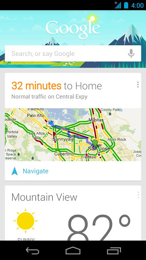
The design is minimalist in principle, with an easily legible font, Roboto, and all its variants. That, combined with ample spacing, and a modular layout is the holo design code.
There are numerous holo themed apps for you to choose from in the Play Store, but instead of trying to list them all here, I’ll just list the ones I use regularly. (They’ll be listed alphabetically, simply because I’m getting the list from my Play Store entries online.)
- Dashclock Widget
- Clean File Manager
- Gmail
- Google Calendar
- Google Chrome
- Google Currents
- Google Drive
- Google Keep
- Google Play Music
- Google Plus
- Google Search (Google Now – which is possibly the best looking app on my device)
- Google Translate
- Minimalist Text Widget
- Notable Pro
- Reddit Sync Pro
- Soundcloud
- Tweedle
- Youtube
There are a ton of other apps that have been given the holo treatment, including Flipster for Facebook, Shuttle + Music Player, Dropbox, Foursquare, Battery Widget Reborn, TED, Baconreader for Reddit, The Verge, Falcon Pro for Twitter, Tasks and Notes.
I love how Android has matured to the point where I actually WANT to look at my screen and interact with it. I remember the Froyo and Gingerbread days, and I can’t be much happier that they are no more. If I’ve missed any of your favourite holo themed apps, leave us a comment, I’d like to check them out myself.
