Hisense is making a deliberate play for South Africa’s growing gaming and hybrid-work audience with the launch of its latest monitor lineup, led by…
8 new iOS designs that are better than Apple’s

Apple has placed design guru Jony Ive in charge of the look and feel of iOS, and speculation has never been hotter. The upcoming iOS 7 will likely feature the most significant visual upgrade of the platform ever. One rumor says that privacy filters are required during field testing to prevent onlookers from catching a glimpse of the new design.
But we don’t have to wait until Apple’s announcement to imagine what could be in store: users of Dribbble, a “show-and-tell” for designers, have been hard at work reimagining iOS with a clean new design.
8 new iOS designs that are better than Apple’s


Slide Out Navigation
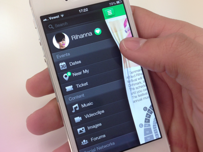
Bonus shot: we're seeing slide-out navigation (sometimes referred to as a "hamburger menu") everywhere. This visual metaphor from Álvaro Carreras looks fun!
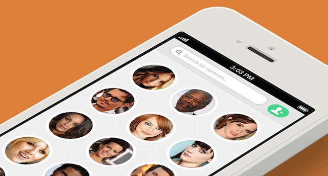
Facebook Home-style Contacts
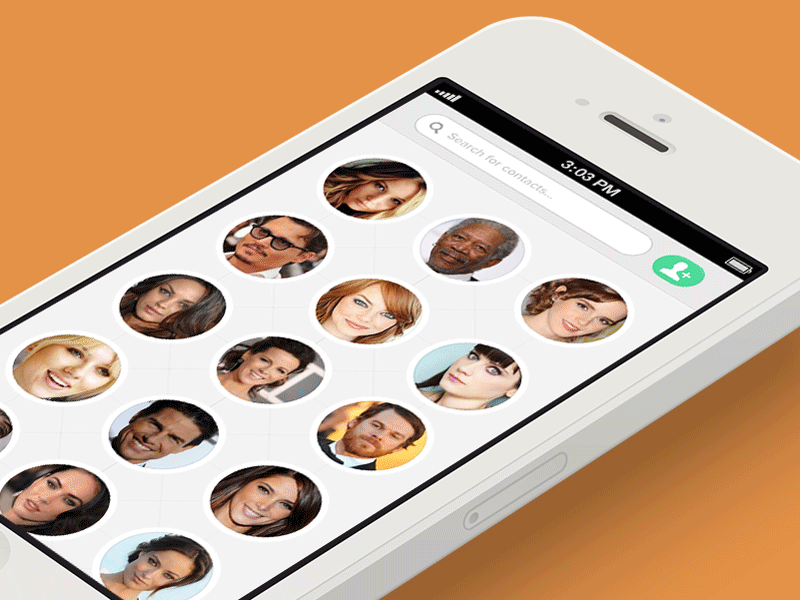
A mock up by Justin Nurse suggests that the contacts app could be more than just a simple alphabetical list of names.
Messages Get Refreshed
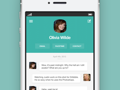
Similarly, Messages hasn't changed much since 2007, and I find it visually lacking. What would happen if we added some faces to the experience? Justin Nurse found out.
Slide To Unlock
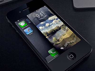
The "Slide to unlock" gesture hasn't changed at all since the original iPhone. Anton Kudin's "Fold to unlock" seems much more intuitive.
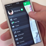
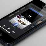
Ios App Switching
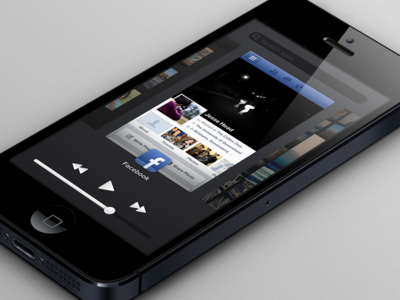
The iOS app switcher is unintuitive and contains little useful information. Designer Jesse Head has mocked up a much better one, with built in search and music controls.
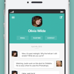
Messages Made Better
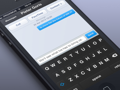
Could the iOS keyboard use a visual update? Pieter Goris might say yes. His take on the Messages app most notably shows off a white-on-black keyboard, which I find both visually striking and easier to read.
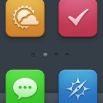
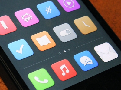
Clean And Neat Icons
Newar has created similar icons that share the clean, minimalist motif
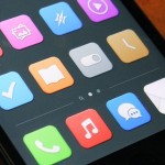
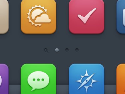
Minimal Ios Screen
Manu Gamero has produced a set of refreshing, minimalist iOS icons that breathe new life into a tired home screen.
Ios New Designs
This article by Joshua Merrill originally appeared on Josh.io, and is republished with permission.
Images via Dribble.com