Donald Trump’s call for Netflix to remove board member Susan Rice has intensified the Paramount saga, pushing the streaming wars into a political confrontation.
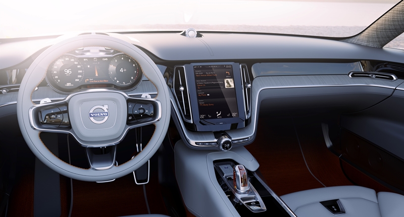
Volvo’s new ‘human machine interface’ is pretty much a tablet in your centre console

Say hello to the “human machine interface” that will grace future Volvos (starting with the upcoming XC90). If you’re looking at your screen, disappointed at the fact that it pretty much appears to be a tablet and not something out the latest Iron Man movie, don’t worry, we feel your pain.
According to Volvo, the touch screen is meant to simplify and enhance the way drivers operate their cars by replacing the traditional selection of buttons and controls in the centre stack with one “clean and sleek control panel”.
According to the Swedish car maker, the system also borrows a fair bit of functionality from tablets, including swiping and pinching. It adds however that there a few new solutions that are “specially designed for the in-car environment”.
“The basic idea is to organise controls and information in a perfectly intuitive and user-friendly way. Everything is exactly where you expect it to be, making the drive more enjoyable, efficient, and safe,†says Thomas Ingenlath, Senior Vice President Design at Volvo Cars.
The interface is apparently organised as a stack of flexible “tiles”, each displaying a key functionality. The tiles apparently expand on interaction. When one of the tiles expands to display required information, the others are compressed, still visible and instantly accessible.
In what is most likely a bid to avoid the safety issues presented by pure touch screens, Volvo’s also remembered to include thumb reach controls and voice navigation in the interface.

