Bitcoin has surged to its highest level in a month as global risk sentiment improves and Donald Trump signals renewed support for the crypto sector.
4 UX principles for creating effective car interfaces

Have you noticed that today’s most buzzed about companies don’t actually own any product? Amazon and Alibaba unite manufacturers; Uber provides transportation services, but doesn’t own a single car; Airbnb is a worldwide hotel brand that doesn’t own any of its offered apartments.
What unites all these companies? What is the secret to their success? The answer is a buzzing collocation you have definitely heard about: user experience. UX is highly valued by every individual, and something we are willing to pay for.
Automotive is one of the most rapidly developing industries, and the last few years have witnessed a growing and complex interaction between cars and brand new technologies:
- Driver’s assistants (e.g., autonomous cruise control systems, automotive radar devices, collision warning, blind spot detection, lane control, etc.)
- Smartphone integration (built-in Android and creation of new marketplaces)
- Electromobiles
At first glance, everything looks positive, but there is a “but.” With all the modern add-ons and techy features, the cost of a car is also skyrocketing. People don’t want to maintain this commodity any more, because in an era of such rapid technological development, it is much more reasonable to pay for a service. You know the feeling when you buy something and it gets outdated within a year? How can automakers begin to think like pioneer service providers like Spotify or Netflix, where a critical mass of people have already demonstrated that they prefer streaming content to buying it?
As Time points out, those principles are already emerging in the automotive market. Uber is flourishing because it offers a high quality sharing-economy-style way of commuting, often for less than the cost of owning a car, while Car2Go offers an affordable car rental service, where you pick up a car at the nearest parking lot, get to your destination, and leave the car right there.
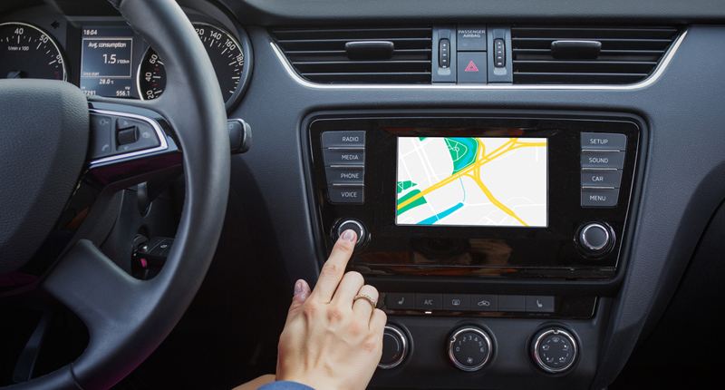
However, a car is also about convenience and personal preference. It takes time to adjust your vehicle to your needs: seats, mirrors, favorite radio stations, right? Research of user needs may soon solve these issues instantly and without distracting a driver. UX should assure the highest possible safety and comfort. Here are four basic UX design principles to rely on while creating both enticing and functional auto interfaces.
1. Visibility of system status
A vehicle’s system should always stay in real-time touch with the driver, informing them about immediate inside and outside factors in a clear, distinctive way.
2. Prevent errors in the first place
A user should know about all the possible problems that could occur. Make sure they can easily recognise, diagnose, and recover (if so) from errors. Notifications informing the driver about errors need to be delivered in an easy and understandable way, clearly stating the cause of the problem and offering a way to solve it.
To improve upon error notification, think about how the system could eradicate error-prone conditions without notifying the driver at all, or send them a request to confirm a specific action — including a warning about the consequences.
3. Recognition over recalling
Don’t confuse your user with a load of information—apply the less-talk-more-action principle. Relieve the verbalized burden by turning objects, actions, and options into visuals. It’s much easier for a user to recognize an icon, rather than recall a wordy instruction or name. If a button is in the form of an image, it’s much easier to sort out the function of this button as opposed to a word.
4. Design for interruptions
Save current settings for users and allow users to save them at will. When you are at the steering wheel, all your attention is focused on the road. So while you interact with the car interface, switching radio station or tuning climate control, your mind should be fully on the road, because someone may appear out of the blue from around the corner, and your mind will jump to the driving process. A designer’s task is to create an interface that doesn’t distract you from your main responsibility, but at the same time keeps everything crucial in your line of sight when you glance away from the road.
Conclusions
Modern technology brings an immense information flow, which may turn into “noise” with time. To avoid this, decide on priorities: filter the context and provide only the necessary information. For example, if a driver is outside a car, offer features like remotely starting the engine or switching on the lights to easily find the car in a parking lot. During the ride, such things as overspeeding notifications and upcoming meeting reminder, or route changes and technical failures, will be of greater help.


