Big-Screen Android Luxury If you’re after an Android tablet that can flex its muscles as both a binge-watching machine and a productivity sidekick, the…
LG G Flex review: curve appeal
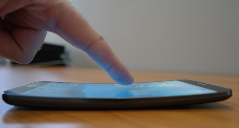

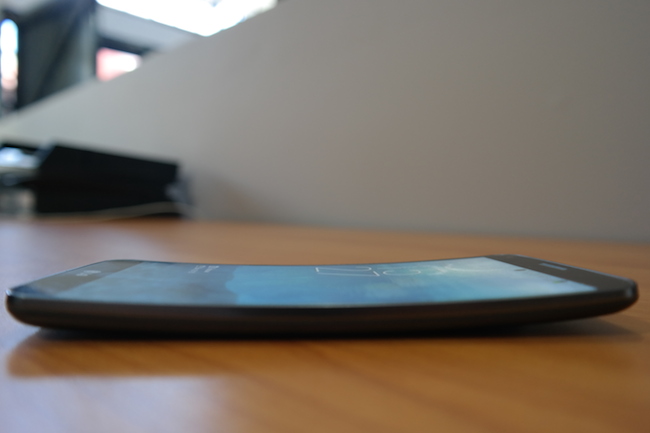
The world’s first curved phone, the LG G Flex, is not great. It’s an average Android phone with a major issue: the display. Also, it’s sluggish in places where it really shouldn’t be. And its one selling point, the curved screen, is average at best. What I have in my hand is a cool template, or prototype for a phone that will one day be a must-buy. But what LG’s trying to sell here is proof-of-concept, and I for one am unconvinced. It’s also one of the most, if not the most, expensive smartphones on the market.
Curvy
This is a crying shame. What LG’s done with the screen is a crime. The curved 6-inch P-OLED capacitive touchscreen is wasted here, because the resolution is too low. What should have been a full HD experience (1080p) turns out to be a 720×1280 display with 245 pixel per inch density. What should be sharp, isn’t. It’s particularly noticeable when viewing HD content, which looks washed out, especially compared to an LG with proper HD, namely the G2.
One of the worst offenders of CRT monitors (those big ol’ thangs from the late-nineties era of computing) was screen burnout. And today on a phone from 2014, it’s back, baby. At first I had a hard time believing what I had seen. It happens a lot and worried me about the condition of the display after a year of use. Imagine dropping a small fortune on a revolutionary display, only for it to display permanent reminders of notifications, icons, apps and whatever else burned into the screen. It’s impossible to take a picture of this, as the burn-out hasn’t become permanent, but it is something you’ll notice as a G Flex user.
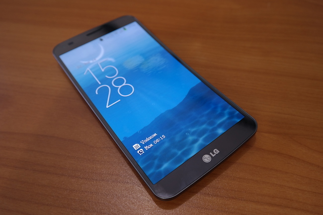
The display overall is perfectly adequate for mostly everything else. The screen responds almost instantly to any tap, but there’s another issue at hand, and that’s to do with the brightness. It’s impossible to truly dim it, and is still extremely bright when it shouldn’t be, and too dark to read unless the brightness slider is ramped way up. Also, there’s a noticeable jump in brightness from 99 to 100%, but it’s as if the G Flex doubles the brightness when it goes up by 1%. It’s extremely baffling, but I can nail this down to LG’s lack of experience with these new-fangled OLEDs.
On to the curve. It’s essentially a gimmick, and is no way as curved as the adverts and product shots make it out to be. I was expecting a radical curve, but it’s more of a gentle sweep. After a while it’s hardly noticeable, which I suppose is a good thing. LG says it designed the Curve for those who store the phone in their rear pocket, and who accidentally sit on it. To test this, I sat on it, hard. There’s not much junk to my booty, but I firmly squeezed the G Flex ‘twixt the cotton seat and my rear. There was no crack and the phone took my weight like a pro. As LG so sweetly says by means of a tiny disclaimer on its website, “The flexibility of this product is limited. This phone may be bent flat up to 180 degrees for a limited period of time only. Do not bend inward or twist.” I was hoping for a twist phone… perhaps next year.
LG also says that the Curve is more comfortable to hold, but that’s absolute nonsense. Because the Curve has software buttons and it’s so freaking huge, you’ll endlessly exit from apps by accidentally tapping the home button. This constantly happened to me, and if the phone was a little smaller I’d have a better, more comfortable grip and be able to type at the speed I’m acquired to. Overall, the G Flex is too big to ever be considered a comfortable phone, but this then is the issue with all phablets. I pray that they die off soon.
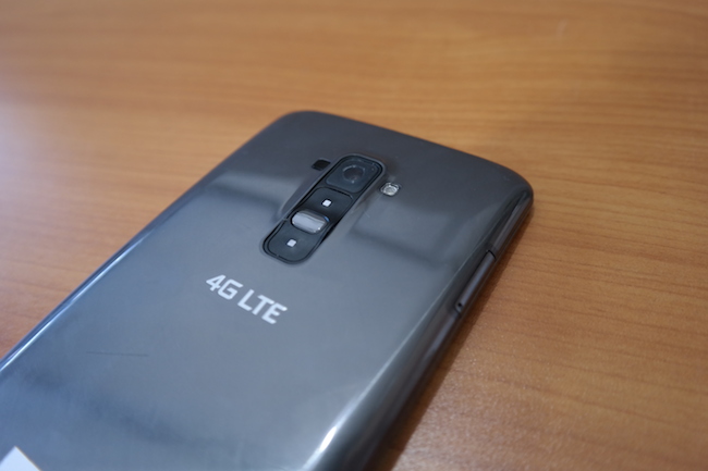
A few other features (which rarely work) round off the G Flex’s contribution to the curved screen revolution. First is Knock On. Tap the screen twice to wake it, but you must knock it in a slow “tap… tap…” motion or it simply won’t work. I took to just furiously tapping the screen to wake it. Because there’s no physical power button on the front — it’s located on the rear under the camera and between the impossible to use volume buttons — tapping to wake becomes a frustrating part of the phone’s daily use.
The final two features are “Quick Theatre” (slide the screen apart with your thumbs in landscape mode) which should reveal three shortcuts to media content when activated. It can only be activated from the lockscreen, so take note of that. Lastly, we have Slide Aside (swipe three fingers horizontally to switch from multiple windows) and it worked most of the time — it’s just not a useful feature and causes a fair degree of lag.
I dub the curved screen a gimmick. When we remove that from the equation, what remains? A bog-standard Android phone.
The speed of the phone was decent. A 2.26Ghz quad-core CPU with an Adreno GPU and 2GB RAM ran everything I threw at it, but it’s what I kind of expect from a top-end smartphone. I say “kind of” because the I’ve used low and mid-range device, which seem to offer the same performance.
When I ran the benchmark tests, another story revealed itself to me, namely that the LG G Flex is apparently the fastest phone in the world? I ran AnTuTu Benchmark and it scored an incredible 36251. That beats the Galaxy Note 3, Sony Xperia Z Ultra, Xiaomi MI3 and my much-loved LG G2. All I can surmise is that the G Flex is an insanely fast phone, just under-optimised. I hope that in time and with software updates, the G Flex’s true abilities can shine through.
The LG G Flex runs Android 4.2.2, Jellybean, on top of a modified UI I first saw in the G2. It works fine. One of the improvements in the interface which LG added is the ability to resize icons on the home screen by holding down on them, and then tapping the purple paintbrush icon. It makes for cool, customised home screens.
Camera quality is uniformly excellent. The 13MP shooter has a decent autofocus and a slew of extras, as well as filters to apply to shots in real-time. As stellar as the camera was though, the HD recording is even better. Everything which I loved about the LG G2’s camera is all front and present here.
Sound is lacking, and outputs from a single mono speaker. It’s not great but it’s loud, at least. There’s also 32GB fixed memory which isn’t as bad as you think it is. I loaded thousands of songs, a few films and flooded the G Flex with games and my storage situation remained in check.
Finally, and as a phone, I didn’t find the G Flex comfortable, which it should be as the damn thing curves. I actually prefer a flat phone and since the G Flex doesn’t really curve that much (it’s a very slight bend), it never flexes near my mouth, which is what I expected it to do when it was first announced. I found that I had to use the included earbuds which were thankfully of excellent quality.
Nutshell: This is a flawed phone with great ideas, most incorrectly implemented. It’s a disappointing device, I really expected more and was genuinely excited when it arrived on my desk only to be disappointed in the long run. Top marks for curving the screen though, there’s just little use for it besides stares from envious strangers. Think of the G Flex as a nifty concept for what the future holds for smartphones. But no-one should have to pay that type of money for a concept device.
Score: 6/10

