With youth unemployment above 60 percent, South Africa is betting on digital skills to drive inclusive growth. Here is how MICT SETA is positioning the next generation for the Fourth Industrial Revolution.
Tracking the coronavirus outbreak? Look no further than this detailed dashboard

Tracking and visualising the growing number of coronavirus (aka 2019-nCoV or, more recently COVID-19) cases online is a tough task.
While Twitter’s an excellent source of info — at least from those included in our COVID-19 Twitter list — it can be a steaming pile of misinformation.
That’s true with some news sources, that deem clicks more important than facts.
However, there are unbiased sources online that only deal with coronavirus numbers and charts.
That’s where this nifty, incredibly informative dashboard comes into play.

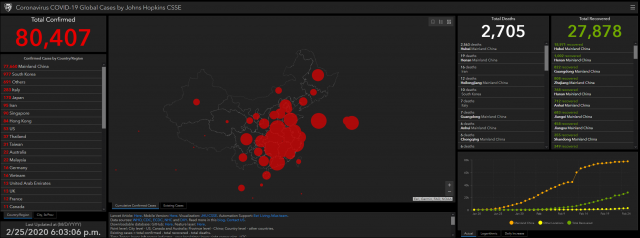
Image: Johns Hopkins CSSE’s interactive dashboard is brilliant for data lovers or curious viewers
Created by Baltimore’s Johns Hopkins University’s Center for Systems Science and Engineering, the dashboard tallies all known cases from course across the world, including WHO, the US’s CDC and the EU’s ECDC.
“The dashboard, first shared publicly on January 22, illustrates the location and number of confirmed COVID-19 cases, deaths and recoveries for all affected countries,” the university team notes in a blog post back in January.
“It was developed to provide researchers, public health authorities and the general public with a user-friendly tool to track the outbreak as it unfolds.”
The dashboard updates every 15 minutes, but that’s plenty frequent.
Countries affected by coronavirus cases are listed in the left-hand pane, a map of the hardest hit areas is available in the centre portion of the dashboard, while total deaths and recoveries are also monitored.
For those on mobile, there’s a compact version available here. But the full desktop version can be found here.
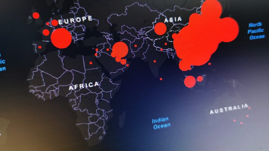
Feature image: a snap of Johns Hopkins’ coronavirus dashboard, by Andy Walker/Memeburn


