With powerful hardware working together with an industry-leading camera system and intuitive AI experiences, everyday tasks have never been easier and faster
Facebook is testing a new desktop site design (and we hate it)

If Facebook suddenly appears different on your desktop browser version of the site, you’re not the only one. The social network appears to be testing a new redesign.
While some users appear to be getting a notification and introduction to the redesign, you may also find yourself with the sudden change without warning (as we did).
The redesign is also apparently applied without the user directly opting in.
So what does it include?
Facebook’s new design test

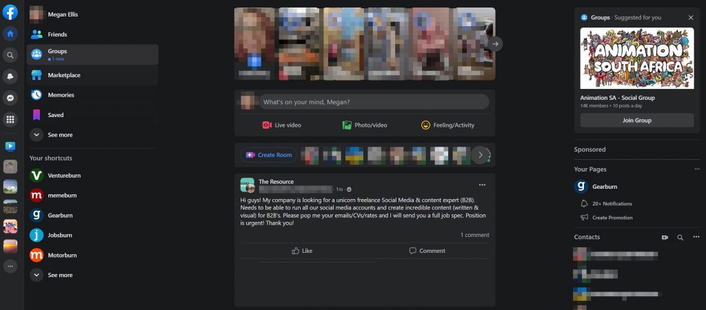
The most noticeable change in the test is the removal of the top navigation bar. Previously, menus like notifications and your account settings appeared in a top header bar on the site.
Now, these icons appear to the left of the interface, alongside tabs for your friends and groups, as well as your shortcuts.
The leftmost bar also has icons for Facebook Watch and various groups.
Meanwhile, on the right you’ll find friend requests, a “suggested for you” window, your pages, and your list of contacts.
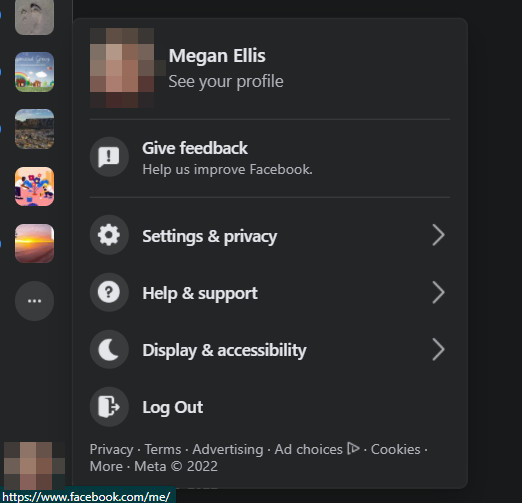
The profile icon you clicked to access your settings is now on the bottom left of the page, rather than the top right.

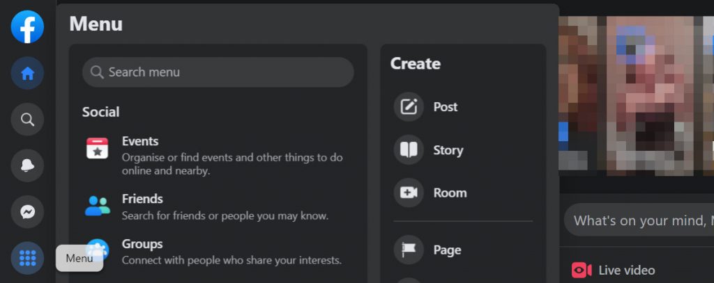
Clicking on icons like the nine-dot menu option expands new menus over existing sidebars–which isn’t exactly ideal.

The redesign seems to be an attempt to emulate a Twitter feed more closely. However, rather than creating a sleek interface, it actually feels more cluttered and confusing to us.
Facebook has a lot of features and most users won’t use all of them. So trying to make these more prominent by moving the controls and navigation bar is frustrating when the website already bombards users with tabs, feed items, and notifications.
A choice to revert back to the old design and opt out of the test could go a long way to improving the experience.
Making sure the introduction wizard actually launches, as it did in Mashable’s experience could also help, rather than blindsiding users with the change.
Read more: How to post to Instagram from your PC
Feature image: Luca Sammarco from Pexels


