South Africa’s creators, coders and founders are under pressure to do more with less. Whether you’re running a meme page from Mitchells Plain, debugging…
Penny drops on new Honeycomb display tech

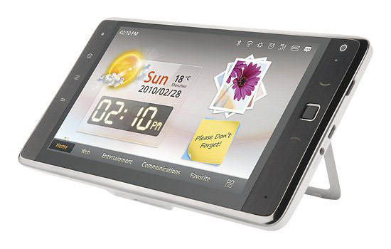
After a blog post to the Android developers blog, the penny has dropped why the Honeycomb 3.2 update is actually a big thing. It allows proper support for 7″ screens. Until now, mid-size tablets fell into the cracks between smartphones and full-size tablets, with apps often unable to swap smoothly between portrait and landscape, or not displaying properly.
When the latest version of Google’s tablet-centric Honeycomb operating system was announced, even the dev team was low key: “Android 3.2 is a minor feature update that includes new APIs that allow you to better target your layouts for specific screen sizes and other miscellaneous new APIs,” read the official blurb.
After a blog post by Dianne Hackborne, one of the dev leads on Honeycomb, however, things are coming into sharper focus, and more sites are starting to get the story. A tip of the hat to Gizmodo, which got the point when the 3.2 release went out:
“Where you once had an interface designed for 4-inch screens, now you have one that’s actually designed for tablets.”
This is true in effect, although as a consequence, not a specific targeting of 7″ devices. What the Android team has done is moved on from the old system of screen size ‘buckets’ which loosely described screens as “xlarge”, “large”, “normal” and “small”. This has become problematic with the increasing variety of screen sizes, resolutions and aspects.
Honeycomb now uses a system based on “dp” units, which gives pixel size, but is corrected for density defined by the physical size. Using this system, developers don’t have to worry about screen sizes as much: a single number lets them design accordingly.
As Hackborne explains: “The ‘smallest width dp’ is now the most important number. It replaces the old screen-size buckets with a continuous range of numbers giving the effective size. This number is based on width because that is fairly universally the driving factor in designing a layout. A UI will often scroll vertically, but have fairly hard constraints on the minimum space it needs horizontally; the available width is also the key factor in determining whether to use a phone-style one-pane layout or tablet-style multi-pane layout.”
Android is effectively looking ahead to a time when it will not only run on a huge range of devices and display types, but have a display model that lets developers create good looking apps that don’t break just because you have a funny shaped device.