We tested Vox Telecom’s 100Mbps Kiwi Home Wireless in South Africa. Installation, real speed tests, pricing and how it compares to fibre for everyday use
Review: Living with the Motorola XOOM
 What is there left to say about the Motorola XOOM that you don’t already know? Released way back in February of this year in the US, it has finally found its way to African shores. There are literally hundreds of reviews of the Motorola XOOM by now, so instead of boring you with tedious minutiae, I’ll try to convey just what it’s like to welcome to XOOM into your home.
A quick refresher course
To recap, the XOOM was Motorola’s first tablet, and the world’s first tablet to run Google’s Honeycomb tablet-specific OS.
Even 8 months after its introduction, it still packs some serious heat.
As far as internals go, you get an NVIDIA Tegra 2 1GHz dual-core processor, 1GB of DDR2 RAM and 32GB internal storage. The entire alphabet of Wi-Fi protocols is present as well as snappy 3.5G connectivity, and of course Bluetooth 2.1.
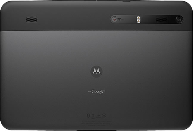
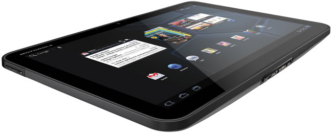
On the exterior, there’s a 10.1-inch 1280×800 capacitive display, 5MP rear-facing shooter (dual-LED, autofocus, 720p video) and a 2MP front-facing camera. The SIM slot is located at the top of the device, as well as a 3.5mm headset jack and an SD card slot which adds an optional extra 32GB of removable storage. At the bottom, a Micro USB 2.0 port as well as a mini HDMI out jack provides physical connectivity options. On the back you’ll find the power on/off/sleep button as well as two stereo speakers. The volume rockers appear on the left of the device.
To round it all off, the XOOM includes a gyroscope, barometer, e-compass and accelerometer to make possible some interesting apps.
Living with the XOOM
During the first week, the XOOM melted comfortably into my living room. I’d casually reach over to it with the TV on in the background and check out some apps in the Android Market, do some casual web browsing, or reply to a few emails.
The XOOM loves to be held in landscape orientation. A consequence of the rock solid build construction, holding it in portrait orientation felt a bit unwieldy as the the elongated shape made the 730g tablet feel heavy after a while. Viewing angles aren’t the best, and the display’s pixel density — 150ppi — leaves something to be desired, but despite this, the XOOM is more than capable of crisp, clear video playback. The speakers are better than average I’d say, but don’t turn them up too loud, or you’re bound to run into some distortion.
The browser is good, though sadly, not great. Pinching, zooming and scrolling happens swiftly enough, and pages seem to load fairly quickly in general. Despite the enhanced Flash performance in Honeycomb 3.1, I did however experience some jitters while streaming YouTube videos at 720p, as well as slow downs on Flash heavy pages.
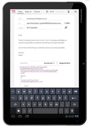
It wasn’t until the second week, that I tried to do some actual work on the XOOM. I moved from the sofa to my office chair and placed some magazines under the XOOM, propping it up, so it was facing me at an angle. Typing became much easier, and as I started getting comfortable and using multiple fingers, I was soon hammering out emails and documents almost as efficiently as on my laptop.
The Standard Dock for the XOOM allows you to watch video content or listen to music through external speakers while the device charges. That’s nice if you want to have the XOOM stand up vertically like a laptop screen. Throw in a Bluetooth wireless keyboard and mouse, and I could see myself leaving my laptop at home.
Finally, the battery life on the XOOM is excellent. To give you an idea, you can loop an HD video at 65% brightness for more than 8 hours on a single charge.
Software
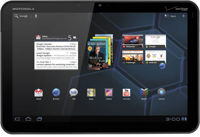
Personally, I love the Tron’esque styling of Honeycomb and I found the OS to be very intuitive, despite being more complex than iOS; it feels more like Windows.
Like many, I’m a Gmail fanatic and I loved the redesigned Gmail app for Honeycomb. The music player is gorgeous and gives you a dimensional, 3D interface to browse your media with. I didn’t attempt a video call, but you can do so out of the box thanks to Google Talk. The video editing app called Movie Studio was a bit obtuse and allows for some rudimentary video editing. Despite its, at times, clunky interface and laggy performance however, it’s a welcome new addition to Honeycomb.
Since the XOOM’s launch, the Honeycomb experience has improved. Honeycomb 3.1 offers better multitasking support with a scrollable app list, resizable homescreen widgets, pointer device support — think mice, trackpads, trackballs — USB host capability — with an adapter you can access thumbdrives for example — and updated core apps.
These are welcome enhancements, but sadly the lack of Honeycomb optimised apps is still a sore point. While the Android app catalogue is vast, there are only a handful of apps that scale properly to the larger dimensions of the bigger Android tablets. If not optimised, fixed-sized apps can be stuck running in an unsightly small box.
Honeycomb 3.2 brings with it app-zooming capability. With compatibility zoom, an icon appears in the lower-right corner of the display when any such app is opened. Tapping the icon causes the system to zoom in, usually causing pixelation unfortunately, but makes the pint-sized item take up your entire screen.
Honeycomb 3.2 is now available for the XOOM.
Wrap-up
Despite some of the drawbacks highlighted in this article, I loved the XOOM, and it was difficult to part with the review unit when the time came to return it. If you’re already invested in the Android eco-system, you’ll probably love Honeycomb and I strongly suggest you check out the Motorola XOOM if you’re thinking about making an Android tablet a part of your life.
The internals are fast, and the build construction is solid and sleek. Contrastingly however, the lack of Honeycomb optimised apps, made the whole experience feel a little unpolished and neglected. Also the 3G version weighs 730g, which definitely makes the XOOM feel heavy and bulky.
Motorola delivered a true iPad competitor in the XOOM. It’s right up there with the iPad 2 in terms of hardware, but sadly falls short in terms of tablet optimised apps in the Android Market.
Gear it or burn it? Gear it.
Who it’s for
Fans of Android. Anyone looking for a more versatile iPad alternative.
What we like
- Solid build quality
- Powerful internals
- Great looking and intuitive UI
- SD card slot
- Optional connectivity with wireless peripherals
- HDMI out
What we don’t like
- Lack of Honeycomb optimised apps
- At 730g the XOOM’s weight is a drawback, especially in portrait mode
- Occasional jittery 720p video streaming performance
