With powerful hardware working together with an industry-leading camera system and intuitive AI experiences, everyday tasks have never been easier and faster
Pantone iPad Book Case [Review]

The iPad is a lightweight device with minimalist design. The Pantone iPad Book Case is bulky, fairly heavy and covers the iPad like a piece of armour. Its great for keeping your investment safe and protected, but the device no longer feels sleek and sexy.
The iPad fits into a sleeve, which has all the holes necessary for you to access the device’s switches plus there’s a cutaway for the camera to peek through. The stand works fairly well, with grooves in the leather that hold the iPad upright. The magnet is fairly weak and doesn’t hold the cover closed on its own, but it does have a strap.
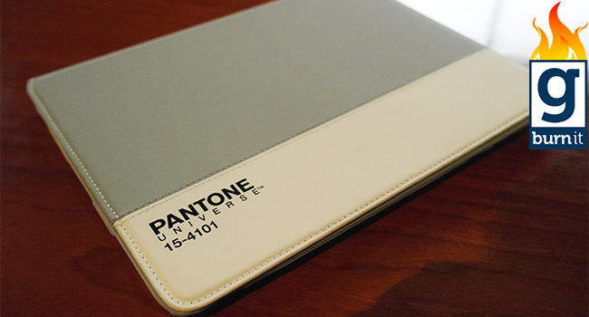
The exterior does come with different design options which gives the iPad some personality. The colour of our case was bone-china white, with an overwhelming patch of skeleton-grey coating the exterior of the book case.
So why have I burned it? As I mentioned, the case is exceptionally bulky and disgustingly expensive. It’s a premium case though and at US$80, represents a significant investment in the iPad’s sex appeal. I’m also pretty much convinced that the iPad is protected from minor knocks and spills, as the case is rock solid. Here’s how I tested it: I placed it against a wall and punched it as hard as I could. I felt the minute bones in my knuckles give in as the Pantone case fought back. My joints swelled and the case remained as a firm, monolithic protector of my prized investment.
But I don’t like it. It’s like a BMW X6. It looks amazing, but feels wrong on every level. It’s like it’s taken what is one of Apple’s finest moments and wrapped it in a blanket of wealth which sneers at the iPad’s humble aesthetic. At what point do we stop and consider what the iPad stands for? Quick, accessible, fun. With the Pantone it becomes a weighty nightmare. Sure, it’s a viewing stand as well but it’s all lost on me. Find the lightest iPad cover you can and stick with that. The Pantone should be relegated to the corner of an art gallery. Pretty, but functionally vapid.


