Donald Trump’s call for Netflix to remove board member Susan Rice has intensified the Paramount saga, pushing the streaming wars into a political confrontation.
Linux Ubuntu 12.10 review: finally growing up

After reviewing the last version of Ubuntu 12 a few months ago I wasn’t too impressed with the OS in general. Ubuntu kept loyal to its obscure following by not dipping its toes into the real reason Windows and OSX are popular. And I’m happy to say that it has finally broken out of that mold with Linux Ubuntu 12.10.
I would like to remind you that this is still a beta and I’m reviewing the work that it has done so far. I usually run beta OS’s because I’m a sucker for them, and I’ve reviewed Windows 8 since the Developer Preview, so this is only fair.
Single core blues
When I installed Ubuntu on my regular setup I noticed it is extremely slow on a single core, 2 GB system where the previous version ran fine. This time I didn’t even run it from a USB stick, this was a pure install from the get go. So I moved over to a Quad Core, 4 GB system and it performed reasonably well. I was seriously surprised by this as the Linux faithful always touted Linux as being the OS to install on dusty old stuff.
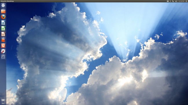
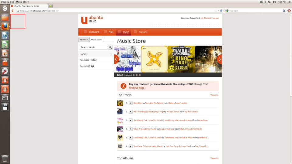
The UI hasn’t changed much from the previous version. The dock still hovers at the left and the taskbar or menu bar will be at the top. There were a few additional programs installed and some pinned websites like Amazon. They finally added an Ubuntu Music store with a few songs if you’re feeling frisky with your credit card.
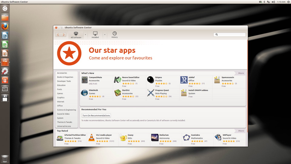
The music store is a website unfortunately and not a dedicated native app like with the App store. The app store however grew by quite a number and now features 46k apps. In stark contrast the Windows 8 store only sports around 2500 right now, but that is growing.
Unstable relations
The OS was extremely unstable and I had applications force quit on me a hundred times, and I saw the nice when you’re suicidal Crash report pop up every now and again. I also had to restart several times because for some reason when I closed settings the entire UI would disappear and leave me hanging. Some of these issues were resolved when I finally found the Software update app.
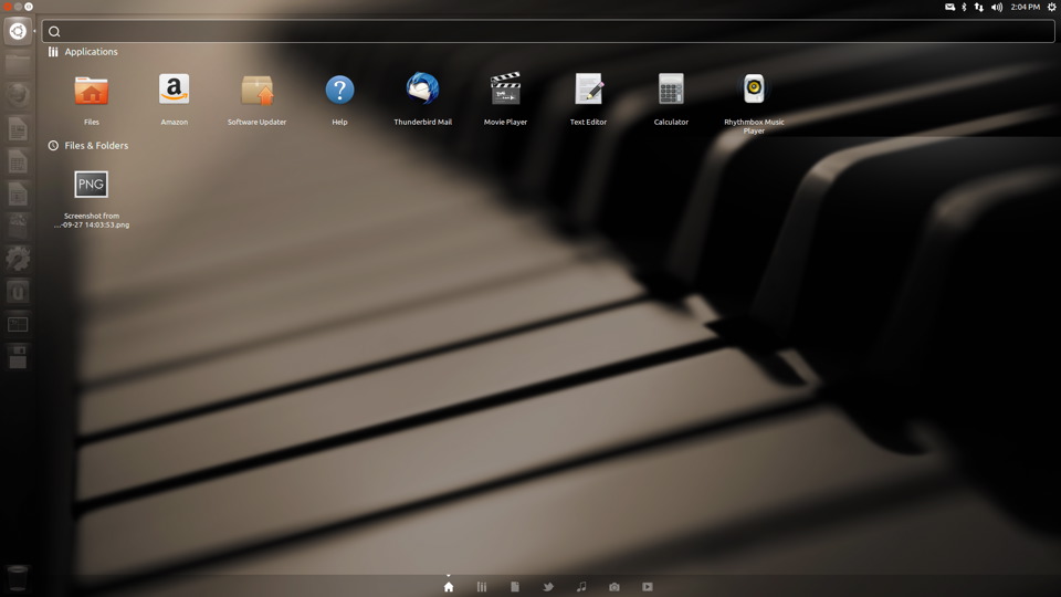
Software update was improved and now only shows a single bar showing progress. However it isn’t in the top right corner under the power button. It’s conveniently moved into the App Dash. I would still prefer it to be in the Settings menu because it seems like the logical place for it.
App improvements
The App Dashboard improved a bit as well. Searching for say Fire (for Firefox), it automatically searches the App store, Music store and Amazon.com. This is quite interesting and it remains to be seen how useful this is. Built in search functions in operating systems have always been a grabbing at straws kind of affair. OSX has that awful Finder with an App Dashboard which don’t complement each other, and Windows 8 comes with a rather unhelpful search function which lets you click one of the hundreds of options. It’s nice to see this Dashboard give you multiple results right on the first page from several apps. This is definitely a plus for Ubuntu.
Security’s improved a bit too. It’s adopted the Apple OSX method of asking for your password every time you look over your shoulder. I appreciate this move however it gets a bit old after five minutes. But being the most secure OS comes with a few negatives.
So I wanted to check how Ubuntu changed upon my original gripes. I wanted to see what would happen if an everyday Linux user wanted to listen to music, or install an app. So I downloaded a random track which seemed appropriate and lo and behold. The built-in media player didn’t even have the plug-ins installed for a standard MP3. I had to install a codec with that password popup box plaguing me again. I would suggest that they include these from the get go. I’m fortunate enough to have fast internet, but what about someone who doesn’t?
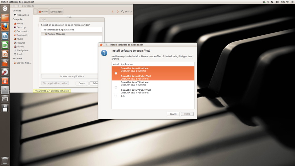
I also downloaded Minecraft and the process is still as tiresome as the previous time, with an additional password request box. Instead of making the process less of a hassle they went and added even more steps to playing your favorite game. I would seriously suggest they include Java and Flash. Also, as I’ve said before, it would be a bit more convenient if they added a ‘Run Anyway’ button when you download a new application. Or make it easier to make apps run as executable files, because having to jump in head first into settings kills the buzz.
LibreOffice were updated to the latest version and it still is as basic as they come. I would still prefer if Microsoft moves Office 2013 to Linux but we can only hope. What I currently enjoy about Office 2013 is the fact that you have all your social networks plugged into Office, and that you can directly save to Skydrive. Maybe Mark should light a fire under the LibreOffice team and let them build some functionality of Ubuntu One into their office suite. I was surprised to see Thunderbird Mail, I thought they killed it off already.
Happy endings
Overall the OS was cleaned up a lot and I have to say it’s becoming a bigger and bigger player in the market, based on how easy to use it is slowly becoming. It’s still a pain in the behind in most cases. Mark, I have to give you a slow clap here. I am looking forward to seeing the final version. Hopefully they’ll make some real changes that would make me actually recommend this to someone.
