With stablecoins gaining traction and regulation improving, African merchants may be nearing a crypto tipping point. Here’s why 2026 could mark a shift from hesitation to adoption.
Meernotes II app review: Moleskine best tread carefully


In July 2011, I reviewed a beautiful note-taking app for iPhone called ‘Molenotes’. If you read the review you’ll remember that I fell in love with it for the way it was designed to look and feel just like the original Moleskine notebooks. I thought, and still think, that it was what the official Moleskine app should’ve been. It was a beautiful, intuitively designed piece of brilliance that brought the feel of an actual notebook to the iPhone. Since then, Fabulously Retro were forced by Moleskine to change the name due to the copyright infringement and it was then rebranded ‘Meernotes’. Now, more than a year later, they’ve released Meernotes II, so lets take a look and see what improvements have been added.
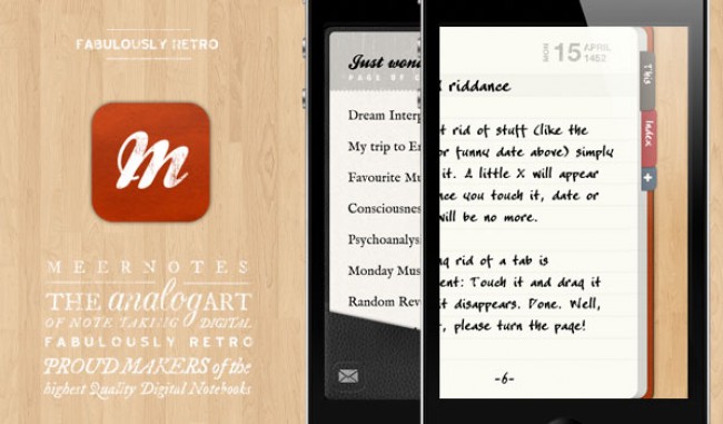
Meernotes II is not just a small jump from the original version, it is a complete overhaul and redesign of everything it was when it first came out. Of course, in principle, it is just a notes app with a beautiful aesthetic edge, but what sets version two apart are the new sets of gestures and features that simplify the process and get you to the core function faster than before.

The bookshelf that you’re greeted with in the beginning has been redesigned and looks so much better than the original version. The wood texture is beautiful and features a logo that looks like it has been pressed into the dark wood of your screen, pure design pleasure.
There are some new notebook covers and font styles to choose from, as well as a few styles that you can buy through the app. Notebooks now feature content pages for easy navigation and sorting of your pages and the app allows you to post pictures in your notebooks too (Camera+ support comes standard with the new version).

The most important update for me however, has to be the new gestures that make this app smooth and easy to use. While writing in one of your notebooks, swipe down a bit and you’re given the option to return to the page of contents, go even further and you can watch yourself close the book and go back to the bookshelf. Swipe up on a page a bit to add a new page, go a little further and you can add a photo, it really is little innovations like these that make a big difference to me. What it also helps with is the uncluttering of the screen, in other words, the buttons normally associated with tasks like I’ve described above are replaced by intelligent gestures that eliminate the need for buttons altogether.
In summary, with all the new features and design tweaks, Fabulously Retro have managed to turn a great app into a brilliant app. Make sure to check it out.

