Anthropic says its AI will not be used to spy on customers, even in government contracts. Here is what that means for AI governance, enterprise trust and defence partnerships.
3 must-have minimalist Android apps
Since I’ve been using Android, and trying to encourage other people to use it, I’ve waxed lyrical about the customisability and open nature of the OS. The sheer number of options available to Android user when it comes to setting up a device exactly to their individual needs is seemingly endless. I’ve tried most of the major launchers, Twitter and Facebook clients, as well as the keyboards. I’ve tried these not out of need, but more out of curiosity, more out of trying to find the best setup for my phone.
Then something strange happened: all the choice became overwhelming. There are too many options, so many things to try. At the heart of it all, these options were slightly overwhelming, so I thought, “let me find some minimalist apps and see how that works out for me.” And I did, and it did, very well.
I’ve always been a fan of minimalism, whether in art, or technology. I believe less is more, and I have three apps that will make any fan of minimalism jump for joy. Let’s tuck in.

Carbon
Fleksy

Sicksky

Flesky
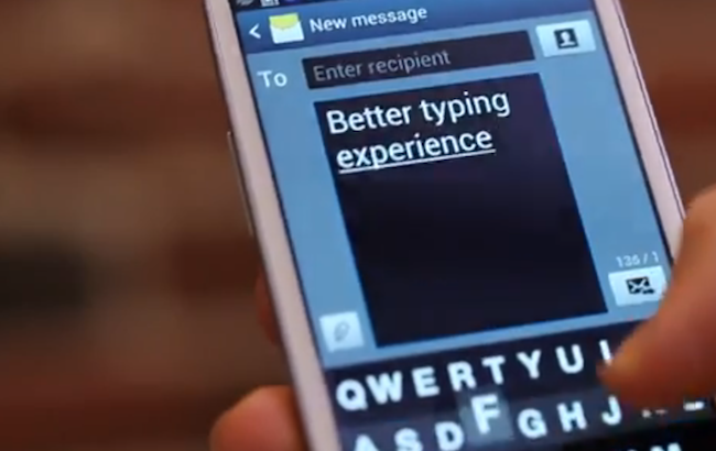
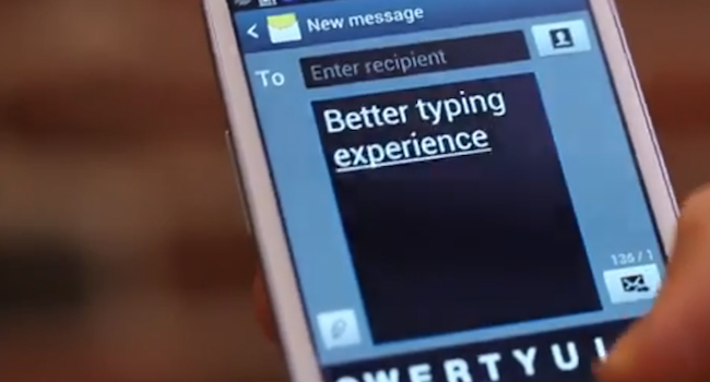
I’ve long been an advocate of the stock Google Keyboard, so when this newcomer reared its head and the beta programme was announced, I downloaded and uninstalled it three times before I "got" it. Its got very little in terms of customisation options, or even settings. Instead it has a very intuitive way of adding words to your custom dictionary, once you are used to it. Most of its interactions are gesture based, there is no swipe, and it won’t predict your next words either. What it does is offer an easy, fast way to type. I should add that this app is still in beta, so join the Google+ community and apply to be a beta tester, and install it from here. That's my keyboard sorted, but what about Twitter? Join the community here and then download the Fleksy beta here
Sicksky
I really like custom launchers like SickSky, because they give you the ability to change the primary UI of the device. It can change how your homescreen looks, behaves and most times will add fantastic functionality to your device. However, when I was running Gingerbread all of three years ago, there was a small custom launcher called Zeam. It was baked into the first ROM I ever flashed on my HTC Desire, and maybe because of that, I’ve really enjoyed using it. That is where SickSky comes in, it’s from the same developer as Zeam, and what is even better is that it’s a local (South African) developer who created it. It gives you one homescreen, a weather “page” as well as a “calendar” equivalent, and an app drawer. That's it. No customising homescreens, no adding widgets, etc. It’s simple, small and quick as lightning. Download the SickSky beta here
Carbon
Now, upon first glance all the animations, transitions and overall gorgeous looks will give the impression that Carbon is a very complicated, intricate and powerful Twitter client. It is one of those things, powerful. It’s not complicated, in fact there are only two settings under “Settings” and they are for notifications of mentions and direct messages. The update interval can’t even be changed from the default of 15 minutes. I thought this would hamper my Twitter experience, without push (realtime) notifications, etc, but I’m happy to report it works fantastically well. It’s had no impact on my battery life, it looks amazing and for simply reading, interacting and browsing Twitter, I can’t recommend this app enough. I’m a massive fan. Sign up for the Carbon beta here
Flesky Android

The reason I like these apps so much is that it, SickSky more than the others, allows me to make the most of core Android functionality. SickSky actually forces me to use lockscreen widgets more, something that stock Android doesn’t really need. That’s because the launcher has multiple screens which can be populated with widgets, where SickSky has none.Carbon has interactive notifications that allow me to reply or quote when someone mentions me on Twitter, and Fleksy has given me back some screen real-estate.
These three minimalist apps make using my device an absolute pleasure. I used to think that the Nexus 4 is fast, and then I implemented this new “system” of mine, and I can honestly say that I’ve noticed an improvement in not only responsiveness, but also in how much I enjoy interacting with my device. And that is kind of the point, isn’t it?
