With stablecoins gaining traction and regulation improving, African merchants may be nearing a crypto tipping point. Here’s why 2026 could mark a shift from hesitation to adoption.
Sony Xperia J review: no small wonder


Sony’s Xperia J is getting on a bit, but it’s still a part of the new Xperia family, some of which I really like. The Xperia J isn’t a good phone though, and it’s pretty costly for what it offers. For US$209, you’re saddled with a plastic lump that’s as ugly to look at, as it is awful to interact with. I dunno, sometimes this job just feels like a job when I have to waste my time with phones like the Xperia J. I think it’s made for one specific market, those with money to burn and who want to complete their Xperia collection. Well those people won’t be disappointed because the Xperia J looks great to display as long as you don’t use it as a phone.
Look and feel
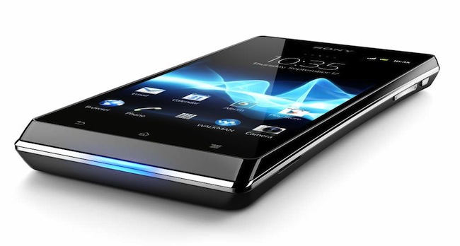
We’re off to a bad start already. The J is oddly shaped, like a black and silver banana. It curves inwards which seems pleasant to hold for a few minutes, but then starts to feel uncomfortable. It looks like it should be such a cool phone to use and hold. It’ s not ugly to look at, no, but it is shoddily built and there are tiny imperfections which bring the look of the J down with even the slightest scrutiny.
At least there’s no external flap covering the charging port, something I don’t like about the other Xperias. So this is the one positive then, I wish Sony could figure this out and place it like so with all its devices. With the good stuff out the way, let’s get back to the bad. The J, when disassembled, feels about as cheap as it gets. The inside looks very tinny, like a cheap trinket. It all slams together and the toy phone look is complete.
The volume and power keys are especially difficult to interact with and are far too small to be useful for anyone. Just too damn small, I have no idea how the J managed to sneak past quality control. The whole package is meant for only the smallest of hands, but I’m sure that kids will get irritated with the slow speed of the J.
Hardware
Here’s the confusing part, the J is loaded with decent hardware, even for a close to year-old device. A 1Ghz CPU, 512MB RAM, 4GB internal memory, a 480×854 display, it all looks great on paper that’s for sure. But none of it really adds us, cause the J is slow, like it drags everything it does through mud.
The usual suite of apps like Facebook, Twitter, Whatsapp and Candy Crush Saga ran poorly and crashed daily. Facebook performance was especially poor. Here’s an app I use more than I should and it crashed many times, lagged, never seemed to connect to the wi-fi and so on. Is it down to hardware? Hell yeah, this is the first time that one of these little bastards has given me so much flak.
The phone comes with a bunch of extras, none of which really make the J a more attractive purchase. There’s a 5MP camera that makes every image blurry, Bluetooth which took away the pain of having to listen to the built-in sound (I streamed audio to an external device) and not much else. Well, there’s a nice little light that flashes on the bottom of the phone when a notification comes in.
Oh right, as a phone it’s almost unusable. Voice calls were garbled or extremely echoey. Even answering the phone is a hit or miss affair, with my touch not registering as I swiped to answer. What a waste, lord it makes my teeth hurt. The radio’s okay though, and if the J was a third of this price, it would be a good media player. But it’s expensive, so let’s take a step back and reassess the situation. It’s US$210 for a very buggy, crash-prone Android device that doesn’t make the best of a decent set of mid-range specs. At that price, the lack of speed is a disappointment.
Android
My Xperia J automatically upgraded from Ice Cream Sandwich to Jelly Bean after a few hours of use and I can’t tell if it was slower before or after. It’s a jerky OS and on this small screen it’s the worst version of Android you’ve yet seen. Everything that my other Xperia’s had, so did the J but it didn’t once feel like a smooth or intuitive process.
The usual fun I have with Android is replicating the same screen from device to device. My last Xperia was the more than capable V, where the screen was bright and clear. The same app shortcuts, widgets and so on were copied over to the screen of the J, it just looked cramped and low-res now.
Everything has a low-res look, but Android does the best it can as it tries to adapt each app to the smaller screen of the J. But in doing so, this pared-down version of Android can’t even keep up with its cleverness. The pull-down bar, never mind that it barely registers a drag from the top, sometimes won’t register my touch. I usually had to tap each shortcut (wi-fi, Bluetooth) multiple times to active it. That’s just one example, but maybe it’s down to the hardware? Doubtful, as I’ve used tablets and phones with the same 1GHz CPU and the Android experience was miles better.
So that’s the bottom line then for Android on the J. For some reason, it’s a lazy port. Something to do with money? Only Sony knows.
verdict: I didn’t like the J at all. Spend a little bit more and get the Samsung Galaxy S III Mini. It’s much faster, looks better, won’t lag during even the simplest of tasks and generally beats the J in every aspect.
score: 3/10


