Bitcoin has surged to its highest level in a month as global risk sentiment improves and Donald Trump signals renewed support for the crypto sector.
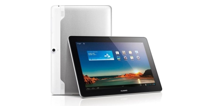
Huawei MediaPad 10 Link review: the vanilla ice cream tablet


Huawei’s MediaPad 10 Link is an attractive 10” tablet at first glance. Then you see how much it costs and what it does, and a tiny drill with the words etched “oh hell no” bores into your skull. There’s nothing wrong with the 10 Link, but there’s also nothing worth recommending it about either. If you’re in the market for a 10” tablet that costs R4 499 (listed as on some sites as US$600) and does exactly what every other tablet does, read on.
“Extremely fast” it isn’t
One of the first lines you’ll read on the site is “Extreme fast”. Funny though, because the quad-core 1.2Ghz CPU is anything but. Performance on Android 4.0 (Ice Cream Sandwich) should be slick and fast, yet everything is as average as possible. Especially the built-in web browser. I’m used to flying across the internet with my Samsung Galaxy S4, not crawling like a pensioner in the fast lane. There were also odd slowdowns, none of which doesn’t seem necessary. It’s as if the 10 Link missed out on device orientation day. With even a little bit more love and care, it could have been an okay Android experience.
Games I tested included Cut the Rope, Angry Birds: who cares anymore edition, Shadowgun, Street Fighter and Real Racing 3. Each ran from good to terrible, in that order. And it’s not a 1.2Ghz CPU thing. I’ve used less expensive, and less “extremely fast” tablets than the 10 Link and each handled and looked better on those (Galaxy Tab 10.1 springs to mind and is still one of the best “older” tablets for very little money, comparatively.)
A dull display
I’m not sure what the issue is with the display. Bland is the word. Colours look dull, there’s ghosting in the videos and if there’s any pressure from the knees, lap or fingers, the screen distorts like an old calculator. The 1280×800 isn’t worth tweeting, writing home or even thinking about. Do you know what type of display you can get for R4 499? 2048×1536 on the 4th-generation iPad. Hell, the Nexus 7 is almost half the price of the 10 Link and has the same resolution. Also, it’s only 7”. It’s a smaller package with the same screen resolution and it’s practically 50% cheaper. One positive, the screen is very bright. Still, with a dreary display, a brighter screen only highlights the issues. So the screen is well below par, what else?
Budget build quality
Everything about the design of the 10 Link screams generically built. The way the camera sticks out on the back (it’s an awful 3MP-rear and 0.3-front set of cameras) is amateur hour. The odd white/gunmetal combo of colours on the rear is baffling in design and the 10 Link feels like a tablet designed slapped together by the B-team over at Huawei. It’s trying to be a current-generation tablet, but looks worse than the first-gen iPad. What’s overwhelmingly positive is the battery life. The 6600mAh battery went for days. Even after I stopped using the tablet out of sheer boredom, I came back to it a week later and it still had enough juice for a few hours of work. So if battery life is your desire, the 10 Link delivers.
There’s no physical buttons on the 10 Link, everything is handled by Android’s software buttons. Home, Back and Menu are your only guides. That and the blind faith that one day the 10 Link will be better than its humble shell and OS.
It starts out looking great, all fresh and ready in the box. But it nicks and scratches easily and when the metal begins to tarnish, the device looks remarkably cheap. An iPad looks like an antique chest of drawers as it ages. I wager that after a year with the 10 Link, it’ll resemble an old flat-screen TV.
Android, is it even made for tablets?
If there’s one thing I am grateful for, it’s the disparity in Android that I discovered. I’ll explain in detail. Android is fantastic on smaller devices but as I found out, It’s fairly cumbersome on a tablet, even the most high-end ones (Xperia Tablet Z).
On the 10 Link, Android 4.0 doesn’t even make full use of the homescreen width. For some insane reason, there’s a limit to how many app shortcuts you can place and it’s immensely irritating. I don’t think that Android, in its current form, should be on 10″ tablets at all. The format is too different; optimizing the experience for both mobile and tablet is harder, and mobile won that battle years ago. There’s no magic bullet. So you end up with a jack-of-two-trades-not-quite-a-master-of-either situation. I simply never realized it before using the 10 Link. I feel like some magical illusion has been shattered.
On a crazy-fantastic Android tablet (Galaxy Note 10.1 2014 Edition), there’s usually a skinned UI carefully layered over the default OS’ interface. Here, there’s just blandness. And don’t even bother searching for a dedicated app screen. Every app is on the homescreen, you just swipe left to get at it. It’s confusing and dumb. Every Android user ever knows that apps go onto a separate app page, so why tie it to the homescreen? Why even bother unifying it?
Verdict: The endless battery life saves the 10 Link. Without that, there’d be nothing left to recommend. It’s below average in every way, costs way too much and has shattered my Android tablet experience. That alone deserves a punishing score.
Score: 5/10
Here’s the full specs for the 10 Link. I don’t have the strength to go on.


