South Africa’s retail forex industry is entering a decisive phase as regulation tightens and consolidation accelerates. What does it mean for brokers and traders?
Watch this: 11 fabulous and free Fitbit Versa 2 watchfaces
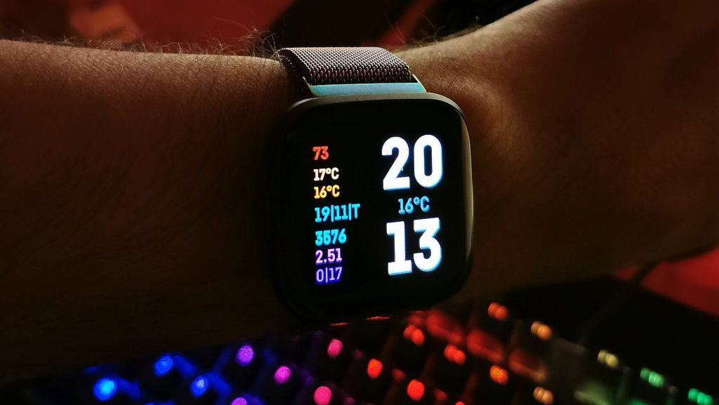
Fitbit’s ecosystem has improved in leaps and bounds since I last used it with the Ionic. There weren’t many useful apps around, let alone apps in general, and the watch faces were as dull as Wear OS’s selection. But that’s changed since the Fitbit Versa 2 debuted.
I’ve been using the watch now for a little over a month, and have a penchant for choosing a different face every few days. It’s safe to say I’ve built up a little selection of favourites.
To find each, simply search their names in Fitbit’s clock face store.
WhateverClock Classic
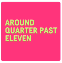
Inspired by a Pebble watch face, WhateverClock Classic is perfect for those who couldn’t care less what the time actually is. It’s as simple as a clock face can get, but you may want something else if you need the exact time.
Grad Times
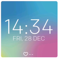
This face changes its collage of colours based on the time of day, so expect to see dark blues in the evening, light blues in the morning, and blushing pinks in the afternoon.
Crypto
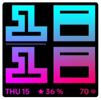
For the love of pink and purple and large, confusing fonts. Crypto’s a great face to match brightly-coloured straps. It also displays your total activity goal progress in the form of a percentage alongside the date and current heart rate in the lower portion of the screen.
Percision
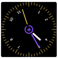
Elegant and trendy, Percision is for people who want a digital but analog face. It features stacks of colour options, and the “random” option in particular is perfect for those who like to be surprised.
FLANK
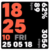
It’s a busy face, but FLANK does remind me of the original faces we saw on the Blaze. It shows the brightly-coloured time and date horizontally, while steps, heart-rate and battery remaining are displayed vertically.
Modern Analog
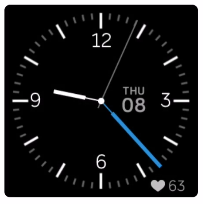
Beautifully simple. It’s a face that displays the time and little else. And if you want the heart-rate to be hidden, you can by painting it black.
Colfaxness
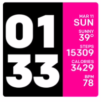
Bold and easy to read, Colfaxness adds a splash of colour in the sidebar and leaves plenty of room for stats. There’s also an option to display today’s weather details, although I couldn’t quite get it to work.
Multilingual Clock Face
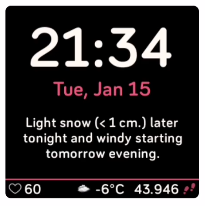
Fan of Dark Sky’s forecasts? This face leaves plenty of room for them, and displays the current temperature in the lower bar. Despite its focus on weather, it’s also easy to read the date and time. Tapping on the forecast brings up another screen with even more weather info.
Digilog
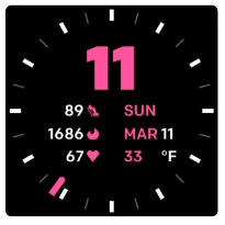
An analog-digital combo, Digilog colours indicators while leaving important stats white which constrasts well with the dark background. Like Colfaxness, it also displays the current weather, but I just couldn’t get it to work.
Cube

Big. Bold. Brash. And beautifully customisable. Cube is exactly what it says on the tin. The time can take up the entire face in one config, or can be shrunk slightly in another. Tapping on it also gives you access to more intricate stats.
Orda
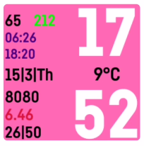
Loaded with text but somehow doesn’t feel busy, Orda is one ridiculously customisable face. Each line can be coloured differently, making it easier to pick out specific stats or information. The current temperature separates the hour and minutes, and the face can even display feet above sea level (albeit not very accurately).
Feature image: Andy Walker/Memeburn

