Sony launches the WF-1000XM6 in South Africa with upgraded noise cancelling, better call clarity and premium sound. Pricing starts at R7,999.
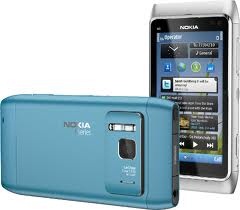
N8: Nokia almost delivers a really great phone

 Let’s get right to the question you’re begging to have answered. Because if you’re not asking it, you’re probably already into iPhones or Blackberries or some other hippy-open-whatchamacallit-wotsit made by HTC. The question on everyone’s lips is, of course: “Is the Nokia N8 any good?” Which really means, “Should I, as a Nokia loyalist (or disenchanted refugee from some other phone that’s just pissed me off one time too many) buy one, and keep the torch burning for the clever little elves deep in the cold wintry wastes of Espoo?”
In a word, yes. The N8 is a bloody good piece of technology. Firstly, it’s built like a tank, in the old Nokia way where after two years it’s scarred, scratched and stained, but not cracked, and still letting you phone people. You get excellent performance from all the bits, from neatly machined switches to perfectly aligned seams. Great sound quality for music. An accurate, responsive display. Phenomenal 12MP auto-focus camera. Gobs of connectivity options. Top-notch call quality. A full-on HDMI port, ferchrissakes!

Being a clever clogs, you’ll have noticed something missing from that list of superlatives. Yes, mention of the software. Or anything to do with Ovi.
There’s been plenty of ink spilled about the volcanic eruptions of senior management at Nokia, with kiss and tell stories aplenty (read them here, it’s a salutary tale in corporate hubris and MBA groupthink).
You probably know all about the missteps and neglect of Symbian, and the fiasco that finally resulted in Symbian^3 (er…Meego, no Symbian^4, no, Moblin, or Maemo, Meeblin S60 5th edition^2, oh whatever). You’ll have read about the top Finnish bod being hoofed for the first time since 1865 to replace him with an American, from Microsoft, no less. (No tittering at the back. He led the highly competitive MS Business solutions group, not Vista or Xbox or Zune or Bing or any other millstone). At this point things are not looking good.
But back to the N8. It’s not the cutting edge of interface design, or Social Media integration, or iPhoneness. Quite frankly, I don’t care. My phone is a tool, not a social statement. First and foremost, it must make phoning and messaging people easy and reliable.
It must provide powerful messaging capabilities, basic document editing, Web browsing, and multimedia (music and camera, mostly, although video output is welcome for weekends away).
This the N8 does in spades.
Firstly – what a great camera. 12MP (which means very little, an old Nikon 40D was 6MP and would blow it out the water), but with Carl Zeiss optics (yes, it’s about the glass, stupid!), autofocus and mechanical aperture and Xenon flash. You can take very decent pics – the only major flaw is the lens cover, which flares very badly if you get a stray beam of light across it. It’ll do 25fps 720p video.
Secondly – what a great screen. 3.5” AMOLED 640×360 pixels, it’s bright, crisp and very responsive to touch.
16GB internal memory, expandable with SD cards (up to 32GB), and while it doesn’t have a terribly powerful processor (680MHZ ARM 11) it has a graphics co-processor, so it’s more than fast enough.
So, once again, Nokia delivers a great piece of hardware.
Unfortunately, it needed at least another three months of software tweaking.
Apple understands this – build a piece of hardware, and relentlessly optimise the software, so that every possible functional iota can be squeezed from it.
The N8 is frustratingly bitty. The new Symbian is fine(ish) – it’s the details that make it feel so behind the curve.
Home screen and widgets are not great but I don’t care, that’s not my cup of tea anyway. Although the Facebook/Twitter widget just fires up an Ovi wrapper app.
The new Symbian still has a menu structure that makes you have to drop through Menu/Settings/Connectivity/Buetooth/Bluetooth On/ just to turn the BT radio on. Seriously, Nokia. Sure I can re-arrange things to make a shortcut, but why make me bother?
Not enough thought has gone into usability to take real advantage of the hardware. The most obvious thing you want to do with a digital camera is take a pic, and then zoom into it to check if it’s sharp (it’s a 12MP image, dammit!). No, on the N8 you have to fire up the media browser to do that.
It’s inconsistent. In some apps you can do pinch/spread with multi-touch, in some apps you can both pinch or use the +/- rocker switch on the side, in some apps you can just use the rocker. Why not pick a standard and stick to it?
Like starting a new message and EVERY TIME having to tap the screen to start up the touch keyboard. What do you think I’m starting a new message for, Nokia? To gaze adoringly at the blank recipient and message fields?
Just a few months (or even weeks) of tweaking, and most of the little interface stupidities could have been solved.
But Nokia doesn’t seem to grasp that usability does not equal more features. And besides, it’s still wasting resources trying to turn that dog called Ovi into something palatable.
With any luck, Nokia will do some more work on the N8’s firmware, and improve usability. The Nokia hacker community will certainly create some brilliant workarounds. Which is partly what gives Nokia phones their charm – the ability to tweak and improve.
So, the verdict. The N8 is a great piece of hardware, with very functional, albeit somewhat annoying, software and user interface. If you love Nokia, or love tweaking a device to your exact preferences because you expect to use it as a loyal and useful tool for the next two to three years, then this is the phone for you.
The more you use it, the more you customise it, the more you’ll love it.
However, if you’re a phone dilettante that loves cute little apps and hipster style points, get an iPhone. The N8 will drive you mad.


