South Africa’s new school year has begun with renewed attention on digital inclusion. MTN South Africa, through the MTN SA Foundation, has provided digital…
Sony SmartWatch 2 review: it’s not bad


The best compliment I can give Sony’s SmartWatch 2 is that it works. I still believe that wearable devices are in their infancy, and the SmartWatch 2 is proof of this. While it’s filled with great ideas, a readable screen and actually looks like a fairly cool watch, the SmartWatch 2 is still more a novelty than an essential gadget buy.
Here’s the question you’ll be asking yourself: “Why do I need a smartwatch when everything I need is right on my smartphone?” And it’s a great question, a succinct one at that. Why does anyone need the SmartWatch 2 (SW2 as Sony calls it, and so will I for the remainder of the review)? Because it’s a decent second-screen for your notifications and I actually found myself keeping my phone in my pocket. When a notification came in, the SW2 buzzed, I quickly scanned my messages and carried on with my life. There’s not much else to the SW2 outside of it being an incredibly pricey notification hub, but it does carry with it a few nifty built-in apps, as well as ones that need to be downloaded after the fact.
When the SW1 came out two years ago, it was lauded as an unusable mess. It never synced correctly with my smartphone, it rarely worked when it should have and the battery life was appaling. As of right now, Sony’s fixed two out of the three issues I have — it’s just a shame the battery life is still haphazard at best. I managed to get roughly a day of use from the SW2.
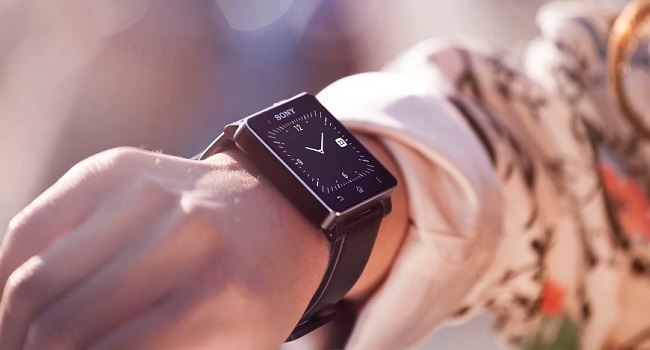
What I love is the design of the SW2. Sony’s created an epic smartwatch, a device that looks at home on mostly anyone’s wrist, thanks to two watch-strap designs and a host of funky colours. The SW1 was chunky and homely, the sort of device only a mother Android could love. The SW2 is stellar and iconic but not in the way that it’ll still look cool in a decade or so. It actually resembles a phone icon, with a “squircle” design which would be at home on iOS 7. The subtle silver edging and beautiful power button neatly accentuates the black bezel which houses a, for lack of a better word, cute 1.6-inch, 22×176 display. The screens pixels are a little large though and can make for a blurry display; for those of us who’re used to Retina Displays, the way the SW2 renders images will not impress.
My SW2 was plain as old boots. A black bezel matched with a rubber black strap. But take note, young trend-setters, there are seven nifty straps to select from. If I could choose, I’d go for the light-brown leather.
Android compatibility
What I despised about the SW1 is that it would only sync with Sony Xperias, which is fair enough because the interface and look of the SW’s operating system is a miniaturised version of the Xperia. But it pissed me off; I had a Galaxy S3 at the time and the SW1 wouldn’t play nicely with it. The SW2 however, synced with my LG G Pro Lite in a matter of minutes. With Bluetooth or NFC on, the SW2 paired with my LG and from there it was a matter of installing a bunch of apps. I’ve loaded Facebook, Twitter, WhatsApp and Gmail. Sometimes though, it can become a bit too much.
Overwhelming
Here are the two sides to the smartwatch coin: the shiny side is politeness; no more will you or I have to pull out our phone when it’s ringing or buzzing with notifications. Just tap the screen when a notification shows up and quickly scroll through the messages. To go to the next notification, just flick the screen to the left or right. It’s incredibly intuitive and Sony’s scored major points with the feel of the OS. On the rotten side, we could easily go on with our existence without ever strapping the SW2 to our wrists. Here is a device that’s ancillary to our lives to the point where it’s downright obnoxious. I’m not Dick Tracey or a businessman from the future, I don’t need a device that acts as a tiny monitor into my life. The SW2 becomes a constant nag, buzzing and lighting up every minute or so. It makes me less of a human being, and more of an observer. What if you were always connected? While smartphones can be stored in a pocket or at a charging dock, the SW2 is always on, and forever buzzing with activity.
Even for those who can handle the onslaught of notifications, it’ll still become too much and this time, I’m speaking about the SW2, not us. The notification centre (a yellow bubble on the home screen which collects all messages) caps at 99. It’s a fairly ugly way of storing messages, and for those with busy fingers you’ll be spending most of your day playing catchup with the notification parade.
Easy rider
Keeping the SW2 customised to your needs is a snap at least. There are thirty or so apps, and they do their job well enough. Once you’ve set up the SW2, you’ll most likely never dive into the app downloads again. I have social media and email notifications, a flash-light, timer, call handler, calender, alarm clock and remote camera control. Anything else and I think my wrist would explode.
Yet as I said, it’s all handed well enough. I think though that the overwhelming selection of apps is what keeps the battery life down, as Sony advertises four days of use – I could squeeze a day and a half with some luck. The SW2 also takes an age to charge from its microUSB socket.
Verdict:
There’s nothing really wrong with the SW2, and for US$169, it costs as much as a middle-range watch. So for your money, you’re getting a great-looking watch, with a screen that’s a bit too tiny to support the myriad notifications on it. But again, the SW2 actually does what it sets out to do without much fuss. It’s just not that necessary yet. If you’re looking for a smartwatch, the SW2 is the best there is, for now. That is until a certain fruit company comes out with its smartwatch. Then the world will truly sit up and take notice.
Score: 7/10


