With youth unemployment above 60 percent, South Africa is betting on digital skills to drive inclusive growth. Here is how MICT SETA is positioning the next generation for the Fourth Industrial Revolution.
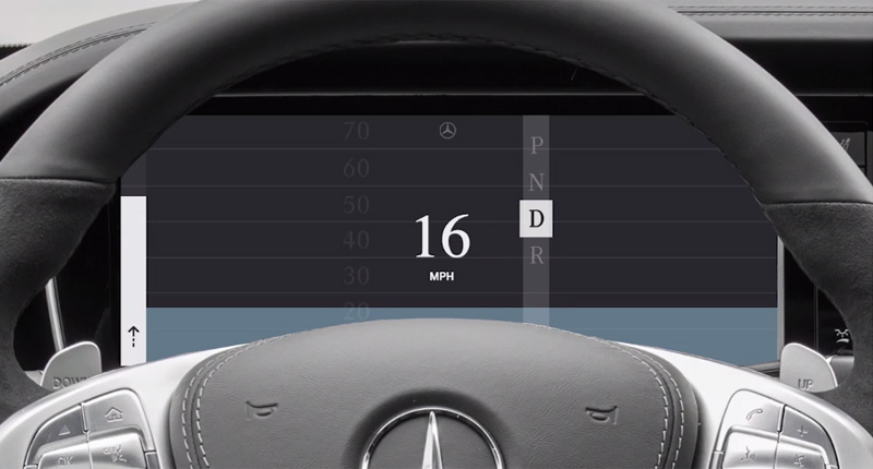
Is this what the instrument cluster of the future should look like?

Unless you’re getting into the kind of car that requires donning a boiler suit, chances are you’ll find the instrument cluster behind the wheel pretty familiar. Just because something’s been a certain way for a long time though, doesn’t mean that’s the way it should always be. That seems to be the thinking behind an experimental driver interface developed by Ustwo.
The interface is a massive break from traditional instrument clusters, as well as the skeumorphic digital replicas which have replaced them in more contemporary vehicles.
In an official blog post, the company (better known for making games than driving interfaces) says it believes it “can make better use of the screen real estate by clearly showing the right information at the right time”.
“With this contextual empathy in place,” it says, “we can then increase situational awareness for the driver – when passing a school during collection time, in adverse weather conditions, accidents, road works, a slippery road and so on”.
It’s produced an accompanying video which illustrates what it’s trying to achieve with the reimagined design. And if we’re honest, it looks pretty damn awesome if not exactly flash:
ustwo reimagines the in-car cluster from ustwo on Vimeo.
The blog post and video are just the tip of the iceberg though. Ustwo has actually released an ebook on how car interfaces could be adapted for contemporary motoring.
The tome covers everything from gesture control to connectivity and branding and all of it designed with a simple goal in mind: to make the driving experience better and safer. Of course, it’s unclear whether it’ll actually achieve that. Whatever happens though, it’s a pretty interesting experiment.

