Samsung heads into CES 2026 with momentum Samsung Electronics is closing out 2025 with a strong signal of where its future tech ambitions lie….
Action Launcher review: a better Android interface


Over the past few months, my interest in Android has started waning a little if I am honest, but let me explain why. It’s mostly because my Galaxy Nexus is starting to act its age: it stutters, reboots, has a terrible battery life and has annoying bugs, but considering my Nexus 4 is on the way, it’ll be rectified soon. Until then, I’m excited to report that I’ve found another app that completely transformed the way I use my phone.
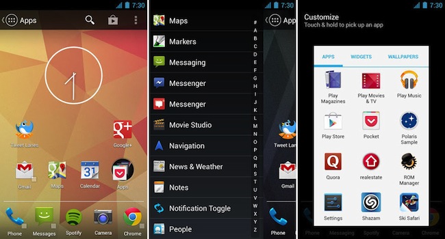
Action Launcher is brought to you by the same developer, Chris Lacy, who developed the Twitter client, Tweet Lanes. Lacy aims to make you interact more logically with your phone and both of his apps do just that. Action Launcher makes fantastic use of gestures and adds one of the coolest features I’ve seen on Android, namely, Covers.
Android’s default launcher (and remember, I use Nexus devices, so it’s stock Android that I am referring to) allows you very little in terms of actual customisation, so I enjoy trying different launchers to get the most out of my device. I’ve tried Nova, Apex, ADW, Holo and others, but for me, they can’t touch Action Launcher.
So what is the difference between Action Launcher and the stock launcher? Well, the stock launcher gives you five homescreens to populate with widgets, shortcuts and apps. Action Launcher gives you the ability to choose how many pages you have, because I’ve noticed that I really don’t need five homescreens, as two works perfectly for my needs.
In the stock launcher, you have your dock at the bottom of your homescreens and it consists of five icons, a shortcut to your app drawer in the middle and two icons to either side. All you can do to it is change the apps to either side and add folders if you like, however, that’s where Action Launcher just flat-out smokes the stock offering. You can determine how many apps are in the drawer, but you can also use a “cover” to provide some extra functionality.
Covers function in much the same way as folders on your homescreen, except that you can add in not only app shortcuts, but 1×1 widgets as well. Think direct dial, WhatsApp contacts, and internet bookmarks. However, the biggest difference between covers and folders is how these are displayed. Traditionally folders display the icons of the apps within the folder (up to three of them) all nested nicely in a round icon. However, with covers, you can decide which app icon to display by placing it first in the expanded cover and the only way you can tell it’s not a normal app is by the small square indicator to the bottom right of the icon.
The result of this is not only cosmetic, but it also doubles as a direct shortcut to the selected app. To bring up the “hidden” shortcuts all you need to do is swipe vertically, or double tap on the app to reveal your selected shortcuts or widgets.
Other features of Action Launcher are (this is straight from the Google Play page):
- Sliding app drawer for instant access to all your apps
- ‘Covers’, an innovative new way to quickly launch apps and shortcuts without compromising the look of your carefully crafted homescreen.
- Quicksearch, a fast and powerful feature that allows you to search for apps, contacts and even music directly from the action bar.
- Android’s unique and powerful action bar is fully integrated into your desktop.
- Highly organized customization options
- All of the settings you expect from custom launcher: specify apps to hide, adjustable number of home screen pages, grid sizes, page margins, dock toggles, resize any widget, etc.
- Strong Play Store integration
I urge you to give it a try, it’s not a free app, but the couple of bucks it’ll set you back will be well worth it. Action Launcher is US$3.99 and can be downloaded here.

