Donald Trump’s call for Netflix to remove board member Susan Rice has intensified the Paramount saga, pushing the streaming wars into a political confrontation.
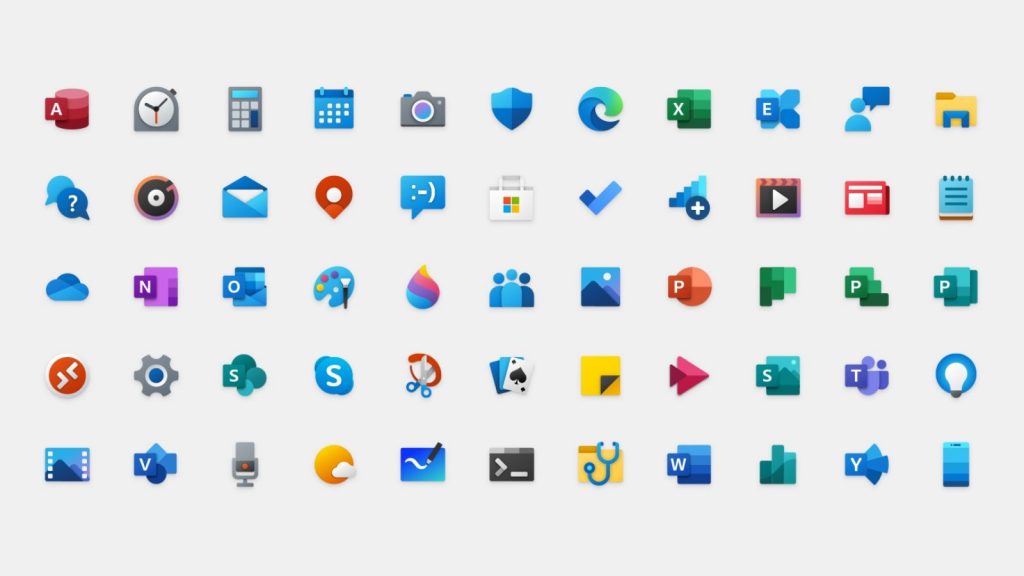
These are Microsoft’s new Fluent Design app icons for Windows 10, other OSes

Microsoft on Thursday officially began rolling out its new Fluent Design app icons featuring more colourful, modern elements.
Similar to the Office icon redesign launched in 2018, the new look simplifies Microsoft’s traditional icons and includes rounded corners as well as eye-catching tones of colour.
“The addition of colour also gives a cohesive design language across platforms: the icon that’s familiar in Windows 10 is the same on Android, iOS, and Mac, providing a wayfinding path across your digital life,” Microsoft explained on its blog.
According to the company, the new icons will appear when users update their apps from the Microsoft Store.
Back in January, Microsoft also released its new Edge Chromium browser with an icon redesign and several updated features too.
Feature image: Microsoft


