Sony launches the WF-1000XM6 in South Africa with upgraded noise cancelling, better call clarity and premium sound. Pricing starts at R7,999.
Review: The Xperia Neo, shiny like a Chinese stereo
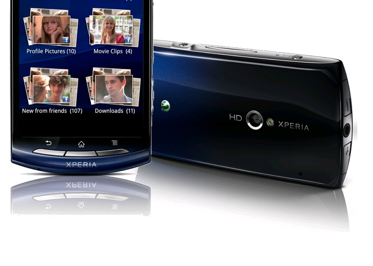
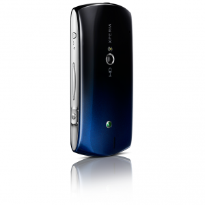
Looking for a midrange smartphone, want Android, don’t want to shell out iPhone prices? Look no further than the Sony Ericsson Xperia Neo. Just don’t look at it too closely: sleek and modern lines, but with chrome accents that wouldn’t look amiss on a 1995 Panasony clock radio. Deeply flawed, but also deeply functional – good value for money, but could be better.
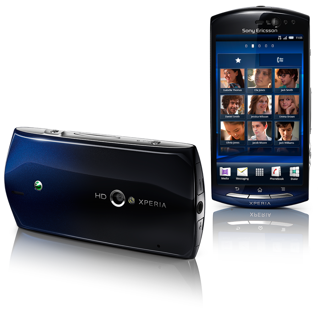
Now that the high end of the smartphone market is pretty much locked in a Galaxy vs iPhone vs Motorola neck-and-neck, the ding-dong battle is to crack the midrange smartphone racket. And it’s all Android, here. This has given Sony Ericsson a last gasp attempt to get back in the game after its disastrous Windows Mobile strategy and a string of lacklustre midrange phones. The new Android-based Xperias are pretty nice – affordable (US$500-odd) and good looking, and with all the Androidy goodness you’d expect.
Sony Ericsson is unfortunately dropping the ball by model proliferation (there is an Xperia pro, a neo, neo V (exactly the same as the neo, but with a 5MP camera), arc, arc S, ray, mini, mini pro, Play, X8, active, X10, X10 mini, X10 mini pro. So many models, so little between them, so much time and energy wasted that could be better spent making better phones. Fixing little things. Usability things.
 We liked the Xperia arc. Super-compact, small enough to lose in your pocket, big enough to be sorta useful as a smartphone (i.e. browser-able screen and typeable onscreen keyboard). Not a powerhouse, but good to go to get you going with the growing smartphone tone. The Xperia neo is bigger, more expensive, higher profile – and small flaws acceptable in the lower end models become a compromise too far.
As per Gearburn standard operating policy, before we get the homing-daggers out, we throw the manufacturer a few bones.
All good on the spec front
The Xperia neo is an excellent choice as a midrange phone – nicely specced, good build quality, bright, sharp screen and responsive operating environment.
Its big selling points are the 8.1MP camera and “Mobile Bravia Engine” for better picture and video display. It’s got HDMI out, all the better for HD video watching, and Exmor R for mobile camera sensor for better low-light snapping.
Which when you look at it closely leaves you with a large bag of not very much.
If one was to be generous, you can sum up the Xperia neo as a solid performer. If one was to be Gearburn, you could dis it as largely unimpressive.
It hums, but does it know the words?
The phone hums along pretty snappily with its 1GHz Scorpion processor, and cycle-hungry functions like GPS kick in fast, so no complaints there.
 The camera is pretty meh. Sure, it’s 8.1 megapixel with nucleo-kryptonite quantum boggle engines, but it only takes average pictures. If you zoom in to any level at all when snapping, the picture instantly grains up. Edges are not crisp, and contrast is only adequate. Image processing is heavy-handed, and you have no control over compression. And, like so many phone cameras, get any bright lights in the frame and the image flares over. That being said, the Exmor sensor does a good fist of low-light shots.
Midrange is as midrange does
It’s also clearly been designed to hit its price point – it’s certainly not the skinniest handset. The bevels and curves hide the flab a bit, but it’s certainly chunky around the middle.
What is disappointing is the battery life. On a full-blooded kick-ass smartphone you can maybe excuse a single day charge. On a mid-range, mid-horsepowered model having to recharge every single day is a bit much. If you eke it out a bit (WiFi off, GPS off, background data off, not too much use) you can get it to last a whole weekend, but no more.
The screen sensitivity leaves a lot to be desired. Inaccurate keypresses are legion, and Sony Ericsson’s not terribly smart predictive text then ties you in knots. The design of the soft keyboard is also not quite on the button, so you’re frequently having to call up the symbols page to get punctuation that the auto-text doesn’t get right.
It may be a personal preference thing, but the design of the standard Android return/home/menu buttons on the front of the phone is suspect. When you’re using a touch screen phone, you’re swiping and stroking and tapping – and then suddenly have to transition to pressing a button. Pressing quite hard. Incongruous. The camera key and volume/zoom rocker on the top are well executed, though.
And lastly: the user interface desperately needs improvements. Not nearly enough attention is given to making it easy and fast to use. The phone dialler still doesn’t auto-search to give matching address book entries as you type. Almost every other Android phone out there does. No, with Sony Ericsson you’re either typing in the whole number, or opening the address book. Interface fail.
Anti-social media
Sony Ericsson’s social media and messaging integration is pretty poor – although for me that’s a bonus. I don’t like my phone’s manufacturer curating my various communication and social media channels (especially not storing my logins). You get Sony Ericsson’s TimeScape, which brings together SMS, Facebook, Twitter and your last phone calls, but not email (it appears to be able to handle email as there is one “chat” type icon for SMS messages, and what looks like an envelope icon for email… that shows you SMS messages.
Widgets are strangely feeble. No email widget, one-size mini-calendar widget (the built-in calendar app incidentally refused point blank to add events – install Jorte, it’s ugly but effective). And no torch app!
Getting to the bottom line
The 3.7” display is really very decent. You get 480×854 pixels for a roughly 265ppi density, and it’s punchy and bright (with a non-configurable auto-dim that actually works — HTC I’m looking at you). It’s not bright enough for bright sun though – although to be fair few displays are.
Do we gear it or burn it? Hard call. It’s a solid performer, but the dubious styling and under-thought user interface is not up to scratch. It’s like Nascar – when you’re competing in the Android world where everyone is racing the same car. it’s the little things that make you the winner.
Who it’s for:
The smartphone buyer that wants a mid-size phone, but hasn’t got the wonga for an iPhone.
What we liked:
- Pretty good looking (if slightly chintzy with all chrome detailing) if you’re tired of ‘oblong gloss black’
- Good specs for the price range
- Display glass is a definite step up from its cheaper siblings (arc, etc)
What we didn’t like:
- Have a strong suspicion that time, scrapes and dings will have it looking tatty
- Text entry is not the smartest, and the soft keyboard not as accurate as it could be (and buttons on front too stiff)
- Dull apps and widgets
- Poor battery life
Unedited sample pictures from the phone’s camera (click for full size):


