Bitcoin has surged to its highest level in a month as global risk sentiment improves and Donald Trump signals renewed support for the crypto sector.
PS4 interface revealed and it looks slick as hell

Just a quick one for now. Sony, care of Edge.com has released screenshots focused on the user interface of the upcoming PS4. While we didn’t get to see much of the interface at the PS4 launch event two weeks ago, we certainly are spoiled for choice now. Here’s our selection of the juiciest PS4 user interface shots and a brief explanation for each one. Relish.
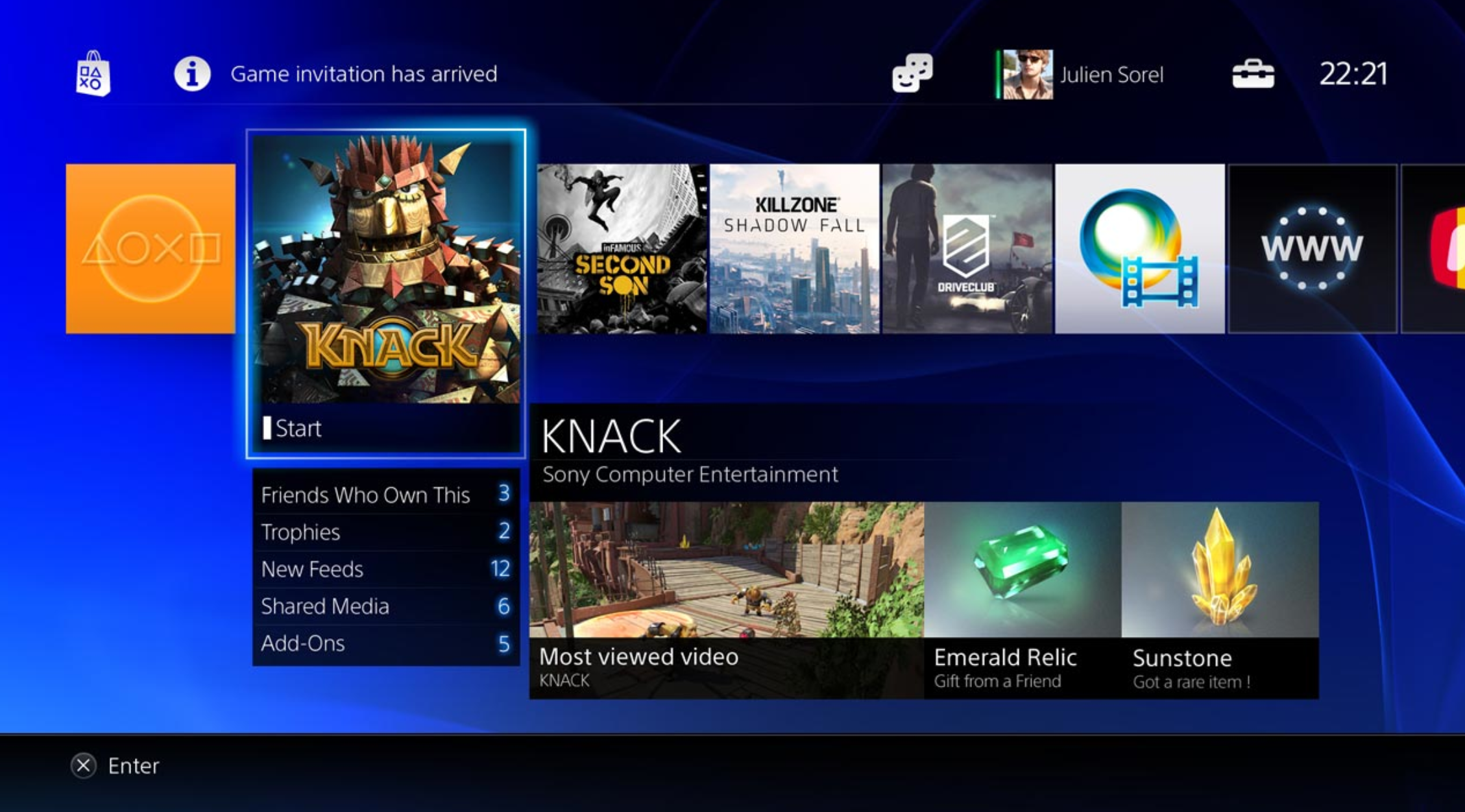
The main interface. On top is a selection of games that we already saw at the PS4 launch. All games on PS4 will be available for download. On the bottom is a YouTube-like “most viewed video” which is part and parcel of the sharing option built into the heart of the PS4.
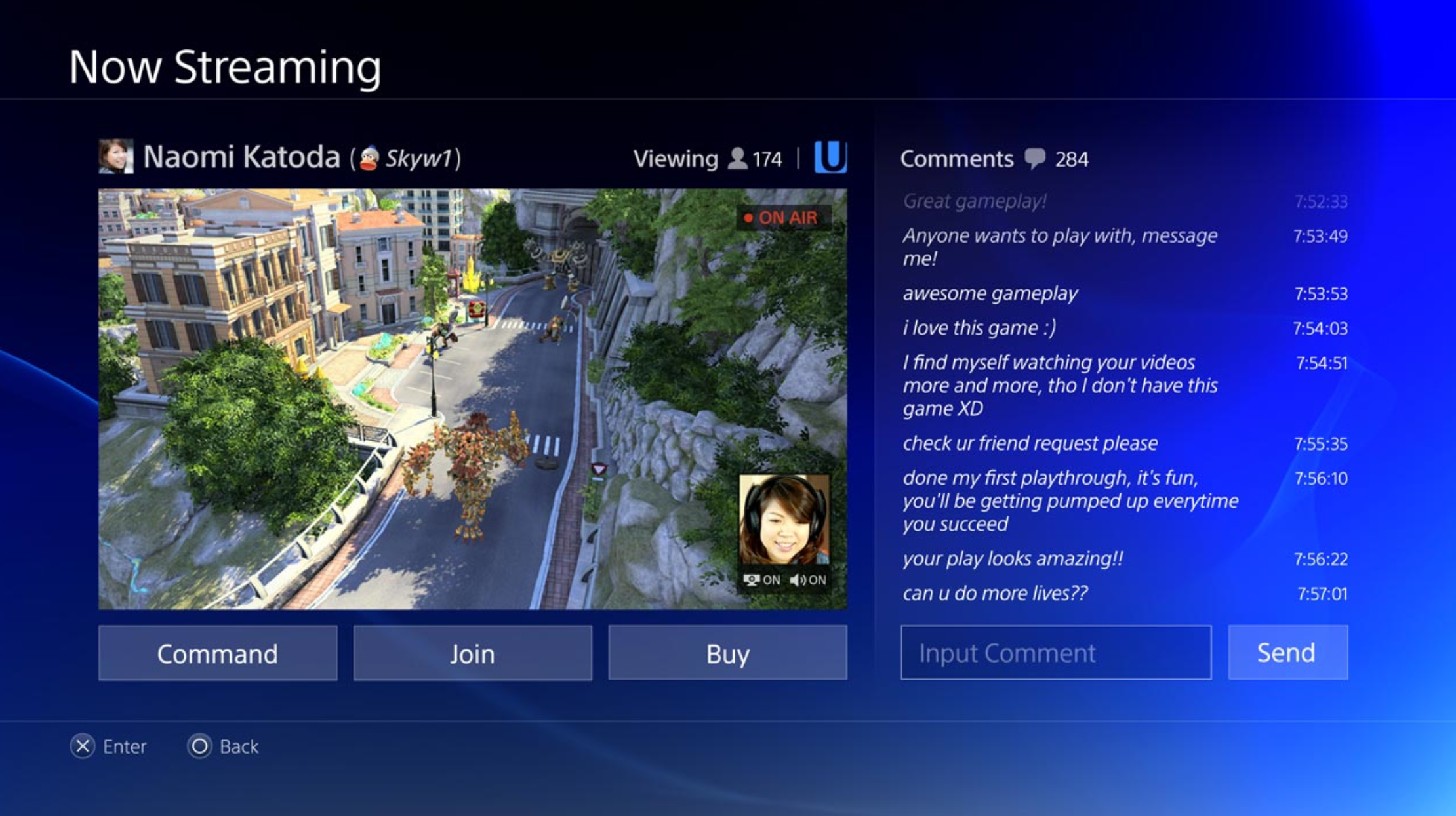
This is cool. It’s the live-streaming interface, showing games with comments from friends. We can even see in the bottom right of the game-play window, a live camera feed of the user.
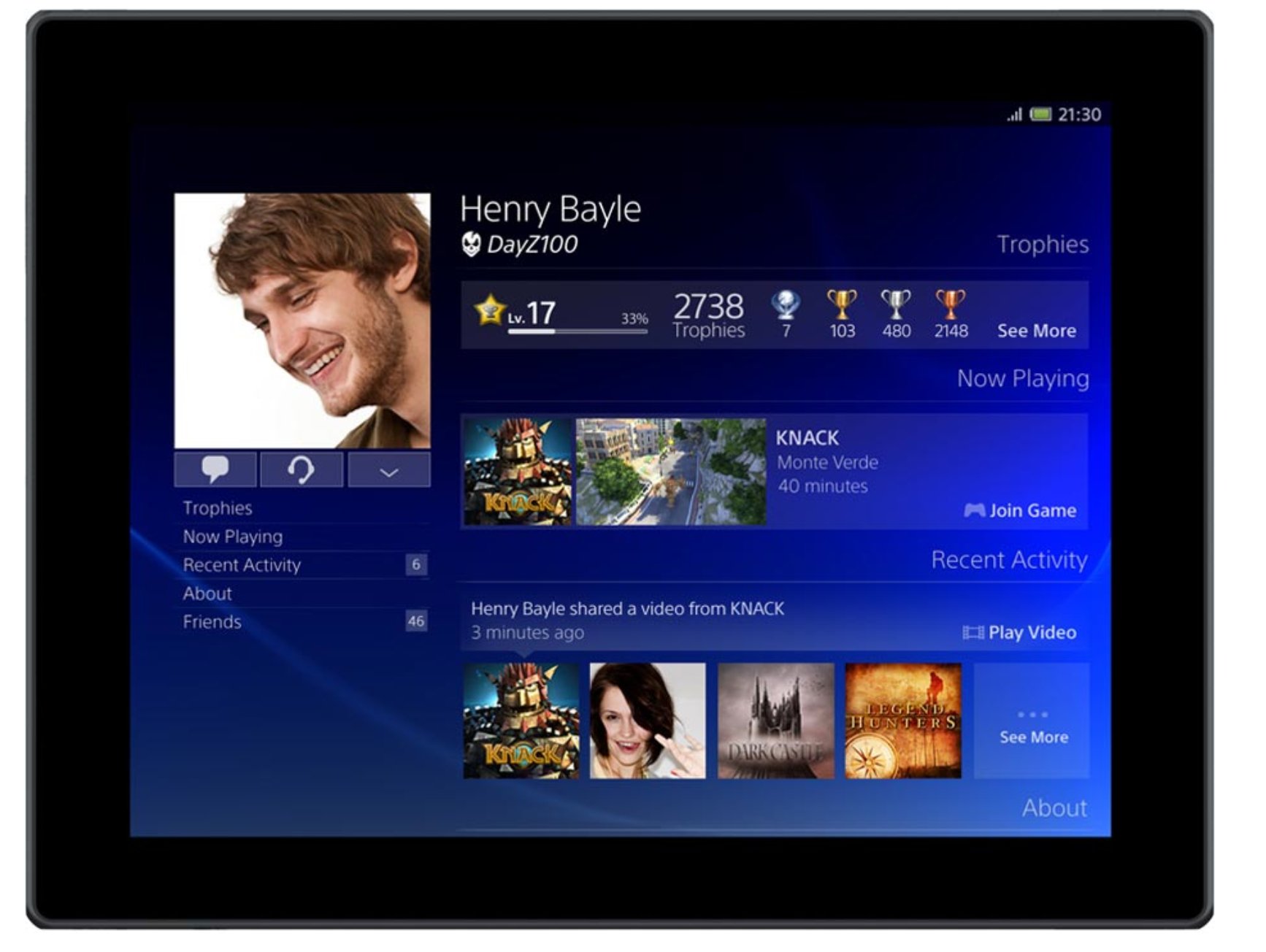
This is the tablet version of the PS4 UI, which looks exactly like the fully fledged version. That’s because the interface will be the same across all platforms.
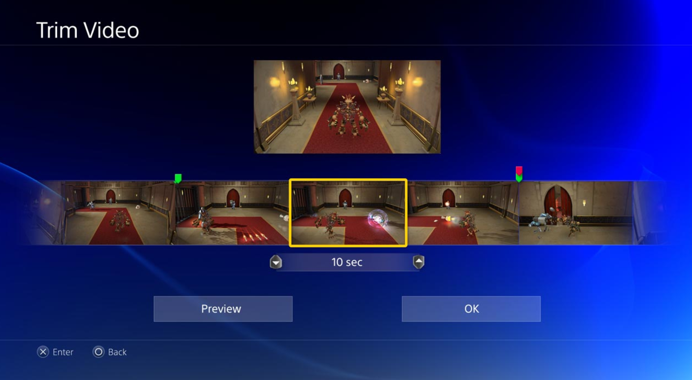
Basic video editing features built into the video sharing option.
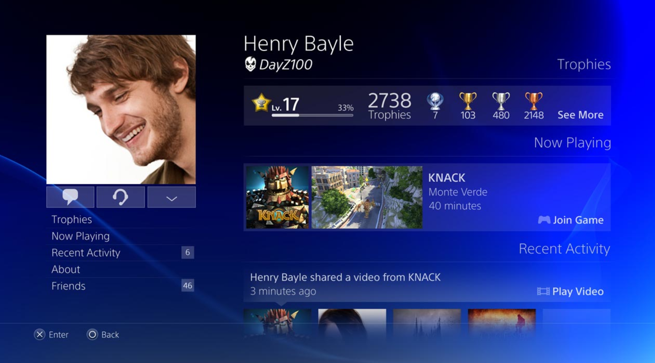
This is the new user profile screen, and it’s a hell of a lot cleaner than the PS3’s.
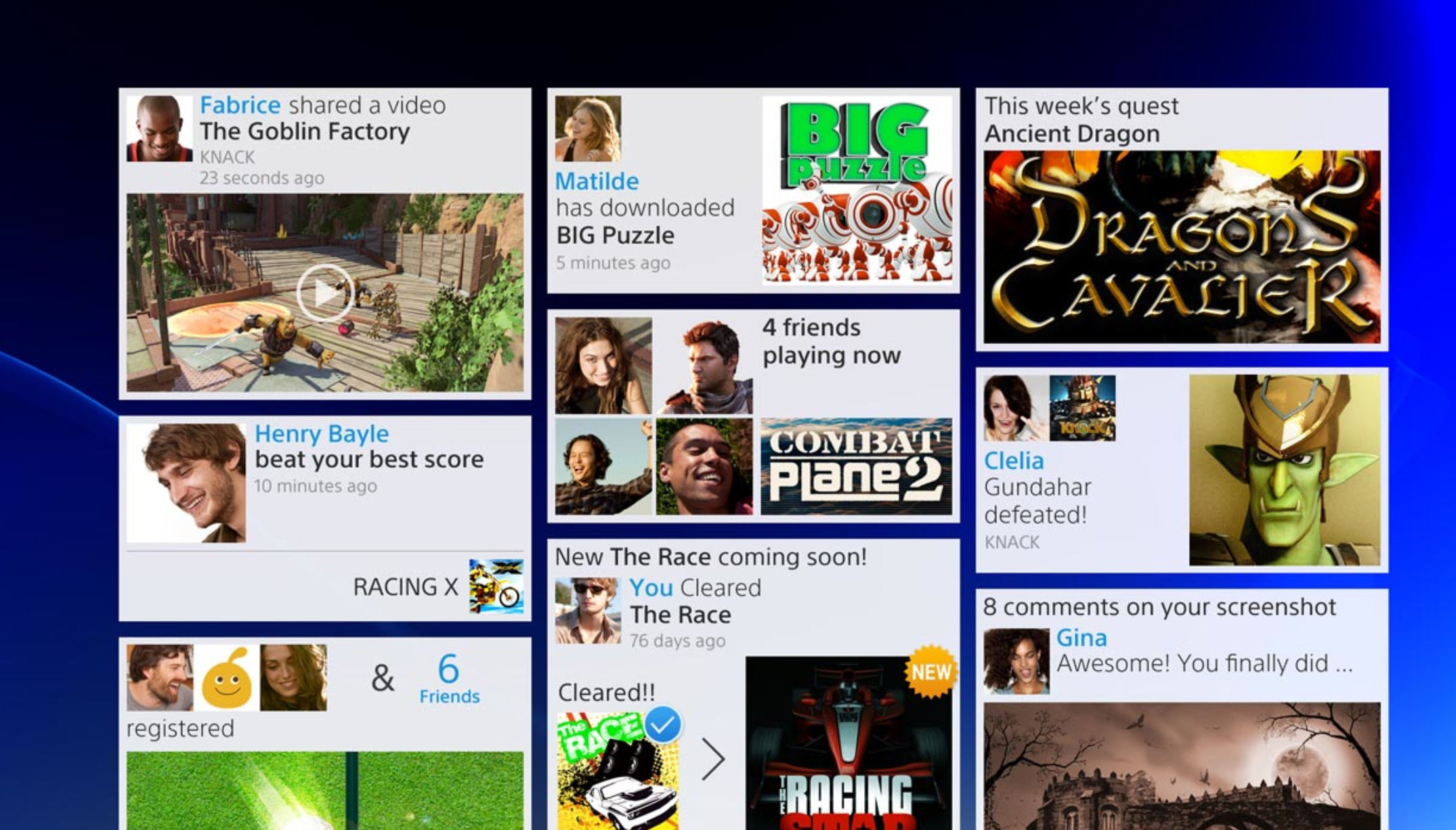
A social-media, Pinterest-like screen detailing a timeline of player activities.
This is what will supposedly happen when the “share” button is pushed on the PS4 controller.
