With powerful hardware working together with an industry-leading camera system and intuitive AI experiences, everyday tasks have never been easier and faster
Project Spartan first impressions: buggy but promising

If you’re a Windows Insider and have updated to Windows 10 Build 10049 last week, you’d have noticed a new blue icon alongside the Task View button on the Task Bar. Well, that’s Microsoft‘s shiny new browser Project Spartan which Redmond is finally allowing the public to try.
When it was first announced back in November 2014 by Microsoft execs, the company talked it up as being the quintessential browser for the modern age. With Internet Explorer now all-but-culled from Microsoft’s future plans, Project Spartan has a lot to live up to.
So, as a Firefox user (who sometimes dabbles in Google Chrome and Vivaldi when the need arises), what did I make of the first Project Spartan preview build available to the public?
Simple UI
Microsoft did a good job cleaning up the muggy Internet Explorer interface, removing many pointless buttons and menus while employing a Chrome-like master menu button in the far right-hand corner. Clicking said button opens a larger menu where users can gain access to the settings bar. Like many of the system and apps menus in Windows 10, Project Spartan’s opens alongside the right flank of the browser. It’s a simple layout with no confusing options. Microsoft definitely nailed this one.

Microsoft has employed an understated, simple UI to its new browser.
Power users may complain that there’s no granular control available, and they’d be right, but this is the preview build.
Tabs form part of the title bar, while there’s an option to add a bookmarks bar below it and the location bar. Alongside the master menu button, there’s three interesting nodules for saving favourite pages, adding notes to a webpage (a la Evernote or OneNote, if you want to keep it in the family) and a feedback button, which is another reminder that Microsoft’s not quite done with Project Spartan yet.
Read more: Microsoft’s Spartan and Internet Explorer to feature Edge, Trident respectively
As one would expect, Bing is the default search engine while we were unable to test Cortana, thanks to her lack of availability in South Africa at the time. Search is, nonetheless, swift and slick with Bing uncannily resembling Google in many ways.
MSN is the home page too, but this can be changed rather efficiently in the settings tab.
Is it swift?
According to benchmarks done by LaptopMag, it isn’t, and much slower than Internet Explorer in fact.
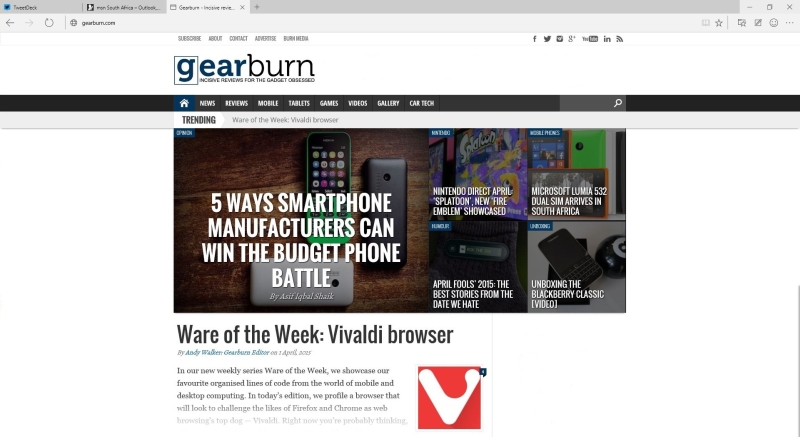
Trailing in PeaceKeeper HTML5 benches, the browser doesn’t seem fast, but I had no issue loading pages swiftly on my nearly six-year-old machine. I did have issues with visually intensive websites like Tweetdeck for the Web but search pages loaded extremely swiftly, and so did Gearburn.
While it’s nothing to shout home about, Project Spartan has a long while to improve its standing in these benchmarks. After all, this is the preview version with plenty of optimisation to come.
Noting the web

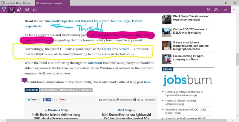
In addition to being quite entertaining, Project Spartan’s annotation tools work extremely well on a non-touch interface.
One big advantage that Project Spartan wears on its chest is its annotation suite. It’s clear that turning the web into a canvas is one of Project Spartan’s primary goals.
Users have reported issues using the note taking feature (and other touch features) on tablets, but I found no issues on non-touch laptop use. The note taking feature works brilliantly well, with a selection of writing, highlighting and annotating tools for users to turn web pages into an interactive canvas. It’s a joy for research.
Bugs, bugs everywhere
One shouldn’t expect a piece of software to be right as rain immediately after launch, but Project Spartan was a bit of a disappointment in this aspect. And there aren’t the usual spate of small bugs — they’re fairly large.
For one, typing a web address into the location bar causes the browser to crash almost instantaneously on Windows 10 Build 10049. Swapping between tabs rapidly also plunges the browser into darkness.
Privacy

There aren’t many things to tinker with in the way of settings.
Do Not Track is disabled by default, so privacy-minded users who don’t fancy being chased around the web by cookies will need to flick this switch manually. And speaking of cookies, all cookies are also universally allowed with Adobe Flash Player also enabled out-the-box.
For now, it’s not clear if Project Spartan will be able to use Google Chrome’s swathe of extensions or whether Microsoft will have its own hub for extensions in the future. At the moment, there is no snap ons available for Project Spartan, so ads are left to reign supreme, and JavaScript can chug away in the background uncontrolled.
And if that doesn’t annoy you, the fact that you’re always logged into your Microsoft account using Project Spartan will. Using Bing, I’d tried disconnecting my account from the browser but it would have none of it. I understand this to a degree, but where is the control Microsoft?
What can we draw from this?
Project Spartan hasn’t set the web alight with its debut, but the direction that Microsoft is heading in is apparent. And it’s positive.
There are issues, crashes, privacy problems, and optimisation issues, but Microsoft can address these swiftly thanks to the swathe of Insiders reporting faults. These issues are also understandable for such a young browser.
Overall, there is a lot to look forward on Project Spartan, but there is also a lot to hate for now.


