Unlock up to 10,000 USDT with the best MEXC referral code, mexc-NFTP. Learn how to claim bonuses, reduce trading fees, and earn rewards for deposits and trades.
Samsung Galaxy S8 review: a great phone, but not Galaxy S7 great
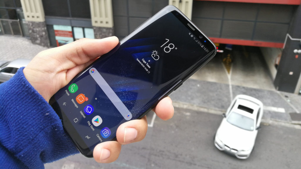
How do you build on the success of the Galaxy S7 and S7 Edge (review)? It’s quite possibly one of the best smartphones ever released, combining a killer camera with a respectable battery and a gorgeous screen.
That alone is a tall order, but throw in the Note 7 disaster and you’ve got all eyes on Samsung, as it seeks to regain its place atop the Android smartphone pile. Speaking of “tall”, that’s the first thing you’ll notice about the Galaxy S8…
Design
Imagine the Galaxy S7 Edge, but with thinner bezels, a similarly thin design and a taller form factor, and you’ve got a great idea of what the Galaxy S8 is like.
Much like LG and the G6 (review), Samsung has opted for the high screen/body ratio, cutting borders away to just a sliver at the top and bottom. But Samsung has thrown in that dual-curved screen as well, dominating the front of the phone. And the only logo you’ll find is on the back.
LG’s smartphone is definitely thicker, with Samsung’s device being more svelte. I quite like LG’s heft and thicker design though — I don’t feel like the S8 can survive an accidental drop. In fact, a fellow tech writer friend has already cracked their review unit after an inadvertent drop.
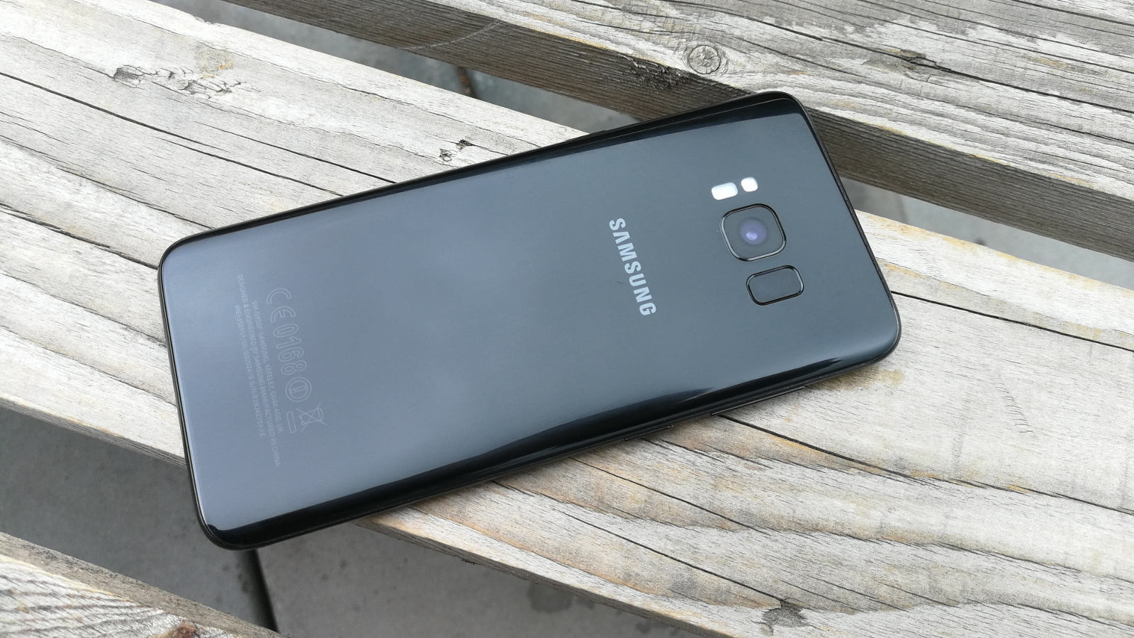
As for materials, you’re looking at a metallic rim (tapering off on the left and right edges) and a glass back that attracts fingerprint grease. In any event, it all comes together to produce a phone that definitely feels expensive.
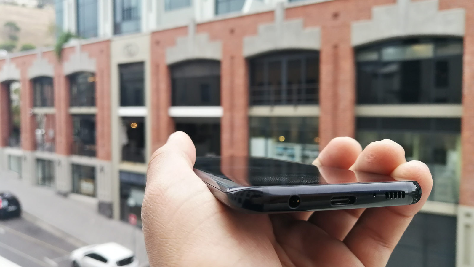
In terms of I/O and buttons, you’ve got an earphone jack (yay), USB Type-C port and speaker at the bottom, power/lock button on the left, SIM/microSD bay at the top, and volume rocker and Bixby button on the left. More on that Bixby button later…
Between the high screen/body ratio, the materials used and the thin form factor, the Galaxy S8 definitely makes for a striking first impression. Is it the most visually appealing Android smartphone around? I still like the Mi Mix, but Samsung’s device is certainly in the running.
Display
Whether you’re a member of the LCD legion or an AMOLED acolyte, I think we can all agree that the Galaxy S8 has an absolutely gorgeous screen. Text looks sharp, your photos look great and the choice to go narrow and tall, much like the G6, is a wise one.
It’s not a fingerprint magnet like many other screens, while it bursts with colour and reaches some high brightness levels. You won’t have trouble in direct sunlight, then. And the AMOLED nature of the screen means that always-on functionality (displaying the clock, battery life, etc) is put to good use, only lighting a portion of the screen rather than the whole display.
The display is HDR-enabled, but Netflix only supports the LG G6 as of writing, while other services like Amazon Prime Video and YouTube are missing. The ability to record video in HDR would be a solid way improve the content situation then, but it’s not present either.
Nevertheless, the 18.5:9 screen ratio and tall, narrow screen is indeed a great decision. The phone’s display does feel a little too tall when reaching for the dropdown menu and the upper sixth of the screen, necessitating a shuffle to get to the top with one hand. But overall, it’s reminiscent of the iPhone 5, feeling far more ergonomic than a traditional 5.7-inch display even. Heck, my seeded Huawei P9 feels super wide in comparison, despite having a 5.2-inch screen.
I’m still not fully sold on the dual-curved design though, as gorgeous as it is. The hit-and-miss palm rejection tech means you might miss camera shots on the very odd occasion or accidentally open a WhatsApp contact’s profile photo (this happened far too often for my liking).
Still, if you’re basing your purchase on display quality above all else, the Galaxy S8 is definitely up there with the Xperia XZ Premium as one of the best in the market.
Performance on paper?
Last year’s Galaxy S7 and S7 Edge stood out for sheer horsepower too, with the Exynos 8890 chipset actually beating the Snapdragon 820 used in rival phones. In fact, the Samsung chip was also more powerful than Huawei’s own beefy Kirin 950 chip, specifically in the graphics department.
Does the Galaxy S8 and its Exynos 8895 provide a big leap though?
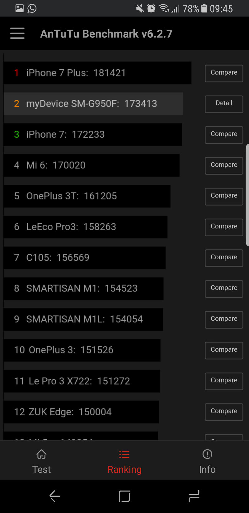
An Antutu test saw the phone deliver some pretty fantastic results during graphical scenes, with judder now and again but a smooth experience the vast majority of the time. As for an overall score, you’re looking at two consecutive scores in the 173 000 range, being significantly higher than the Galaxy S7’s 129 000 or thereabouts. In fact, the S8’s score sees it landing at number two on the Antutu charts, with Apple’s iPhone 7 Plus being ahead of it.
The GFX Bench 4 test also sees the Samsung device hand in a strong performance for the most part. It goes toe to toe with Apple’s best when it comes to the likes of the T-Rex test, ALU 2 run-through and several off-screen tests. Otherwise, the phone lags behind Apple’s best and/or Nvidia’s Shield TV when it comes to tests like Car Chase, Manhattan and texturing.
In plain English, the Galaxy S8 silicon is a big step forward for Samsung in benchmarks, but Apple’s hardware/software synergy means it’s still pulling big numbers.
Key numbers
Dimensions: 68.1mm x 8.0mm x 148.9mm (Galaxy S8)
Weight: 155 grams (Galaxy S8)
SIM type: single nano-SIM
Display: 5.8-inch, 1440×2960, Super AMOLED
Chipset: Samsung Exynos 8895 octacore processor | quad-core custom 2.3Ghz & quad-core ARM Cortex-A53 1.7Ghz | Mali G71 MP20 GPU | 4GB RAM
Storage: 64GB expandable storage
Imaging: (Main) 12MP, f/1.7 aperture, 1.5 micron pixels, OIS | (Front) 8MP, f/1.7 aperture, 1.22 micron pixels
Video: 4K at 30fps, slow-motion 240fps at 720p, 1080p/60fps
Battery: 3000mAh fixed
Cool features: rear-mounted fingerprint scanner, iris scanner
OS: Android 7.0 Nougat with TouchWiz
Benchmarks are one thing, but we’re glad to report that the Galaxy S8 isn’t a slouch when it comes to actually using the device.
The phone unlocks in no time flat, multitasking is usually extremely snappy and responsive, apps launch quickly and scrolling (be it on the web or in apps) is a smooth endeavour. Sticklers for detail will probably notice a frameskip once in a blue moon, but it’s clear that we’ve got a speedy phone on our hands. It’s a long way away from the Galaxy S4 and its bloatware-ridden skin.
In saying so, I did notice two random shutdowns in the three weeks I’ve been using it. The first shutdown took place when I was tinkering with the camera, failing to save the last photo I had taken at that moment. The second reboot came out of nowhere, as I stuck the phone in its box. The phone booted up a game as I placed it in the box (an accidental press due to the curved screen) and then, as I hit the home button to exit the game, it shut down. Very weird.
In the gaming department, we played about half a dozen titles on the handset, starting with lighter/older fare like Nimble Quest, MNDZZ and Astra, then ramping it up with Nascar Heat Mobile, Motorsport Manager, Maximum Car and Fury Turn. The result? Well, the lightweight titles predictably ran without judder at all, but the heavier games didn’t disappoint either, running at a very smooth pace.
Maximum Car in particular is a workout for many a phone, but it looks and feels great on the Galaxy S8. Now, about installing the Dolphin emulator and getting my GameCube library onto the phone…
What does Samsung bring to the Android table?
As for the actual TouchWiz skin, we’re glad to see Samsung isn’t quite returning to the heavy theme of yore. That’s not to say that the company hasn’t delivered plenty of customisations though…
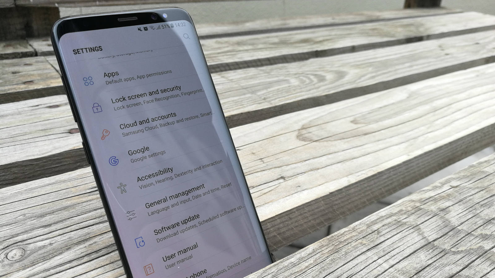
We’ve got a Pixel-style app drawer that I don’t particularly care for (swipe vertically to open your app list), a Bixby menu on the left-most homescreen that can fortunately be disabled, a persistent local search bar at the top of the app drawer, the now-standard device maintenance menu (to optimise battery life, free up RAM/storage etc) and a settings menu overhaul, among other things.
In terms of preinstalled goodies/bloatware, the Galaxy S8 fares a wee bit worse than the S7. There’s the usual suite of Microsoft apps, Samsung Health, the Galaxy Apps store, Samsung Gear (why not make this an optional download?), the Samsung internet browser (a rather capable app), a Samsung Members app (for diagnostics, help etc), a Samsung Notes app, a Secure Folder app (why not add this functionality to the file explorer?) and of course, Bixby.
To put it bluntly, Bixby is Samsung’s take on Google Now/Assistant and, at its best, the card-based aspect seems like a less capable version of Google Now. At its worst, Bixby is an unfinished product, due to the lack of voice commands at launch. And the voice aspect was a heavily hyped feature, with Samsung saying it represents a true natural language interface.
TouchWiz on the Galaxy S8 looks and feels great, but that doesn’t mean Samsung got rid of bloatware
Meanwhile, the Bixby Vision feature is another element that could do with some polish. No Bixby, that box of crackers isn’t toothpaste. Although I have to say that the Translate feature seems solid enough, using Google’s backbone to get things done. Now, if only it delivered offline support too…
The biggest issue with Bixby is the fact that Samsung has delivered a physical button devoted to the feature. A feature that isn’t quite ready yet. This wouldn’t be as big of a deal if the company just let people customise the button. But no, the firm is strong-arming people into opening Bixby, even if it is an accidental launch. Probably so they can say “look, people are opening our app” at the Note 8 launch…
There are indeed apps that let you remap the button (I’m using Bixby Remapper), but it’s not an ideal solution and Samsung has been clamping down. Here’s hoping they change course and introduce a native remapping option.
When it comes to software, the Galaxy S8 is more proof that Samsung wants you to use its services rather than Google’s. That’s not to say that it’s reached the dizzy heights of Meizu and LeEco though. We still have a fast phone and a very pleasant user interface, while the menu when holding down on an app is a nice touch. But this is about as far as Samsung should go for its next release, before we have a repeat of the Galaxy S4.
Is the camera any good? Does a bear poop in the woods?
The Galaxy S7 delivered a sensibly sized 12MP camera with a large f/1.7 aperture for improved low-light performance. And the results were fantastic, featuring Samsung’s trademark sharpness and saturated (but not overly so) colours. Night-time snaps were also a step ahead of the competition in many ways, sucking in more light than rivals.
The Galaxy S8 has the same camera sensor, which means that you should reasonably expect quality snaps again. But, much like Google, Samsung has sought to differentiate itself by using software smarts to improve the camera experience, in the form of multi-frame image processing.
Samsung’s technique sees a few images being combined for each shot taken, in order to reduce blur and improve low-light performance.
Does it actually make a massive difference? I’m not sure, as I’d need a Galaxy S7 to do a side-by-side comparison. But the phone is still spitting out some great shots, with well-defined edges, accurate (if a tad saturated) colours and low levels of noise.
Night time situations also see some great results and, when I took the S8 and P10 Plus to a live gig, the Samsung phone would often have less blur and seemed to have less noise. Is that due to the software smarts, better OIS or what? I don’t know, but it was clear that Samsung had a distinct advantage in that department.
The Samsung Galaxy S8 takes some fantastic photos, but so did its predecessor
Speaking of the competition, it’s clear that the 2017 crop of high-end phones are as close as ever when it comes to photo quality. You can see this in our G6/P10 Plus/Galaxy S8 camera comparison, where the difference mainly boils down to white balance and colour preference (although noise is a factor too).
The difference also comes down to things like autofocus, with the phone being extremely quick on the draw due to a tweaked autofocus system. I haven’t really had any occasions where the phone failed to focus, save for those times when I got a little too close to a subject.
Read more: Samsung Galaxy S8 – check these photo samples
There were a few oddities though, like stubborn lens flares when taking outdoor snaps or a ghosted hand in one of our shots. To be fair, the former sometimes can’t be helped, but the latter was definitely a weird result.
As for actual features, we’ve got the usual auto, pro, panorama, food, selective focus and virtual shot modes. The pro mode gets the job done well enough too, although the lack of LG-style focus peaking is a little disappointing.
Nevertheless, Samsung still manages to stay level with Apple when it comes to fire and forget photography. No need for endless tweaking, no need for half a dozen shots — one or two will get the job done.
One for video enthusiasts?
We really enjoyed the Galaxy S7 video experience, delivering great quality recordings in 4K, 240fps slow-motion and 1080p/60fps flavours. The same great quality is on show here too, but those rumours of 1000fps video are unfounded.
We went one step further with the Galaxy S8, taking the phone to a live gig. The result? You’ve got clips that are well-lit and feature less noise than many rival devices. It’s also worth noting that the phone has an AOP microphone for audio recording and, as the clip demonstrates, it’s capable of capturing good quality, distortion-free sound for the most part.
My only qualm is that the company could’ve slapped on another AOP microphone for “richer” sound and HTC-style recording features (surround sound etc).
Otherwise, the phone makes for a great buy if you value video quality above all else. And your shaky concert footage will actually sound decent.
Will that 3000mAh battery last?
The Galaxy S7 and Galaxy S8 share the same 3000mAh battery capacity, which is pretty much the baseline for a flagship smartphone these days. In fact, LG’s battery is slightly bigger (3300mAh) while Huawei’s P10 also edges out Samsung’s offering (3200mAh).
In any event, I never found myself having to charge before leaving the newsroom on a typical day. My usual day of usage saw me chatting extensively on WhatsApp, listening to some tracks via Google Play Music and accessing email, often having 40% or more juice still left.
Attending a conference is one of the more strenuous workouts for a phone, as I live-tweet, browse the web and generally punish the modem and screen. At the recent BotCon Africa event, I was live-tweeting pretty much 70% of the time, from about 10am to 4pm. The result was that the phone dipped below the 30% mark at about 2pm or so, subsequently plugging it into the power bank. A pretty good workout, but a solid showing from the phone. Still, I’d expect the likes of the Mate 9 (review) and other much larger phones to last a few hours longer.
I did find however, that running benchmarks on the phone (two Antutu tests and GFX Bench) knocked double digits off the phone’s battery life. And you can expect streaming video to do similar damage. What about normal video playback?
We put the phone through our usual video playback test, running a 20 second 1080p/60fps video on loop. We use MX Player, while enabling mobile data/WiFi and turning the brightness up to 100%. The result? It hit the 10% mark after eight hours and a few minutes, handily beating our five to six hour average. So that means you should be able to watch three movies on the plane, turning down the brightness and disabling connectivity to add a few hours.
Still, if you’re worried about lasting for a day, the Galaxy S8 won’t let you down. In fact, if you forget to charge the night before, you should have enough juice for the morning. So it’s pretty much on par with the other flagships this year.
The biometrics are a step backward and forward
The elephant in the room really, is Samsung’s poorly placed, tiny fingerprint scanner. You’ll press the camera more times than you’d care to admit — and don’t get me started on the phone imploring me to cover the scanner with my entire finger.
It works fine when you eventually get the hang of it, but yeah, the Galaxy S7’s scanner puts Samsung’s current flagship to shame. Although I still think the P9 has the best scanner on the market, owing to my preference for rear-mounted scanners.
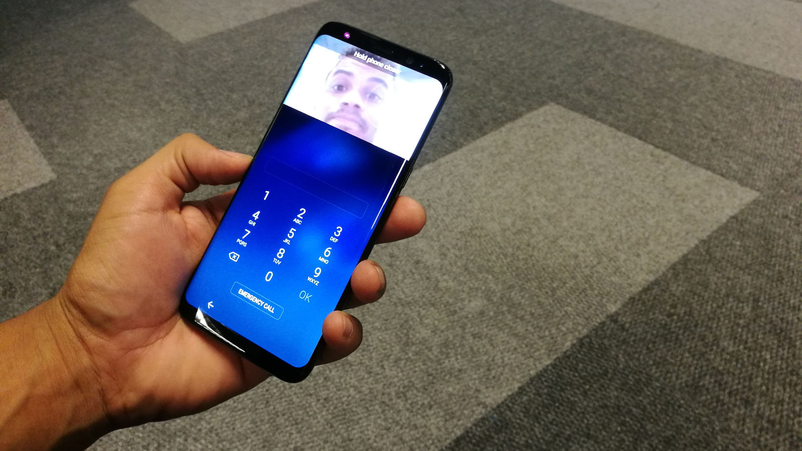
Then there’s the iris scanner, being much faster than my Lumia 950. The phone only takes a second or so to unlock, in a best case scenario. Unfortunately, much like Microsoft’s effort, it seldom works in direct sunlight, so you’ll need to use the fingerprint scanner or PIN code instead (or go to a shady spot). It works well in the dark though, owing to the use of infrared light to scan your iris.
There are two other notable issues I have with Samsung’s iris scanner though.
Firstly, why do I have to hit the power button and then swipe up to activate the scanner? A power button press like the 950 should automatically activate the scanner. This is even more apparent when the afterthought of a fingerprint scanner only requires a touch — no power button needed. [Update: we somehow missed that there was an option to enable iris scanning without a screen swipe. We’ve tweaked the score to reflect this.]
The second iris-related issue (and one covered extensively here) is that you can’t improve your scanning profile like the aforementioned Microsoft phone. That means you can’t scan your iris with and without spectacles, for instance, or in a lighting situation that proves troublesome.
Nevertheless, Samsung still lets you log into websites and the like via your biometrics, being very convenient. And the preinstalled Secure Folder utility means you can securely stash away your apps, photos and other files. Otherwise, Samsung has pulled a Huawei and delivered the ability to activate the dropdown menu with a fingerprint scanner swipe.
So… should you get it?
The Galaxy S8 is a less impressive leap from the Galaxy S7 than the LG G6 was from the G5. Then again, Samsung had already achieved greatness with the 2016 phone, while LG… well… hadn’t.
Does the Galaxy S8 represent a big upgrade over the S7? Is it a skin-deep change only? Or is it a step back even? Well, the truth is that it’s a little bit of all three in many ways.
We’ve got a solid but not great iris scanner, that gorgeous screen and a slick but “please-don’t-let-me-drop-it-for-the-love-of-all-that-is-holy” hardware design. Then there are the changes that are barely felt. Yes, the camera is excellent, but so was last year’s model. Sure, the phone is extremely nippy, but the S7 was a smooth operator too.
Finally, we’ve got the departments that feel like a step back. There’s the tiny fingerprint scanner in a weird location. We’ve also got the return of an extra physical button — a good idea, but bad when Samsung forcibly ties it to Bixby. Speaking of Bixby, we’ve also got the return of software that duplicates Google functionality (Assistant/Now) for the sake of it. And it’s still not finished yet, lacking voice commands.
Verdict: The Samsung Galaxy S8 packs a slick (water-resistant) design, snappy camera, brisk performance and a battery that punches slightly above its capacity. But if you’ve got a Galaxy S7 or S7 Edge, you actually have an equal or even better phone in many ways. Got an S6 or S6 Edge? Then you’re in for a treat.
Score: 8.6 out of 10
Disclosure: Samsung allowed us to keep our Galaxy S8 review units, as well as a wireless charging pad.
