Artificial Intelligence is no longer a distant promise or a Silicon Valley experiment. It’s embedded in the now. South Africans are already using generative…
Twitter undergoes a facelift, changes app design

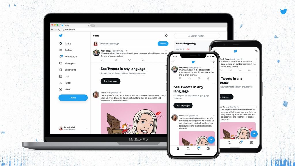
Twitter has rolled out several design changes on the app including high-contrast colours, increased space, and a brand-new typeface called Chirp.
The social media company listed the changes in a Twitter thread published on 11 August.
The design changes are available on both the mobile and web Twitter apps.
Notice anything different?
Today, we released a few changes to the way Twitter looks on the web and on your phone. While it might feel weird at first, these updates make us more accessible, unique, and focused on you and what you’re talking about.
Let’s take a deeper look. 🧵 pic.twitter.com/vCUomsgCNA
— Twitter Design (@TwitterDesign) August 11, 2021
“While it might feel weird at first, these updates make us more accessible, unique, and focused on you and what you’re talking about,” it wrote.
What design changes has Twitter made to the app?
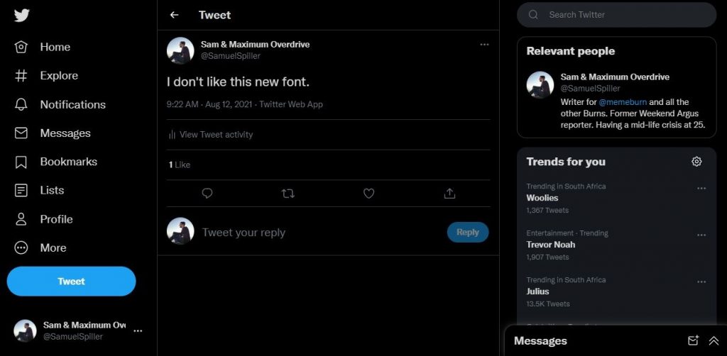
The biggest change to the Twitter app is the new Chirp typeface.
Twitter first debuted the font back in January. At the time, it said the font struck a balance of fun and seriousness in the appearance of tweets.
At the same time, text in all Western languages such as English will now align to the left of the display. Non-Western languages will remain aligned as they previously were.
Twitter has also updated colours in the app to be high contrast. The app uses much less of the blue colour as before. Twitter said the change aims to draw attention to other content such as posted photos and videos.
The new buttons in the app are also high contrast in colour.
“We’re also rolling out new colours soon, giving you a fresh palette,” Twitter added.
Meanwhile, Twitter has cleaned up the app’s appearance with several smaller changes. The app features fewer grey backgrounds and divider lines between elements, and has increased space to make tweets easier to read.
Twitter said it would introduce more design changes soon.
Featured image: Twitter